This site uses cookies to improve your experience. To help us insure we adhere to various privacy regulations, please select your country/region of residence. If you do not select a country, we will assume you are from the United States. Select your Cookie Settings or view our Privacy Policy and Terms of Use.
Cookie Settings
Cookies and similar technologies are used on this website for proper function of the website, for tracking performance analytics and for marketing purposes. We and some of our third-party providers may use cookie data for various purposes. Please review the cookie settings below and choose your preference.
Used for the proper function of the website
Used for monitoring website traffic and interactions
Cookie Settings
Cookies and similar technologies are used on this website for proper function of the website, for tracking performance analytics and for marketing purposes. We and some of our third-party providers may use cookie data for various purposes. Please review the cookie settings below and choose your preference.
Strictly Necessary: Used for the proper function of the website
Performance/Analytics: Used for monitoring website traffic and interactions
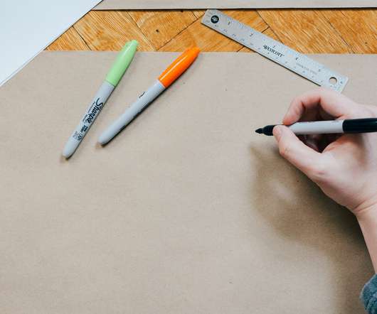
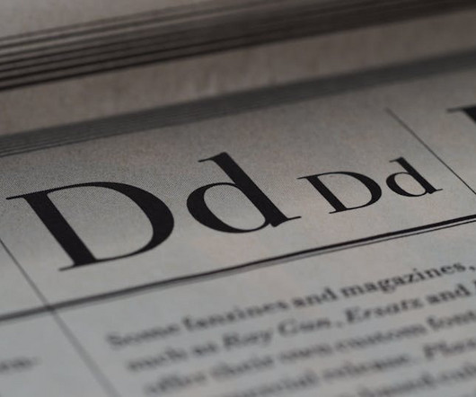
"I've worked with clients who already have an established brand typeface which doesn't have the things it needs," reveals independent typographic designer Sarah Cowan. Go back into the archives and find styles that may influence your choices or bend the rules and pinch it from another category or industry.
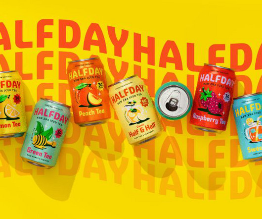
With the better-for-you drinks category becoming increasingly crowded, HALFDAY needed to ensure its functional benefits were clear, but also that the great classic taste of the liquid shone through," Bruce explains. The team chose Strippy Regular as the headline font, embracing its bold, square shapes reminiscent of '90s editorial design.
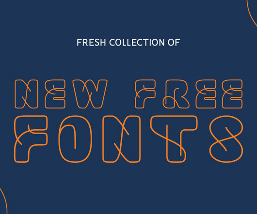
Need a fresh burst of typographic inspiration? From the first superfamily from Order Type Foundry to a groundbreaking system offering exclusive ownership of typographic variants, these fonts represent the cutting edge of contemporary type design. What better time to refresh your typographic palette?
Their goal was to elevate Hip Pop from an indie challenger to a mainstream category leader, moving away from typical health drink aesthetics. One of their recent landmark projects was Bigger , a large-scale typographic installation created for the Shenzhen Art Book Fair.
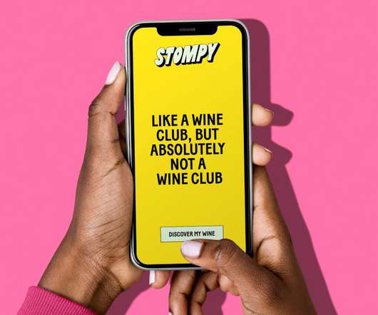
At its heart, Stompy's new typographic logo is inspired by the art of grape stomping. Playful in its manner, the extruded type is transformed into repetitive patterns throughout the identity, alluding to the brand's different categories of wine.
The studio's head of design, Meg Jannott, describes the brief as "exciting and ambitious" while stressing the importance of the client's category as parenting is overwhelming enough without having to sift through hundreds of brands that don't resonate with them. So they stuck with the original name.
A strong typographic framework simplifies development and makes products easier to maintain. Key typographic principles in designsystems Effective typography within a design system is guided by several key principles, including usability, clarity, and hierarchy. As vinney notes, this is a key aspect[3,4].
Read the book, Typographic Firsts. Among my favorite kinds of typefaces are those that don’t fit neatly into predefined or existing categories; those that dip their toes into more than one genre, or take their cues from disparate historical periods. These twilight zone hybrids aren’t always easy to pull off.
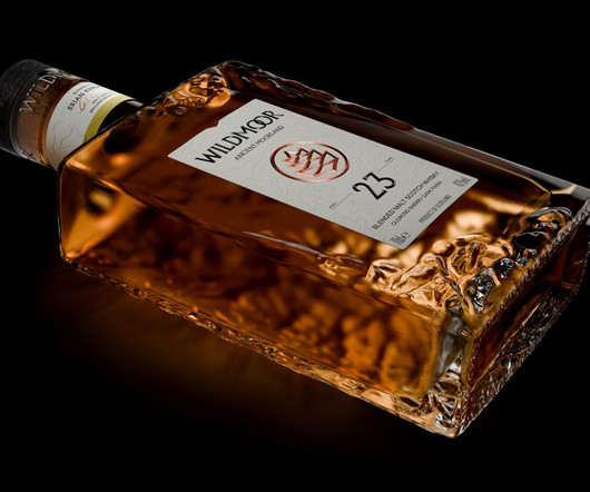
Amid the rising popularity of Japanese whiskeys, LOVE has designed a new brand that combines two cultures while staying true to the category's time-honoured codes. Wildmoor's "chiselled from stone" aesthetic aims to give the enduring, timeless quality currently missing from the category.
As well as portraits, Sam is also known as an illustrator and typographer. To help keep himself organised, he breaks his work down into three categories: nouns, verbs, and typography. I like to imagine how a person would look if we could see them in their entirety at a certain moment."
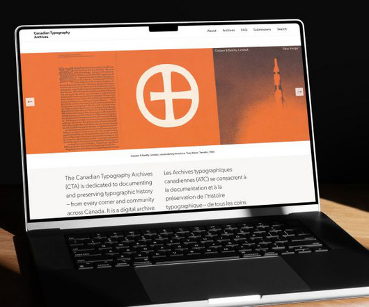
The project is dedicated to documenting and preserving typographic history – from every corner and community across Canada. The work profiled on the site spans various categories of typography, including printed books, calligraphy, hand lettering, typeface design and advertising.
Typography Posters by Anahit Lyudvigian Pushing Typographic Boundaries Lyudvigian’s posters break away from traditional typographic rules. For example, her “New Frame” poster not only reimagines typographic structure but also conveys empowering statements like, “Old ways won’t open new doors.”
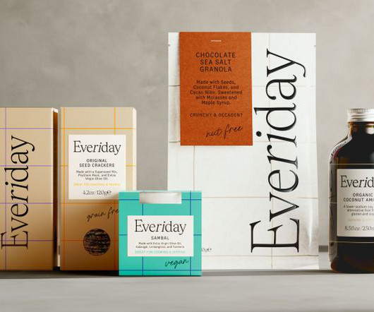
Midday's innovative design strategy builds on this mission and introduces a modular system that anticipates rapid growth across diverse product categories. Its approach perfectly aligns with Everiday's aspirations to enhance everyone's pantry shelves.
These new fonts come from all popular categories, including serif, sans-serif, script, display, and more, ensuring that you always have the perfect typography for any project. Marathon was cut by renowned typograph Rudolf Koch in several sizes. As yet, it comes in just one weight: Maranatha Book.
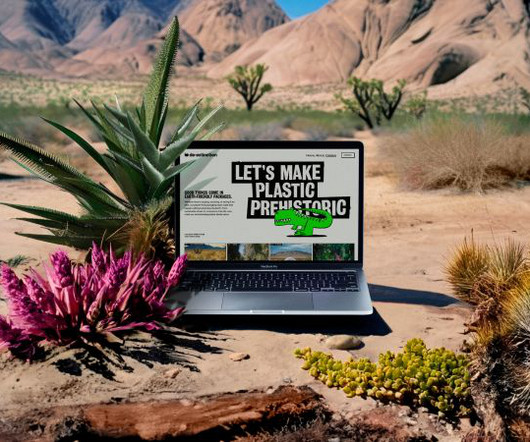
This typeface masterfully balances expressiveness and functionality, serving as a typographic representation of the De-extinction ethos — reflecting reinvention for an unconventional, bold future," the studio explains. With this vibrant branding, we shook up the eco-friendly category by not playing it safe.
Having judged the competition before, I noticed a much greater diversity in the subject matter across all the categories, which was refreshing!" So if you're thinking of submitting an entry next year, keep in mind that Andrew noticed: "While print quality and craft were high, sometimes typographic detailing stumbled."
There are three main categories that I typically group logo designs into: illustrative, iconic, and typographical. Typographical A typographical logo is a design made entirely of text/fonts without an image to complicate it. Does your logo fall into one of these categories?
Earthling Studio has developed the brand positioning and created the visual and verbal identity for Cuddle Sleep Health, a new entrant into the sleep supplement category that marries credibility and scientific rigour with an elevated lifestyle aesthetic. It summarises the brand as calm and supportive yet dedicated, curious, and science-led.
Right to Left, then back again Samar joins Pentagram's London office along with her team from Right to Left, the design studio she founded in 2021 to straddle different cultures and typographic traditions. Taking the leap Being invited into discussions about the Pentagram partnership clearly fits into the category of "good things happening".
This guide explores 70+ Japanese-style fonts , categorized by their design styles, and provides insights into how each category can enhance modern design and branding. Whether you’re working on branding, packaging, or web design, the right Japanese-style font can evoke cultural authenticity, elegance, or contemporary simplicity.
Learning about Typography: The Typography Primer Book was actually first published waaaay back in the day, circa 2000, but the contents are still very relevant over a decade later, and includes Glossary of Typographic Terms. Even for those seasoned designers and self proclaimed typographers, this is a good resource book to have close by.
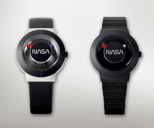
Of the numerous iconic logos designed throughout history, one quickly notices most fall under the category of companies and brands selling wares or services. And now it’s back in the form of a limited edition Anicorn x NASA Space Watch.
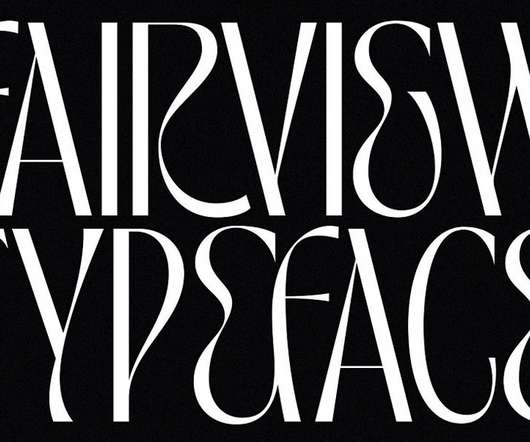
The TAN Fairview font will definitely give your typographic work a unique look. For those of you looking for more trending typefaces, feel free to check out our extensive Fonts category. Just click on the following link to learn more about the new TAN Fairview font. Download at Creative Market. TAN Fairview font by TanType.
You can use it for plenty of typographic work including fashion-inspired design projects, branding, packaging, magazines, social media, just to name a few. The TAN PEARL typeface is also equipped with numerous typographic features such as alternate letters and multilingual support. On the other hand, it still maintains a classy style.
You’re well-versed in typographic history. Most importantly, they can see a typeface and identify a precise category label for it. Experts exercise great care and consideration over special typographic symbols for a number of reasons. He also keeps up with industry events like Typographics. When did it originate?
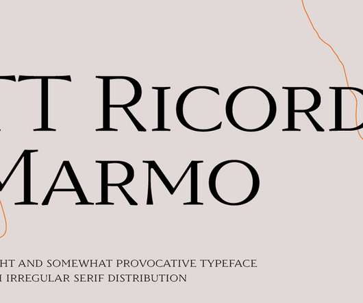
Created and published by foundry TypeType, the goal of the TT Ricordi project is to bring back to life ancient typographic styles in the form of contemporary fonts. Check out other great typefaces in our recommended Fonts category. TT Ricordi Marmo font by TypeType. TT Ricordi Marmo font by TypeType. Download on MyFonts.
Understanding Headline Font Categories Typography experts typically organize headline fonts into several distinct categories, each serving different purposes and evoking unique responses from readers. Their simplicity allows the message to shine through without typographical distractions.
They come in various styles and categories, from sleek modern sans-serif fonts to ornate vintage scripts. Font Download Mission Control Monospace Font Embark on a typographic journey with Mission Control from Mehdi Bouhjar and give your content a spatial dimension that transcends conventional design boundaries.
Serif and Sans-serif: The Great Divide Now, lets talk about the two major categories of typefaces: serif and sans-serif. By continuing, you accept the privacy policy The post The Most Important Typographic Technical Terms Simply Explained appeared first on WE AND THE COLOR. Subscribe to our newsletter!
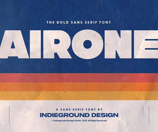
Using the Airone font, you can add a bold and iconic style to your typographic work. Its style is reminiscent of typographic designs known from the tech industry, airlines, or even space traveling. If so, feel free to browse through our Fonts category. You can combine both styles in various ways to create unique designs.
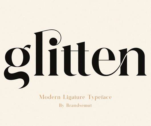
Glitten’s elegant ligatures will add a unique style to your typographic work. If so, feel free to browse through our popular Fonts category. The Glitten Ligature Serif font is both modern and nostalgic at the same time. It works great for logos, magazines, or social media. Just look at this beauty! Download on Font Bundles.
There is currently a trend in typographic design that pushes the boundaries of legibility by creating expressive typefaces. These experimental typographic styles challenge the boundaries between abstract shapes and legible letters. Experimental, Playful Typography. We are curious to see what the future will bring.
This gives you maximum typographic freedom. To explore more fashionable typefaces, look through the Fonts category on WE AND THE COLOR. The section includes a great number of different styles to cover most typographic demands. The font family comes in seven weights, with matching italics and a variable font file included.
The Nothina Mount typeface , a masterwork from Alit Design, belongs firmly in that second category. It successfully marries two seemingly different typographic worlds. They don’t just create fonts; they build typographic systems that are rich with personality and narrative potential.
Download at YouWorkForThem Download at Creative Market Overview of the 426-Asset Collection: Boldly Modern and Versatile Vanzyst’s toolkit provides an impressive range of 426 graphic elements, split into two main categories: 322 geometric shapes and 104 letters and numbers.
Enjoy our hand-picked selection of the top 10 free fonts graphic designers can download to create amazing typographic designs in 2022. This robust font features natural brushstrokes in order to give your typographic work the visual experience of truly handmade lettering. This particular collection includes a variety of styles.
Subheadings and quotes usually fall into this category. Different cultures and regions have different typographic traditions and preferences. Primary : This is the big stuff, the main headline or title. It’s the largest and most noticeable text. Secondary : A bit smaller, but still pretty important.
The Elements of Typographic Style. The Elements of Typographic Style specifically focuses on print design, though its comprehensive look at the principles of typography also applies to web design and any other text medium. He divided them into 4 categories: psychology, architecture, typography, and skills.
On 240 pages, the book explores several typographic case studies in visual and information hierarchies including motion graphics, webpage design, and conceptual experiments. If so, feel free to browse through our Books category. In addition, it includes QR codes with links to the respective projects by the designers. Buy on Amazon.com.
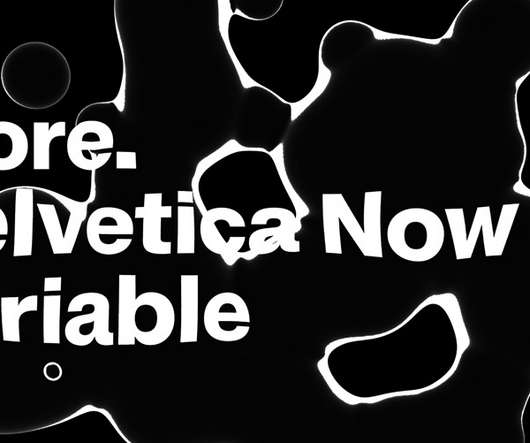
Helvetica Now still preserves the typeface’s Swiss mantra of clarity, simplicity, and neutrality, while giving you all the options you need for your typographic work. Do not hesitate to browse through our Fonts category to find more trending typefaces. Helvetica Now Variable Font from Monotype. Download on MyFonts.
We organize all of the trending information in your field so you don't have to. Join 66,000+ users and stay up to date on the latest articles your peers are reading.
You know about us, now we want to get to know you!
Let's personalize your content
Let's get even more personalized
We recognize your account from another site in our network, please click 'Send Email' below to continue with verifying your account and setting a password.


Let's personalize your content