Remove topics typography-fonts
article thumbnail

Why TYPEONE magazine is a must-read for graphic designers

Creative Boom

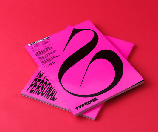
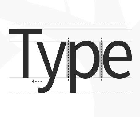
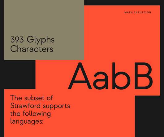
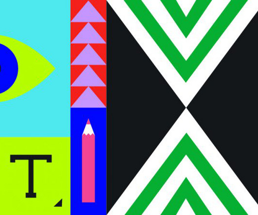
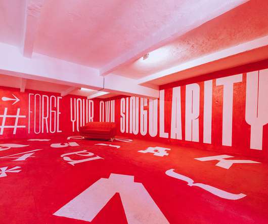
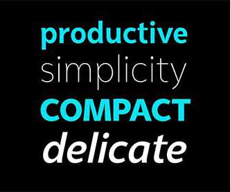
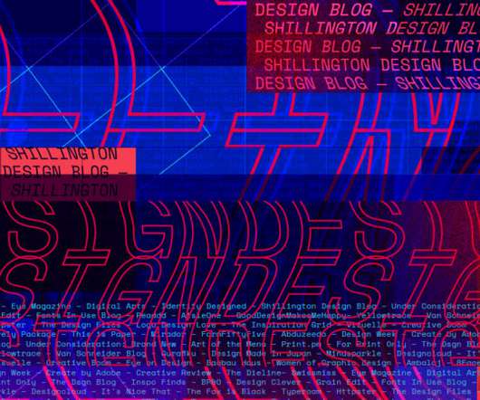
All photography by Yeshen Venema TYPEONE magazine isn't just a beautifully designed print publication; it's also full of key insights about the evolving interaction between typography and graphic design. Ultimately, typography doesn't exist in a vacuum but is just one element in a dynamic and ever-evolving design landscape.

Magazine 440
article thumbnail

Steven Heller’s Font of the Month: Valvolina

I Love Typography

Evoking past, present and future, the geometrically glorious Valvolina with 'its bizarre yet engaging assemblage of contrapuntal shapes' is the topic of this fifth episode of everyone's favorite type column. The post Steven Heller’s Font of the Month: Valvolina appeared first on I Love Typography.

Fonts 325
Insiders

Sign Up for our Newsletter

This site is protected by reCAPTCHA and the Google Privacy Policy and Terms of Service apply.

Trending Sources

article thumbnail

LIT's rebrand of German retailer Gravis draws on the past but looks to the future

Creative Boom

A thoughtfully chosen serif font further reinforces this historical connection. The colours, typography and art direction all add up to a brand refresh that feels, well, quite refreshing. Beyond the logo, the new brand identity extends to every aspect of Gravis' visual language.

article thumbnail

How Semi Permanent Studio designed the visual identity for Future State 2023

Creative Boom

Typography A tier of three typefaces helps the brand communicate its voice consistently and most effectively. Second comes Whyte Inktrap: a sophisticated and robust grotesque font characterised by its ink traps. Colour The colour palette brings the brand to life and symbolises the spirit of innovation and sophistication.

Brand 310
article thumbnail

Optimising Page Layout Design for Better UX

Inkbot Design

Optimising your page design requires considering multiple factors, from typography and whitespace to grid systems and responsive design. Optimising typography improves readability, which enhances user experience. Typography Elements to Optimise Font family – Simple, familiar fonts optimise readability.

Layout 81
article thumbnail

The Best Figma Fonts of 2024 

Noupe

Fonts are more than just text characters; they shape the user experience. From guiding users through your interface to conveying brand personality, fonts are vital to design. However, finding the perfect font that fits your website or app’s tone can be challenging. How to Choose the Right Font? billion times.

Fonts 112
article thumbnail

Bookshelf Essential: Universal Principles of Typography

Abduzeedo

Bookshelf Essential: Universal Principles of Typography abduzeedo 0409—24 Explore 'Universal Principles of Typography'—a design book by Elliot Jay Stocks with pivotal guidelines and concepts for typography enthusiasts. The written word is our daily companion, but its visual counterpart, typography, is an art often unsung.