Remove neue-montreal
article thumbnail

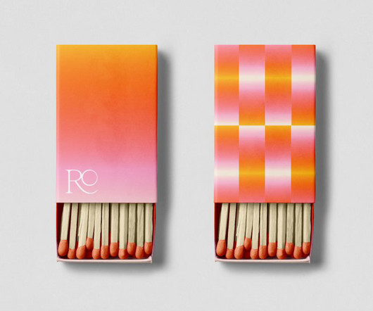
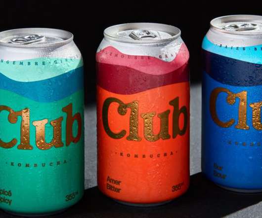
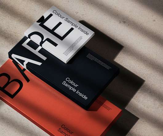
Baillat Studio's identity for Rose Orange terrace is inspired by the warming hues of the sunset

Creative Boom

Located high in Montreal, the terrace's delectable sunsets influenced the entire graphic identity. Located on top of the towering and iconic Montreal building – 185 metres in height, to be exact – this venue demanded a look that resonated with its exceptional location and the colours created when the sun slowly takes itself to bed.

article thumbnail

50 fonts that will be popular with designers in 2024

Creative Boom

Neue Montreal by Pangram Pangram Designed by Mat Desjardins, Neue Montreal is a versatile grotesque with the spirit of a display font. Inspired by the design scene in Montreal, it's already been used by many local brands, notably the most recent rebranding of the city's football club. Sans-serif fonts 1.

Fonts 545
Insiders

Sign Up for our Newsletter

This site is protected by reCAPTCHA and the Google Privacy Policy and Terms of Service apply.

article thumbnail

Names to know: 20 visionaries shaping the future of creativity

Creative Boom

Her book Das Neue Land is a Spiegel bestseller and won the Frankfurt Book Fair's Entrepreneurial Book of the Year in 2020. David Moon Ki Lee Hailing from Montreal, David Moon Ki Lee now splits his time between New York City and Los Angeles as chief creative officer at Squarespace.

Agency 498
article thumbnail

Solitone: Trading Waves Inspire Fresh Visual Identity

Abduzeedo

Typography That Speaks Volumes For the typeface, they chose Neue Montreal. The primary color, a vibrant 'Cornflower' blue (#7861FF), feels techy and trustworthy, balanced by 'Blackout' (#000000) and softer secondary tones like 'Aluminium' (#9EA1AD) and 'Off-White' (#F3F3F3). Its a palette that feels current and professional.

article thumbnail

A lab Smashing Box 2021/2022

Abduzeedo

Through the use of grids and layouts A lab Agency designers have positioned typographic elements, mainly the "A" - in the Neue Montreal typeface of the Pangram Pangram digital foundry - which represents both the letter and the agency's distinctive logo. They also used initials from other fonts.

Agency 85
article thumbnail

QuiteLike Branding: How Universal Favourite Cooked Up a Deliciously Rewarding Identity

We And The Color

To achieve this, Universal Favourite selected a trio of core typefaces: Neue Montreal, Spezia Serif, and Spezia Sans. Neue Montreal takes the lead for headlines, bringing a bold, confident energy and a contemporary edge. Thats quite a brief, isnt it? It grabs your attention.

article thumbnail

From Concept to Creation: Mastering Branding and Visual Identity Design

Graphic Design Junction

A minimalist brand symbol embodies two wave fragments, while the integration of Neue Montreal font, varying in size and aligned with the branded pattern, underscores our distinctive approach to branding. Symbolizing Soliton waves and technical indicators, the design incorporates a gradient for enhanced flexibility and uniqueness.

Brand 297