Remove eurostile
article thumbnail

Old Factory Signage + Eurostile = Elliptical Sans-Serif Typeface, Halisa

Eye on Design

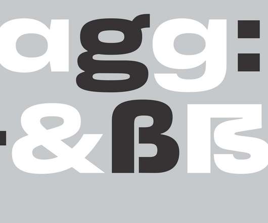
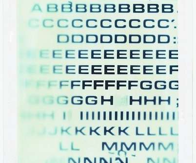
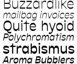
The designer says, “At the start, the letters were looking too much like a Microgramma/Eurostile revival and I started to be more and more interested in making a text typeface. Estrada-Osmycki was also influenced by Swiss neo-grotesque fonts but wanted to make something fresh.

Fonts 96
article thumbnail

Video Tutorial: Retro Text Effects with Adobe Illustrator’s Blend Tool

Spoon Graphics

Activate the Eurostile font – [link]. ? Illustrator’s Blend Tool will be used to create the basic effect, but I will also show you a trick to alter the spacing of the text with a cool easing effect and show how variations of the artwork can be created by combining different combinations of solid and outlined text styles. ?

Adobe 334
Insiders

Sign Up for our Newsletter

This site is protected by reCAPTCHA and the Google Privacy Policy and Terms of Service apply.

article thumbnail

Video Tutorial: Adobe Illustrator ‘Futuristic Gradient Speed Lines’ Text Effect

Spoon Graphics

Activate the Eurostile font – [link]. The process of creating this effect is quite simple, but it includes some must-know techniques that can be applied to all kinds of projects in Illustrator. Check out Envato Elements for Unlimited Downloads of 2,200,000+ Stock & Design Assets – [link].

Adobe 207
article thumbnail

Pentagram redesigns Sight and Sound for a new era of film

Creative Review

Nodding to Sight and Sound’s heritage, the new logo is a reimagining of a previous design from the 1970s using Aldo Novarese’s classic typeface Eurostile. Pentagram partner Marina Willer was asked to look at the Sight and Sound brand as a whole but centred around the redesign of the printed magazine.

article thumbnail

All sizes | Eurostile Breitfett | Flickr - Photo Sharing! #letters #white #letraset #polaroid #type #eurostyle #green

Designspiration

All sizes | Eurostile Breitfett | Flickr - Photo Sharing! letters #white #letraset #polaroid #type #eurostyle #green

52
article thumbnail

Stylish Branding and Visual Identity for Casa Cardona

Abduzeedo

While the artwork and logotype are genuinely inspired by the 1960s Op-art paintings by Bridget Riley and Victor Vasarely, the choice of Fivo Sans Modern typeface evokes the same period—when Aldo Novarese's Eurostile was widely used. Visual Identity. Inspiration – Op-art. Input / Output frame.

Brand 57
article thumbnail

Kakadu

Typographica

The bolder weights of Kakadu remind me of Eurostile, giving me a warm ’70s retro feel, which is a good thing. It has been said that the shapes of Eurostile evoke the appearance of television screens. We have screens and pixels all around us.

Fonts 74