This site uses cookies to improve your experience. To help us insure we adhere to various privacy regulations, please select your country/region of residence. If you do not select a country, we will assume you are from the United States. Select your Cookie Settings or view our Privacy Policy and Terms of Use.
Cookie Settings
Cookies and similar technologies are used on this website for proper function of the website, for tracking performance analytics and for marketing purposes. We and some of our third-party providers may use cookie data for various purposes. Please review the cookie settings below and choose your preference.
Used for the proper function of the website
Used for monitoring website traffic and interactions
Cookie Settings
Cookies and similar technologies are used on this website for proper function of the website, for tracking performance analytics and for marketing purposes. We and some of our third-party providers may use cookie data for various purposes. Please review the cookie settings below and choose your preference.
Strictly Necessary: Used for the proper function of the website
Performance/Analytics: Used for monitoring website traffic and interactions
Key Sustainable and Eco-Friendly Design Practices in 2025 The Role of Technology in Sustainable Design The Benefits of Sustainable and Eco-Friendly Design Practices The Future of Sustainable Design Trend 10: Glitch Art and Digital Deconstruction What is Glitch Art?
Or perhaps one engineered specifically for crisp digital displays? Each one offers a unique reason to be chosen, whether for its historical significance, digital optimization, or sheer aesthetic charm. It’s a practical, no-compromise choice for the digital age. For digital UI, prioritize fonts like Inter or Roboto.
The decision-making process offers a chilling insight into the flawed logic of corporatebranding. The Corporate Logic Behind Changing a Winner The context is essential. ” It's more flexible for digital applications. The initial public and design community reaction was overwhelmingly negative. It's boring.
Today, inclusivity extends beyond physical and digital products to AI and automation , where biased algorithms can create exclusion by design. These techniques are still relevant today, shaping political campaigns, corporatebranding, and digitalmedia. Holmes doesnt just point out problemsshe provides actionable solutions.
How and where people interact with brands – the channels, the locations, the ecosystems – is all getting more varied and complex. Here, we interrogate the demographic needs of the brand’s audience and users, and specify the appropriate functional typographic needs. How we read changes as we grow, learn, and age.
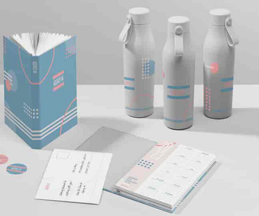
CorporateBrand Collateral: Building a Strong Identity in B2B Settings Corporatebrand collateral is indispensable in creating and invigorating a company's brand identity. It covers many branded materials and assets used to promote the firm, its products and services, and its values and personality.
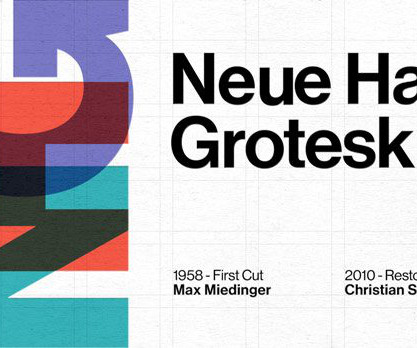
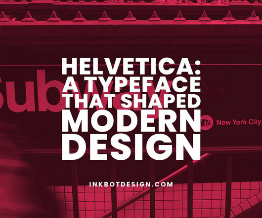
With a wide range of weights and styles, it can be optimised for uses ranging from large-scale environmental graphics to digital interfaces. Sale Helvetica: Homage to a Typeface English (Publication Language) 256 Pages – 01/14/2005 (Publication Date) – Lars Müller Publishers (Publisher) −$3.47 $16.53
Okay — but what’s the difference between corporate identity and corporatebranding? Corporatebranding vs. corporate identity Corporatebranding refers to the relationship between customers and your brand. More specifically, it’s about managing how the public feels about your company.
But this shouldn’t be just limited to your website, Instagram and Behance—it’s important to also reach out to other online publications like magazines and blogs to draw in a wider global audience. World Brand Design Freelance Design Awards. If your work gets featured on a top art and design blog, the work can go viral.
Though they operate quietly in the background, fonts nourish digital communication with visual flair and hidden meaning. Beyond its clean effectiveness in professional design contexts, Helvetica also crossed over into pop culture and broader public awareness. ” Fonts are the equivalent of a delicious meal for our eyes and brains.
Visual Communication as a Key Component: Corporatebranding has evolved beyond logos and slogans to encompass a holistic visual identity. Visual communication plays a pivotal role in establishing a memorable and consistent brand image. With its portrait orientation, it's perfect for both print and digital outputs.
Sale Paul Rand: A Designer's Art Hardcover Book Rand, Paul (Author) English (Publication Language) 256 Pages – 11/15/2016 (Publication Date) – Princeton Architectural Press (Publisher) −$4.01 $60.99 Fletcher's influence is still palpable today, as he redefined how we perceive logos and corporatebranding.
Hyundai Card’s recent publication, Our Typeface, represents a profound exploration of the company’s design and brand identity. The publication marks a significant milestone in the evolution of corporate typography in South Korea, offering a unique lens through which the company’s identity and philosophy can be understood.
Sale Adrian Frutiger – Typefaces: Complete Works Hardcover Book Osterer, Heidrun (Author) English (Publication Language) 468 Pages – 07/31/2021 (Publication Date) – Birkhäuser (Publisher) −$15.33 $53.66 Univers played a pivotal role in transitioning from traditional to digital typesetting.
The Harley Davidson logo has far surpassed its role as a corporatebrand mark. It will likely capture the public imagination and symbolise fundamental ideals of freedom and rebellion. This brand identity has remained remarkably unchanged since its inception in the early 1900s. How Has the Logo Adapted to the Digital Age?
Masters like Paul Rand and Saul Bass elevated graphic design into the popular consciousness through iconic logos and movie title sequences that imprinted their striking visuals into public memory. The Industrial Revolution sparked the need for branding, packaging, and advertising on a national scale.
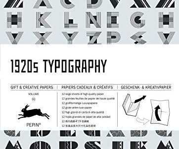
91 (Multilingual Edition) (English, Spanish, French and German Edition) Pepin Van Roojen (author) (Author) English (Publication Language) 16 Pages – 04/14/2019 (Publication Date) – Pepin Press (Publisher) $18.99 Bestseller No. 1 1920s Typography: Gift & Creative Paper Book Vol.91
Think of fonts as the digital versions of typefaces. So, you'll have different font files when you want to use a particular typeface in your digital work. They are commonly used in digital media and have become increasingly popular in recent years for their screen readability.
The graphic designer set up her own studio Half & Twice in Madrid following a stint in the corporatebranding world as a way to pick projects closer to her heart: those that champion sustainability, community and diversity. Paloma Ávila knows the power of networks. “I wanted to try and learn by myself.”
To get you started, be sure to add these five to your list: Graphic Design School: covers the essentials of visual design, theory and practical examples with case studies covering both print and digital. The book covers the development of design, mid-century design, corporatebranding, typography, magazine design and iconic posters.
A logo is a critical touchpoint between a company and the public. It needs to instantly convey what your brand is all about on a visceral level. Ensure your logo can be easily reproduced in different formats, such as print, digital, or embroidery. Create the digital version of your logo using graphic design software.
Letterpress Printing Revival Despite digital design dominance, letterpress printing is witnessing a revival in Japan. By the late 1700s, publication printing was established. Similarly, today’s innovations in digital printing drive creativity. Their innovations blended past and present to define the postwar Japanese style.
Top 10 News Logos Of The Most Iconic Media Brands An image can be louder than all the noise in a world engulfed by information. Beyond corporatebranding, these visual shorthand symbols have become cultural touchstones — engendering trust (or distrust) at first glance. How important is a logo to a news organisation's brand?
Sans-serif fonts are widely used in digital media , user interfaces, and contemporary brand identities. These fonts have a neutral and functional aesthetic, making them suitable for various applications, from body text in print materials to signage and digital interfaces. Loading Preview… Powered by Creative Market 2.4
The goal of logo design is to create the ideal visual brand mark for a business. Or we can say that a logo is a graphic representation that quickly and easily identifies a business, a product for sale, or any other public or private institution. Therefore, everything at Levi's was downplayed, even their brand name.
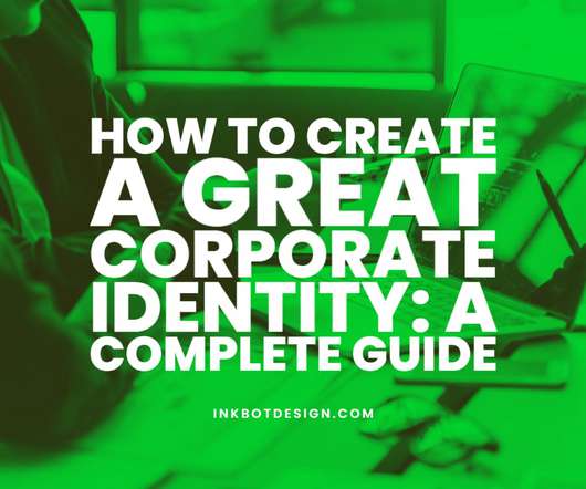
How to Create a Great Corporate Identity: A Complete Guide. Corporate identities are built through corporatebranding, identity architecture and corporate style. They are designed for maximum visibility and brand identification. Does it positively communicate the brand personality ? Is it functional?
The logo has become synonymous with Apple's brand identity and its culture of design-focused innovation. This interlocked ring design was selected after a public competition that attracted over 500 submissions. It featured four overlapping rings, each representing one of the original member companies.
The Designers Republics groundbreaking work on the graphic design for Wipeout, which included everything from packaging to typographic selection in the game menus, has been noticed by many design and gaming publications over the years since the very first Wipeout. Wipeout HD Ingame Branding by Alex Townsend.
Corporatebranding is not just about choosing a catchy name and designing a memorable logo. A game changing corporatebrand is a mix of outstanding strategy, visuals, storytelling, engagement, and application. We live in a world where we’re constantly bombarded with brands, advertisements, slogans, and social media.
Essential Modernism: Design between the World Wars Hardcover Book Bradbury, Dominic (Author) English (Publication Language) 480 Pages – 11/06/2018 (Publication Date) – Yale University Press (Publisher) $70.00 Moreover, modernism has left an indelible mark on digital and interactive design.
To cut a long story short, Gap performed possibly one of the fastest branding turnarounds of all time when they reverted to their original design, just six days after putting their new logo out into the public. Public response, on the other hand, was less than impressed, with many criticising it for being too heavy-handed and outdated.
No horse heads herejust the undeniable influence of a man who transformed corporatebranding into an art form. Sale Paul Rand: A Designer's Art Hardcover Book English (Publication Language) 256 Pages – 11/15/2016 (Publication Date) – Princeton Architectural Press (Publisher) −$21.88 $43.12
This unprecedented publication, authored by Jens Müller, brings together approximately 6,000 trademarks, focused on the period 1940–1980, to examine how modernist attitudes and imperatives gave birth to corporate identity. Less well known, but no less fascinating, is the distillation of modernism in graphic design. Buy the book.
This unprecedented publication, authored by Jens Müller, brings together approximately 6,000 trademarks, focused on the period 1940–1980, to examine how modernist attitudes and imperatives gave birth to corporate identity. Less well known, but no less fascinating, is the distillation of modernism in graphic design. Buy the book.
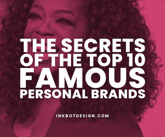
More than just self-promotion, effective personal branding entails defining your values, attributes and goals and consistently conveying your desired image across platforms. When strategically executed, personal branding enables individuals to shape public perception, expand their professional networks and drive meaningful change.
Best Used For : Corporate Design : Ideal for formal documents where professionalism is paramount. Editorial Projects : Perfect for publications that require both tradition and modernity. Secondly, assess the context and purpose of the design—certain pairings work better for print, digital, editorial, or branding applications.
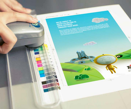
CMYK Colour Systems There are a few specific CMYK colour schemes and systems worth noting: SWOP (Specifications for Web Offset Publications) A standard CMYK definition is used in U.S. Ensures colours translate accurately between design applications, digital proofs, press proofs, and printing presses. commercial printing and packaging.
Master brand A master brand, also known as a flagship brand or corporatebrand , is a brand that represents the entire business. It is often the primary brand associated with the company and may be used interchangeably with the corporate identity.
Apple (in early marketing) – During the 1980s and 1990s, when they were still establishing themselves as major players, Apple opted to utilise more sophisticated fonts such as Garamond throughout their branding materials so as not only to reflect professionalism but also to demonstrate style.
Their expertise typically centres around shaping a company’s brand strategy , brand identity, and brand marketing; in turn, how it’s perceived by its target audience and the broader public. They also help create a unique brand identity and image that stands out in the marketplace.
This will give your brand versatility and allow you to apply the chosen colour to any physical or digital medium. Think of it as a style guide for your brand. The use of shapes is where many brands stumble and fall since they relegate this design element to an afterthought.
The historical plaque on the Apollo 11 lunar module "Eagle" by NASA is in the Public Domain. by Sherbyte is in the Public Domain The Futura Font in History In Nazi Germany, typefaces were one of the strongest ways of showing identity. The typeface works quite well in both print and digital copy and display copy. Conclusion.
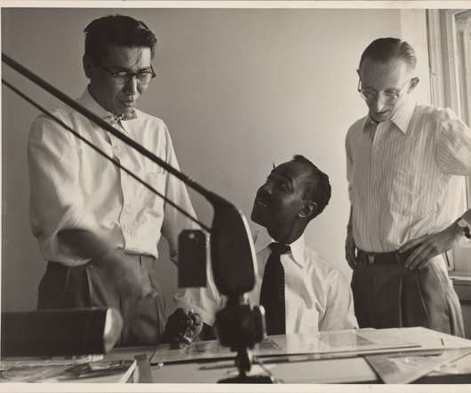
During his tenure at Goldsholl Associates, Miller helped design some of the most iconic corporatebrands of the twentieth century: Motorola, the Peace Corps, Bauer & Black, and 7Up, among many others. I got a job with Mort Goldsholl and I stayed with him 33 or 35 years, and retired from there.”.
I never had an issue with colors because I was typically starting with a client’s corporatebranding guidelines, so I was able to take those colors and use color palette generators to help me build out the look of my designs. I didn’t code anything. I didn’t even write HTML.
We organize all of the trending information in your field so you don't have to. Join 66,000+ users and stay up to date on the latest articles your peers are reading.
You know about us, now we want to get to know you!
Let's personalize your content
Let's get even more personalized
We recognize your account from another site in our network, please click 'Send Email' below to continue with verifying your account and setting a password.


Let's personalize your content