Remove Color Remove Color Theory Remove Patterns Remove Textures
article thumbnail

Experts Weigh in on the Nuances of Wallcoverings Fit to Print

Design Milk

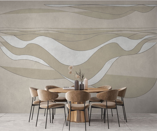
When introducing color, pattern, and texture at any scale, it’s important to consider how those elements might hold a deeper meaning and with whom there may be resonance. “I Organic shapes, reflections of the natural world, muted colors. Soft colors, curved lines, blurred forms.

Print 105
article thumbnail

Good Color Combinations That Go Beyond Trends: Inspirational Examples and Ideas

Graphic Mama

To know how to accurately combine colors is a critical skill that artists, designers, marketers, and brand owners spend years learning and mastering. The perfect examples that just click with you, vibe on the same frequency with you and you know this is the right combination of colors just by seeing it. Colors also have a temperature.

Color 98
Insiders

Sign Up for our Newsletter

This site is protected by reCAPTCHA and the Google Privacy Policy and Terms of Service apply.

Trending Sources

article thumbnail

Color Theory Basics For Non-Designers: Everything You Should Know

Graphic Mama

As a continuation of our inspirational examples and palette ideas for great color combinations, today we will have a look at the basics of color theory and go beyond that. You can also review the color theory article overview below and fast-travel to the specific sections you need. The Color Wheel.

article thumbnail

25 Tattoo Design Elements: Brushes, Vector Art and ToolKits

Just Creative

Containing a variety of brushes that allow you to achieve inked art on digital, these Affinity offerings let you replicate the consistency and texture of real ink. Procreate Eternal Tattoo Color Chart. Vibrant, extensive, and color-accurate, there’s absolutely no reason Procreate designers should turn a blind eye on this pick.

Vectors 250
article thumbnail

A Guide to Vintage Design Styles

Tuts Plus

For example, a designer can use 50s design elements such as fonts and mid-century illustration to give something a 50s art style or retro graphic design, and combine this with aged textures to give the impression of ageing. You might guess the age of a print with slightly more pixelation and a duller color as being of the 1950s or 1960s.

article thumbnail

Important Concepts That Every Icon Designer Needs To Know

Design Freebies

Icons with different shades or colors may be filled without repercussion. Color Matching. Another huge aspect to icon design is the color scheme. Lots of iconsets will have a matching color scheme while others will follow a more realistic approach. Finding Your Style. Each set of icons should follow a similar style.

article thumbnail

11 Elements of Design and How to Use Them

Design Wizard

They can have different directions such as vertical, horizontal, diagonal, curved, or move up and down across a page in a zigzag pattern. . Color immediately stands out in any design. Depending on the type or shade, you can use colors to emphasize elements or evoke certain feelings. Color as a Vehicle for Emotions.

Textures 146