This site uses cookies to improve your experience. To help us insure we adhere to various privacy regulations, please select your country/region of residence. If you do not select a country, we will assume you are from the United States. Select your Cookie Settings or view our Privacy Policy and Terms of Use.
Cookie Settings
Cookies and similar technologies are used on this website for proper function of the website, for tracking performance analytics and for marketing purposes. We and some of our third-party providers may use cookie data for various purposes. Please review the cookie settings below and choose your preference.
Used for the proper function of the website
Used for monitoring website traffic and interactions
Cookie Settings
Cookies and similar technologies are used on this website for proper function of the website, for tracking performance analytics and for marketing purposes. We and some of our third-party providers may use cookie data for various purposes. Please review the cookie settings below and choose your preference.
Strictly Necessary: Used for the proper function of the website
Performance/Analytics: Used for monitoring website traffic and interactions
They have thousands of classes in many different categories, as shown below. The top Skillshare courses from 2020 are broken down into these categories: Graphic Design, Logos & Branding. Logo Design with Grids: Timeless Style from Simple Shapes with George Bakhua. Hand-Coding Your First Website: HTML and CSS Basics.
Create by Remix Design, the icons are designed as outlines and filled in styles on a grid. With a custom collection of more than 275 icons, the Foundation Icon Fonts 3 kit, designed by ZURB, allows you to customize the size, color, and even the style using CSS. Download Now. Vector Line Icons and Font. Foundation Icon Fonts 3.
Klinixer is also highly suitable for other companies and corporate categories. This Theme build with worlds most popular responsive CSS framework Bootstrap 4, visual composer, HTML5, CSS3, jQuery and so many modern technology. The design is very elegant and modern, and also very easy to customize with 1170px grid.
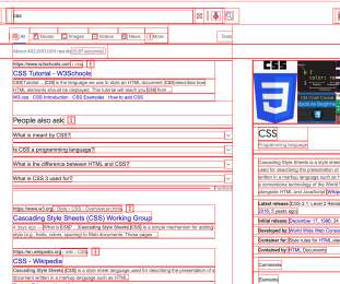
Whatever you want to learn from CSS to SQL, this categorized list should have you covered. CSS Flexbox. CSSGrid Layout. CSS Selectors Cheatsheet. CSS Animations. CSS Filters. CSS Game: CSSBattle. CSS Game: CSS Diner. On design systems, CSS/JS and UX. Grid Garden.
The design is exquisite and modern, and also very easy to customize with 1170px grid. Klinixer is also highly suitable for other companies and corporate categories. This Theme build with worlds most popular responsive CSS framework Bootstrap 4, visual composer, HTML5, CSS3, jQuery and so many modern technology.
A Guide To CSS Debugging. A Guide To CSS Debugging. We’ve all been there, at the end of completing CSS for a layout and — what’s that? CSS, like other languages, becomes easier to debug when you take time to learn a bit about its quirks. Common Causes Of CSS Bugs. On design systems, CSS/JS and UX.
group in a grid. All components are pre-filled with the correct CSS or HTML elements. Creating order out of chaos: LilGrid organzes items in a grid. The little helper takes elements and arranges them into a grid automatically. Exporting Figma to HTML, CSS, React. Also, take a look at the other. accessibility.
Per the W3C spec , “a pseudo-element represents an element not directly present in the document tree” They have been around since version 1 of the CSS specification, when ::first-letter and ::first-line were introduced. They are listed in the spec across three categories: typographic , highlight , and tree-abiding. Marcel Moreau.
It’s divided into different categories: Animation, Component, Layout, Theming, and Web Vitals. Pure CSS Scroll Shadow. CSS has become more powerful over the years. It provides the fundamentals like HTML and CSS, provides recommendation, best practices, and do’s and don’ts when developing a website.
Read more AstronWind AstroWind is a free, open-source template for building websites with Astro and Tailwind CSS. It supports dark mode, RTL, and includes a blog with MDX, categories, tags, social sharing, and an automatic RSS feed. It also sorts Tailwind CSS classes based on your tailwind.config.js. An overall great app with.
Getting Certifications Programs like freeCodeCamp’s Responsive Web Design Certification formally assess design skills through projects on topics like: Accessibility CSS Flexbox and CSSGrid Responsive design Typography and colour theory Preparing for certifications reveals skill gaps to address while validating abilities.
The Tyche theme has a beautiful grid layout on the homepage that makes it easy to showcase the most popular products from several categories. Key features include product search with category select, multiple sections on the front page, full-width slider, latest and featured product carousel, call to actions, and more.
Christian Vizcarra’s experience of creating digital products, designing websites, applications, and all kinds of interfaces for various companies and start-ups has helped him win awards and accolades from Awwwards, Behance, and CSS Design. Learn More. Interface Design with Sketch by Javier Simon Cuello.
As its name suggests, Genesis Responsive Slider allows you to choose specific posts, pages, or categories and shows them in maximum possible dimension , thanks to its responsive nature. It offers five skins, multiple effects , and support for category-specific testimonial sliders. Genesis Responsive Slider. Superb Slideshow.
Smaller elements such as icons, graphics, or photos can be presented in a grid. Google recommends a font size of 16 as a base, which is defined in CSS pixels. For those of you looking for more website inspiration, feel free to browse through our popular Web Design category. You can purchase this font family here.
Also, have a look at other features of Roxxe: SEO-friendliness; cross-browser compatibility; blog options; product listings and grids; pre-designed banners; full-width slideshows; shopping cart and wishlist; social integration; for varied payment systems; Amazon integration; and far more. Notification Bar. Offset/Sidebar Menu available.
Organizing categories on the homepage is straightforward, and user-friendly navigation is enhanced with breadcrumbs. A custom widget also allows for easy navigation within categories or specific posts, improving the user experience. The theme smartly adjusts grid item sizes to display images perfectly.
An industry-unique Grid Editor to harness the power of the CSSGrid natively within Pro, dynamic data features for customized widgets, and a shop demo designed for quick store setups. If you want pixel-perfect product lists visually without having to code, Uncode’s WooCommerce Builder is just right. Visit Uncode 7.
First within tables, animated GIFs, Flash, then with Web Standards, div s, and CSS, there was personality, raw unbridled creativity, and unique means of presentment that often defied any semblance of a visible grid. Splash screens and “browser requirement” pages aplenty.
Since the template comes equipped with six different layouts for homepage, including default “ramsgrid”, column grid, row grid, and masonry, it may be suitable for the art gallery and portfolio websites. Content Layouts come in Standard, List, Grid and Masonry styles. Bootstrap Grids. CSS extension language Sass.
Multiple Grid and List Option. Every single layout contains the main page with dynamic sections, header and footer variations, as well as product and category pages. This theme gives you excellent opportunities for showcasing your products, from grid galleries to banner images and video sliders. 6+ product details.
It provides developers with pre-designed templates , CSS styles, and JavaScript components, enabling them to build websites quickly and efficiently. One of the critical features of Bootstrap is its responsive grid system. This grid system consists of rows and columns, allowing developers to create flexible and responsive page layouts.
Categories keywords by topic, difficulty to rank for, and search volume to guide page design priorities. Best Practices Logical categories and flow – Structure IA top-down from broad to narrow. Target keywords in architecture – Domain names, site sections, categories, URLs, and menu items present optimisation opportunities.
The theme includes a top navigation to display your website categories or pages, and a sidebar to show the widgets on the right. You can also change its CSS directly to modify the look & feel per your requirements. Along with being an SEO-optimized theme, Zephyr has five different portfolio grid styles and six unique blog layouts.
Think of these typographic activities as job categories. Let’s go over these categories of typographic jobs one by one. The em box is what becomes our CSS-specified font size—it maps to the CSS content area. In Chapter 3, we’ll identify the text blocks in our example project and the jobs they need to do.
Using flexible grids and layouts makes your content accessible and visually appealing across all devices, improving user engagement and retention. Steps to Create a Responsive Layout While creating a responsive layout, I focus on a few essential principles, including flexible grids, fluid images, and CSS media queries.
Simply put, we want you to vote for one of the WordPress products already listed under each category or nominate one you think deserves to be included. Monster's Award admits thirteen WP product categories, including Elementor plugins. Product categories. Collapse widget categories. Sort widgets category.
This contest covers thirteen categories of WordPress products, which include WordPress page builders. You may be comfortable with HTML5, CSS, and default WordPress editor. It uses a lightweight CSS foundation that ensures perfect mobile rendering. Adding custom CSS styles for blocks is available only in Elementor Pro.
You can just scroll from top to bottom or if you have a particular category or design style in mind, you can filter by type and style. Use the search box at the top or take your pick from the most popular categories to find what you need. Browse their font tiles or adjust to grid or list view to see which typefaces might suit you best.
Experiment with different alignments, text wrapping, multi-column and grid formats instead of a rigid block. Strategic tips: Break skills into logical categories like design expertise, software proficiency, and soft skills. First, list the most relevant skills for each category's desired graphic design role. Mix up your layout.
Related resource: “ 8-Point Grid: Typography On The Web ” by Elliot Dahl. To provide something very useful for your team, include the grid styles. You can define the 8px grid, 12 columns grid, flexible grids so your team won’t need to recreate them. There’s no need to memorize the grid sizes anymore.
The other functionalities available are: Product grid/list options; Portfolio custom type; Compatibility to the most plugins; Multilanguage support; Touch support included, etc. For instance, you can organize your products in different categories such as “Popular Products” or “New Arrivals.”. DEMO | DETAILS | GET HOSTING.
More than six million sites on the web are currently using Bootstrap, and it helps professional developers and amateurs make websites using special builders based on HTML/CSS and JavaScript frontend trio. Improved Grid System. A new grid tier is added for better mobile experience. Bootstrap 4: What’s New. It is worth your time.
All the categories, posts, and news feeds are flexible, and you can arrange each element to fit your project. Built with Twitter Bootstrap CSS Framework with 1170 grid system. Fast filtering by categories. Creado is based on a progressive CSSGrid layout and offers universal active elements that draw the attention.
For example, I would add a “ Heading ” and “ / ” so I’ll have all my headings inside the category “ Heading.” I also often use Bootstrap Grid and Figma Redlines. Figma’s Tidy Up feature is really when you want to quickly rearrange elements in a grid or just to make everything aligned. Text Styles Naming. Large preview ).
Further, Product Grid and Product Carousel modules help to show helpful and attractive WooCommerce pages. You can organise photos in a grid and masonry layouts by implementing a lightbox, load-more button, hover effects, and filtering options. New custom CSS input boxes for adjusting Divi breakpoints.
How to Achieve It: Use a flexible grid system that adjusts to different screen sizes and resolutions. Frameworks like Bootstrap or CSSGrid are excellent tools for implementing responsive designs. Break down broader categories into more specific subcategories to refine the search process.
It is responsive and is based on the powerful Bootstrap 3 grid system. Besides, it has the Latest Products Module with slider/grid admin options and Well-structured and commented code for easy customization. Optimized for Fast Loading + CSS Sprite. Category Image List on Homepage. Validated HTML5 and CSS3.
Differentiate various sections or categories by employing colour coding, but remember that consistency matters a lot – so use it uniformly across your site to foster unity. Breaking the GridGrid systems have been one of the most critical components for web designing since its inception because grids provide structure and consistency.
Among the other cool features are unique navigation and footer styles, a powerful flexbox grid system, MailChimp and campaign monitor forms, caring 24/7 support, and much more. The template was coded with valid HTML and CSS techniques. Template Category. What is a CSS template? CSS is seen by 99.98% browsers.
You’d better take the time to check its advanced features: Bootstrap HTML and CSS; Multipurpose; Unlimited sliders and banners; Multi-language/currency support; Ajax functionality; Horizontal MegaMenu navigation; Related product slider; Google Maps integration; Performance optimization and fast page speed load; Sliced PSD.
And don't let its simplicity fool you – Sketch packs a powerful punch with its vector drawing and text tools, including perfect Boolean operations, symbols, robust rulers, guides, and grids. The software provides templates , grids, web design guides, and SVG and CSS export options.
This is a simplified top-level development language that can be learned quickly by programmers being familiar with HTML, CSS, and JS. Many product grids, carousels, and an intuitive dashboard are at your disposal. Shopify payments offering vendors an easy way to set a cc clearing system. LIQUID-based. Security issues handling.
The huge undeniable advantage of BigCommerce in comparison with competitors is its simplicity and the lack of need to understand the integration of plugins and how to edit HTML / CSS or other codes. The package comes with a brand carousel, menu design with banner, ajax cart, newsletter, category-wise shopping, and other handy elements.
We organize all of the trending information in your field so you don't have to. Join 66,000+ users and stay up to date on the latest articles your peers are reading.
You know about us, now we want to get to know you!
Let's personalize your content
Let's get even more personalized
We recognize your account from another site in our network, please click 'Send Email' below to continue with verifying your account and setting a password.


 336
336 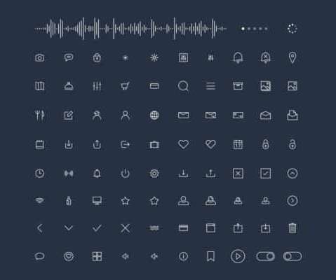


Let's personalize your content