Remove Arts and Crafts Remove Exhibition Remove Layout
article thumbnail

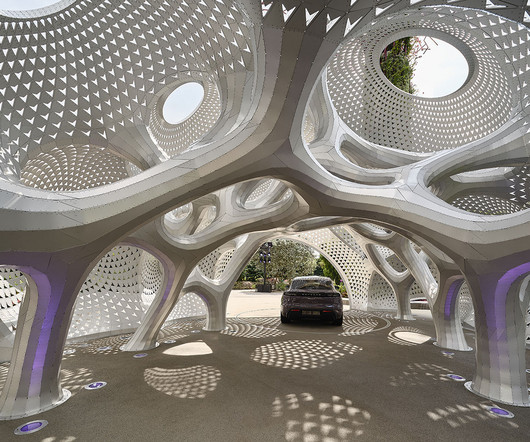
A Geometric Pavilion for Porsche Made of 6,380 Aluminum Strips

Design Milk

In an innovative fusion of art, design, and engineering, architect Marc Fornes / THEVERYMANY and Porsche created My Two Cars Garage , a geometric pavilion crafted to celebrate the debut of the all-electric Porsche Macan. This interplay invites visitors to engage with the space in different ways, depending on the time of day.

article thumbnail

Siege Magazine returns to champion a new era of artist-led collaboration

Creative Boom

When SiegeMag first appeared in 2017, it quietly disrupted the arts publishing world with a refreshing, inclusive ethos: "Artists Recommend Artists." Erratic typography, intentional spelling errors, and chaotic layouts turned the idea of an art magazine on its head. I often get asked when it's coming back."

Insiders

Sign Up for our Newsletter

This site is protected by reCAPTCHA and the Google Privacy Policy and Terms of Service apply.

article thumbnail

Art Studio Catalog Brochure Template: Elevate Your Exhibition with This Stunning InDesign Layout

We And The Color

Presenting art to the world requires a medium that reflects its depth, intention, and aesthetic quality. A well-designed catalog is not just a list of works; it is an extension of the exhibition itself, a tangible piece of the artistic narrative that viewers can take with them. What elements contributed to that experience?

article thumbnail

Download 80 Modern Geometric Poster Design Templates as Fully Editable Vector Graphics

We And The Color

Imagine having a collection of 80 professionally crafted, modern designs right at your fingertips, ready to adapt for your next project. You’ll find designs ranging from hypnotic concentric circles and sharp, rhythmic lines to complex optical art patterns that seem to shift and move. The possibilities are vast.

article thumbnail

130+ Best Condensed & Narrow Fonts of 2025

Design Shack

Its versatile design accommodates numbers, punctuation, and exhibits multilingual support, making it ideal for various designs. It is effortlessly adaptable, making it ideal for diverse projects including sports campaigns, urban branding, and modern editorial layouts.

article thumbnail

“What surrounds a brand shapes how it speaks”: designer Laura Beulens on the delicate art of building a visual identity

Its Nice That

Aware of every identity system’s context, the designer takes her research into thorough tests of a brand’s tone of voice through copy, layout and content, always with one thing in mind: “what surrounds a brand shapes how it speaks.” Hondo is a joyful convergence of minds, material and meaning 12 days ago Work Graphic Design.

article thumbnail

Typography Trends 2025: The Definitive Guide to What’s In & Out

We And The Color

These fonts feel crafted and personal. They convey warmth, vulnerability, and a sense of craft that resonates with audiences tired of corporate sameness. Anti-design embraces intentional “wrongness”—asymmetry, stretched letterforms, and jarring layouts—to create something raw and disruptive.