This site uses cookies to improve your experience. To help us insure we adhere to various privacy regulations, please select your country/region of residence. If you do not select a country, we will assume you are from the United States. Select your Cookie Settings or view our Privacy Policy and Terms of Use.
Cookie Settings
Cookies and similar technologies are used on this website for proper function of the website, for tracking performance analytics and for marketing purposes. We and some of our third-party providers may use cookie data for various purposes. Please review the cookie settings below and choose your preference.
Used for the proper function of the website
Used for monitoring website traffic and interactions
Cookie Settings
Cookies and similar technologies are used on this website for proper function of the website, for tracking performance analytics and for marketing purposes. We and some of our third-party providers may use cookie data for various purposes. Please review the cookie settings below and choose your preference.
Strictly Necessary: Used for the proper function of the website
Performance/Analytics: Used for monitoring website traffic and interactions
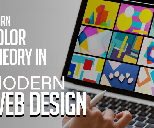
In the ever-evolving landscape of web design, colortheory remains a fundamental pillar. The judicious use of colors can significantly impact the aesthetics, usability, and overall user experience of a website. You may be interested in the following articles as well. Hue refers to the actual color itself (e.g.,
Think about saving hours searching for the perfect image or color palette. More specifically, this is where following WE AND THE COLOR’s Pinterest account can transform your creative process. WE AND THE COLOR understands the needs of creative professionals. Find us on Pinterest Why Follow WE AND THE COLOR on Pinterest?
This is a guest article written by Lauren Marie who is a graphic designer in corporate America. The basic elements of design include color, line, shape, scale, space, texture, and value and these are the fundamental pieces that make up any piece of work. Want to know how to design?
There is something intrinsically emotional about colors and color schemes , don’t you think? So how do colors entice us, change our feelings, inspire us? But sometimes, it pays to go back to basics and look at colors in this way as it brings inspiration, ideas, and clarity. Analogous Color Schemes.
Color is a powerful tool in design, and these resources can make it easier for designers to create meaningful and visually engaging projects. From palette generator to contrast checkers, theres a color tool for every need. Color is a fundamental aspect of design.
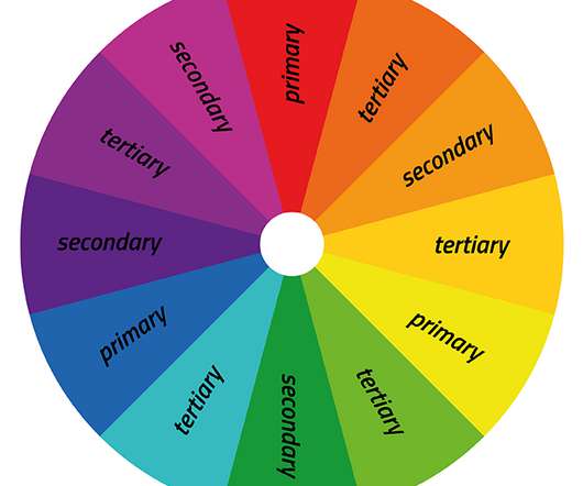
As a continuation of our inspirational examples and palette ideas for great color combinations, today we will have a look at the basics of colortheory and go beyond that. You can also review the colortheoryarticle overview below and fast-travel to the specific sections you need. The Color Wheel.
Vintage is also used in many different industries as a color palette. designed with a vintage color palette. In this case, a vintage color palette is a collection of colors that reflect a “vintage feel”. What Makes a Proper Vintage Color Palette? Vintage Color Palette Examples. Source: In Color Balance.
This article delves into the dynamic examples of websites design with amazing UI and UX , shedding light on websites that epitomize the most recent trends, thereby shaping the forthcoming landscape of online aesthetics and functionality. You may be interested in tinhe following articles as well.
In this article, we’ve compiled a selection of the best books for graphic designers in 2023. Even with the illustrations, it might seem tedious, as with many outdated writings. You know how dry old theories can be if you’ve ever taken artistic training. Sketchnote Handbook, The: the illustrated guide to visual note taking.
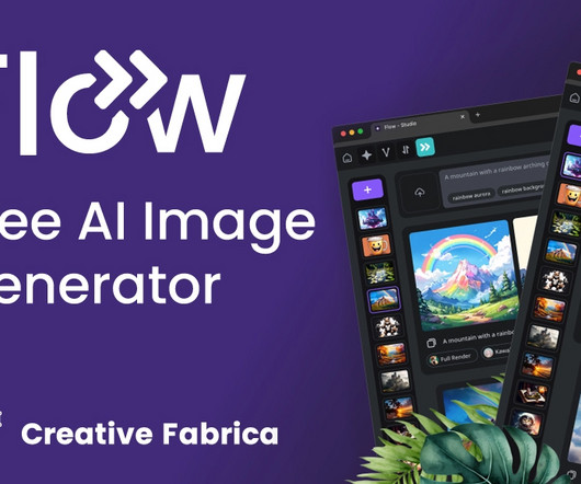
This article delves into the revolutionary features of Flow, powered by the new AI model Flux, and explores how you can Try Flux AI for free to elevate your creative projects. Users can input specific parameters, such as color schemes, styles, and themes, to tailor the generated content to their needs.
Nappy Nappy provides free stock images that showcase diversity and representation, with a focus on people of color. Iconscout Iconscout offers millions of royalty-free icons, illustrations, and stock photos for personal or commercial use. Free Color Tools: 24. Free Mockup Tools: 30. Free Graphic Design Courses: 35.
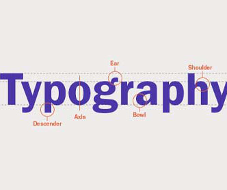
This article touches on misused terms and explains some important typesetting terminology. How to Use Color Fonts on the Web. Looking to use more than one solid color in your next web design project? This tutorial shows you how to use different colors per glyph, which will give you a fun result. Typography. Visit Lesson.
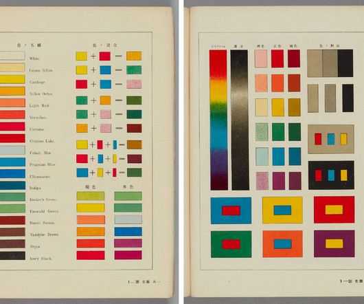
Images courtesy of the National Institute for Educational Policy Research Color printing techniques have been used for centuries in Japan, from monochrome prints that were hand-colored to nishiki-e , or “brocade pictures,” in which a number of woodblocks forming separate parts of the image could be printed using different hues.
Here are some basic theories that help designers and visual communicators organize information and create eye-catching logos, brand images, and overall great designs. ColorTheory. This theory also applies to branding. Many companies base the color of their logo on the meaning or value each color has.
You may be interested in the following related articles as well. You can change the colors, fonts, and layout of your theme, and you can even add your own custom content. This theme has a slider for featured posts, a hidden sidebar for widgets, and the ability to switch between fonts and color styles.
To know how to accurately combine colors is a critical skill that artists, designers, marketers, and brand owners spend years learning and mastering. The perfect examples that just click with you, vibe on the same frequency with you and you know this is the right combination of colors just by seeing it. Article overview: 1.
In previous articles, I’ve written about the lessons to be learned from newspapers and from ancient Roman architects. Let’s start with the most basic aspect — color. We process the colors and arrangement of a website before we have time to process its content. Well, a little more than ‘use bright colors,’ I’m afraid.
Visual Design Theory – Understanding colortheory, the basics of composition, and how to use typography among other things are all necessary for designing visually appealing websites. Adobe Creative Suite – Adobe XD (Figma alternative), Photoshop and Illustrator (graphic design), etc.
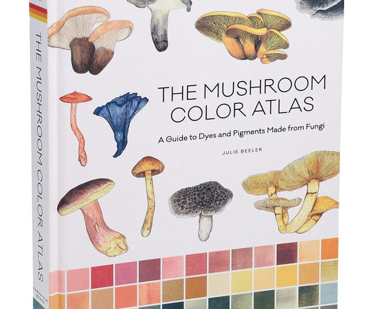
Beeler’s new book, The Mushroom Color Atlas: A Guide to Dyes and Pigments Made From Fungi, dives into the chromatic world of mushrooms. The author has collected 500 swatches to illustrate the phenomenal range of natural colors that can be made from different varieties.
Abstract illustration using shade colors A brief start about color We consume red strawberries and wait for the white ones to mature. Colors give meaning to our context. Colors help us take better decisions. Red pigment Our conscience already developed awareness about colors.
But, there are some things that you can’t just find in blog articles and forums. There are so many great books written by experienced designers, and we’ll try to go through a few of them in this article. Interaction of Color by Josef Albers. Josef Albert’s Interaction of Color is thoroughly used in art education.
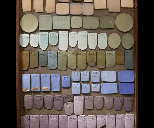
Its matte, “biscuit” finish came in a variety of colors, but most popular was a strikingly pale blueknown as Wedgwood bluedecorated with white, cameo-like reliefs. The article Thousands of Josiah Wedgwood’s Glazed Ceramic Samples Paved the Way for 18th-Century Ingenuity appeared first on Colossal.
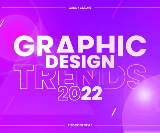
Candy colors. This trend is very adaptable to all formats from illustrations and animation, to web design and typography. Design Collaboration Illustration by tubik.arts. Creative Break Illustration by tubik.arts. 3D Illustration for Altrüus Gifting App by Igor Pavlinski. CANDY COLORS. 2D/3D Mashup.
If you would like to learn and study graphic design from the ground up, then this article lists some great resources that will get you started. 50 Totally Free Lessons in Graphic Design Theory. Color, Texture, and Imagery. It's important to understand the basics of colortheory and get a feel for how to work with colors.
From typography to layout, right through to color and special effects, this list runs through a few basic rules, tips, tricks and guides to some common errors and how to banish them from your design. You can learn more about kerning through this article, A beginner’s guide to kerning like a designer. Don’t forget to kern.
In this article, I want to share ten tips that helped me grow and become a better designer, and I hope these tips will also help you while you’re trying to find more solid ground under your feet. In this first part of the article, we’ll start with the first five tips , and the rest will continue into the second part. Show it off.
color palettes. illustrations. We all want to design better and inclusive experiences, but sometimes we might be forgetting about just the right color contrast, or a proper tab order. Meet Geenes , a reliable and sophisticated tool that allows you to create, maintain, sync and test color palettes and their variations.
This article looks at what a visual identity is, why it’s important for your brand, and how to build one that’s memorable and unique. A brand’s visual identity is a combination of graphic elements that represent and identify it, including its logo, color palette, typography, imagery, and other design elements.
For example, minimalism can communicate simple sophistication and class, vivid colors communicate fun, geometric shapes can be taken as vintage and neutral colors communicate professionalism. Notice that most fast food chains use a combination of the bright colors yellow, red and orange. Graphical Interior Design Logo.
Connection Infographics by Andrew_Kras All visual content, in theory, is information. For example, color, line, shape—the elements of art and principles of design are very informational by nature. It's a good way to establish hierarchy early on and put ideas around the canvas for illustrations, icons etc. Know your tools.
For example, a designer can use 50s design elements such as fonts and mid-century illustration to give something a 50s art style or retro graphic design, and combine this with aged textures to give the impression of ageing. You might guess the age of a print with slightly more pixelation and a duller color as being of the 1950s or 1960s.
In this article, we’ll discuss seven key steps on how to become a successful graphic designer with no experience. From colortheory and typography to layout and composition, mastering these fundamentals will help you to create visually compelling and effective designs that stand out from the crowd.
On the other hand, contrast is a method to create emphasis within a design for impact, which can be seen in color choices, scale, or making specific text bold thereby creating a central focal point. Step 5: Study the Fundamentals of ColorColor affects the mood and personality of a design.
Designers and illustrators will appreciate the service since the subscription includes the "Graphics" section, where you can find PSD sources, logo templates, illustrations, and even infographic elements. The illustration is made by designer brand Solis and Lunae illustrators and designers. Creative pricing plan ($5.75/month
Right below this brief introduction, you will find a collection of icons, illustrations , and fonts for your holiday emails. Follow the principles of colortheory, proportions, and other features that make the result of graphic design successful when you create your icons. Illustrations. Santa’s Sleigh Illustration Set.
In this article, I'll tell you all about it! In this article, we take a look at the different types of graphic design and the results of all these graphic design genres. By using typography, color, form, imagery, and organization, we can achieve clear and effective communication. Adobe Illustrator. Packaging Design.
In this article, we have gathered 30 design examples with an outstanding user experience , which can serve as a guiding light and inspire you to the bones. A beautiful feminine color palette, indicating the target audience. It’s very interactive, full of infographics, and it has plenty of high-quality images and illustrations.
From insightful articles to practical tutorials, these blogs are your gateway to the latest industry insights, expert advice, and creative inspiration. Helpful Tutorials Web Designer Hub not only showcases articles but also provides pragmatic tutorials that assist readers in executing diverse design techniques and approaches.
They often represent data in different colors for different characteristics in each region. They use a series of bars that illustrate data development. Use Colors to Your Advantage. In every form of visualization, colors are your best friend and most powerful tool. Even here, colortheory is important.
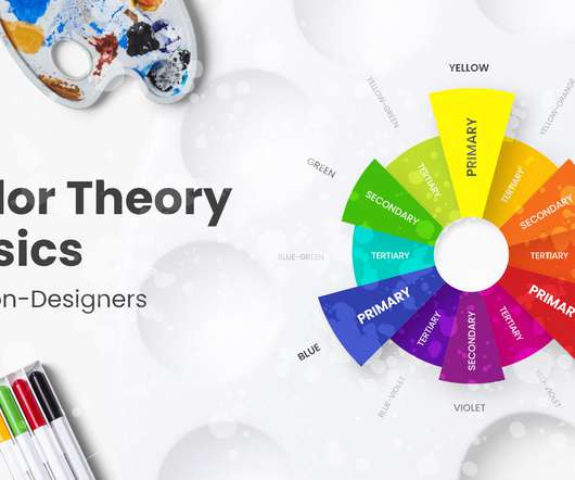
– Colors Terms. It is not necessarily white and can be a repeated pattern or a colored background. Colors Terms. Color Wheel. Colors Terms. Color Wheel. A color wheel is a visualization of the color spectrum fitted into a circle. Hue is a pure color. Analogous Colors.
When you’ve brushed up on the modern graphic design trends, put your ideas into action with on-trend templates, graphics, and illustrations from Envato Elements. VR Isometric Illustration. For print and graphic design, metaverse styling can be achieved with tech-surrealist photography, neon color palettes, and glitch effects.
Applying Visual Hierarchy in Design Theory Hierarchy and Graphic Design Fundamentals What Is Visual Hierarchy in Illustration? The hierarchy of this article, for instance, can be represented as a tree where each branch is a section of content. The hierarchy of content in the article visualized 2. What Is Visual Hierarchy?
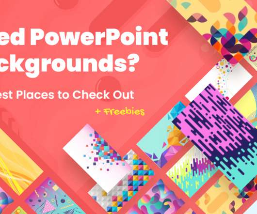
In this article: 1. Freepik’s filters (photos, colors, style, etc.) Free source website Pixabay shares nearly 2 million photos, illustrations, vector graphics, film footage, and music. A really cool feature is each image has color variations, so you can keep a theme but differentiate key slides, areas, or show progress.
We organize all of the trending information in your field so you don't have to. Join 66,000+ users and stay up to date on the latest articles your peers are reading.
You know about us, now we want to get to know you!
Let's personalize your content
Let's get even more personalized
We recognize your account from another site in our network, please click 'Send Email' below to continue with verifying your account and setting a password.


Let's personalize your content