This site uses cookies to improve your experience. To help us insure we adhere to various privacy regulations, please select your country/region of residence. If you do not select a country, we will assume you are from the United States. Select your Cookie Settings or view our Privacy Policy and Terms of Use.
Cookie Settings
Cookies and similar technologies are used on this website for proper function of the website, for tracking performance analytics and for marketing purposes. We and some of our third-party providers may use cookie data for various purposes. Please review the cookie settings below and choose your preference.
Used for the proper function of the website
Used for monitoring website traffic and interactions
Cookie Settings
Cookies and similar technologies are used on this website for proper function of the website, for tracking performance analytics and for marketing purposes. We and some of our third-party providers may use cookie data for various purposes. Please review the cookie settings below and choose your preference.
Strictly Necessary: Used for the proper function of the website
Performance/Analytics: Used for monitoring website traffic and interactions
Take this Online Course by Pietari Posti of Studio Posti and Discover the Secrets to Colorful Vector Illustrations in Adobe Illustrator. With their bold colors and flawlessly clean lines, dont you think vector illustrations are fascinating, too? His work beautifully showcases the power of color and composition.
Also, black with white or any other color creates an obvious, striking contrast that attracts more attention. Third, experiment and see which colors really make the color work and go well with black. Moreover, the black color impacts both visually and emotionally.
Creating a logo is so much more than just throwing shapes, colors and fonts together to look nice. While you may think specific fonts or colors look good, your customers or potential customers may not feel the same way. When working on your logo designs , create different color variations and orientations.
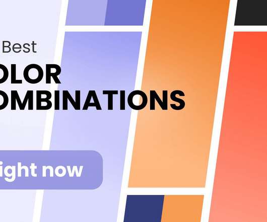
Browse our color combinations to step up your creative game and reap the rewards. Knowing what colors go together is a skill in itself and it can have a positive impact on all areas of your life. Once you gain an understanding of what different colors mean and the theory of color , you’ll see how they can influence perceptions.
Have you ever been captivated by a visually stunning piece of art, design, or even a simple advertisement? The magic behind that impact often lies in the strategic use of color. Colortheory is the science and art of using colors effectively to communicate ideas, evoke emotions, and create harmony in visual compositions.
Visual advertisement, posters, and images can be traced back to ancient marketplaces, from the Greek agora to Persian bazaars. Here are some basic theories that help designers and visual communicators organize information and create eye-catching logos, brand images, and overall great designs. ColorTheory.
Neural Aesthetics explores the collaborative synergy between human creativity and artificial intelligence, while the Quantum Color Palette takes us beyond the conventional spectrum. A Shift in Advertising Paradigm This trend marks a significant shift in the advertising paradigm.
The AI understands colortheory, composition, and artistic styles, ensuring that the images it produces are both aesthetically pleasing and aligned with the user’s vision. Users can input specific parameters, such as color schemes, styles, and themes, to tailor the generated content to their needs.
By utilizing a wide range of colors and fonts can make that design more appealing to site visitors and increase its overall effectiveness. A wide variety of educational opportunities are available to study web design theory. This includes things like colortheory, grid systems, and proportions, among other things.
In advertising, guide the audience to the main object or product you want to sell. Color immediately stands out in any design. Depending on the type or shade, you can use colors to emphasize elements or evoke certain feelings. Choosing the right colors is crucial when you’re trying to tell a story with your design.
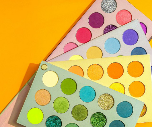
To know how to accurately combine colors is a critical skill that artists, designers, marketers, and brand owners spend years learning and mastering. The perfect examples that just click with you, vibe on the same frequency with you and you know this is the right combination of colors just by seeing it. Colors also have a temperature.
Included in the kit from Lisa Glanz is a smorgasbord of content that you can use including logo templates, branding boards, decorative elements, and additional color themes for both Photoshop and Illustrator. Created by The Darumo Shop, the set is perfect for any poster design or print advertising.
From typography to layout, right through to color and special effects, this list runs through a few basic rules, tips, tricks and guides to some common errors and how to banish them from your design. So, the more important elements are made to hold the most attention through scale, color, type etc. Have a logical color palette.
A brand’s visual identity is a combination of graphic elements that represent and identify it, including its logo, color palette, typography, imagery, and other design elements. When customers see your logo or colors, they should be able to recognize and identify your brand immediately. What is a Visual Identity?
The industry thrives upon designers who can deliver a range of creative content in the arenas of advertising, book design, magazine design, information maps, typography and beyond. But the industry typically doesn’t award major advertising and creativity contracts on a lark! But how do you enter this vibrant profession?
My career has been a series of lucky strikes (although I do believe you make your own luck, however, this is a topic for another article) where I’ve gone into places to find positions that are not traditional , discovering jobs that are either poorly applied for, or poorly advertised; or both, to be honest. Why is this important?
On the other hand, contrast is a method to create emphasis within a design for impact, which can be seen in color choices, scale, or making specific text bold thereby creating a central focal point. Typography gives character to a brand and is crucial to all communications, from magazine copy to advertisements and logos.
50 Totally Free Lessons in Graphic Design Theory. Color, Texture, and Imagery. It's important to understand the basics of colortheory and get a feel for how to work with colors. Color can make areas of a design pop off the page or recede into the background. Advanced ColorTheory: What Is Color Management?
But digital design is an umbrella term which includes all sorts of work like advertising banners, website layouts, motion graphics and of course icon design. Icons with different shades or colors may be filled without repercussion. Color Matching. Another huge aspect to icon design is the color scheme. Finding Your Style.
By using typography, color, form, imagery, and organization, we can achieve clear and effective communication. Developing color palettes, choosing the type of images to use, typographic choices, stationery, and other graphic elements will help a brand communicate its personality. . Types of Graphic Design: Marketing and Advertising.
Good graphic designers are needed in many industries, from advertising and marketing to publishing, web design or even video game development. Advertising & Marketing In advertising and marketing alone, graphic designers can play many roles. Why study graphic design? You may ask. The reasons, my friend, are countless.
You might guess the age of a print with slightly more pixelation and a duller color as being of the 1950s or 1960s. Letterpress is one of the oldest printing techniques, using a method of relief printing to create an engraved color effect. Cogs, metallic textures, and rich colors help to bring a touch of steampunk to any design.
In just two years of full-time study, you'll gain a foundation in essential skills like: Digital illustration & photo editing Page layout principles Typography Colortheory Print and digital design processes You get exposure to the graphic design basics at the associate's level.
For print and graphic design, metaverse styling can be achieved with tech-surrealist photography, neon color palettes, and glitch effects. Blasto Distort advertising font. Next year is all about one unashamedly brash and flash color. We'll look ahead to the style, color, and fonts we'll see in trendy logo designs this year.
Limit it to 2-3 colors max. To illustrate, instead of a generic bullet like “Created print advertisements,” use something like: “Created five award-winning print ad campaigns that increased consumer engagement by 20%.” Avoid weird fonts that are difficult to read. Use negative space strategically.
” In this age of social media, consumers are surrounded by advertisements. That right there is what makes an excellent logo design genuinely great. Why Uniqueness Matters “In a world of similarities, difference is the game changer.” The solution to this problem is distinctiveness.
The digital transformation is setting a new standard, with hyperrealistic graphics meeting the simplicity of minimalism, while dark mode and colorful gradients create impactful, high-contrast visuals. For instance, AI can quickly adjust layouts, select color palettes, or even generate typography variations that align with a brand’s tone.
There’s also critical theory seminars, internships, international design study tours and a senior thesis. USC also aims to create well rounded designers, so all students on the Design BFA have to complete modles in a complementary field such as business, marketing or advertising. California State Polytechnic University Pomona.
such as typography, images, symbols, and colors?—?to Dwiggins in the 1920s, who wanted to describe the emerging profession that utilizes images, colors and typography to establish visual communication (2). Credit: Wired magazine, wired.com The tech industry quickly gained an ambition to snatch graphic designers from advertising.
He scuttled his plans to attend a traditional college, and enrolled at the portfolio-focused Spectrum Institute for the Advertising Arts. Jacobus had deferred to colortheory and utilized a more saturated palette to take the edge off. Once I saw what he was doing, I was like, “yeah—that’s what I want to do.”
Combining colors has always been a critical skill for graphic designers which requires years of learning and mastering. Aside from the basics of colortheory , however, a big part of finding the right color combinations is getting the right inspiration. 8 Color Combination Trends in 2022: Trend 1: Pink and Green.
Made for big projects such as movie posters, advertising or editorials, Crossfit is a powerful headline font family consisting of 9 unique styles. Plus, this deal includes 100+ vector graphics to enhance your designs. $9 9 instead of $470 – Get it now ! Big, Bold Headline Font Crossfit with 9 Styles.
Color Selection Matters. Again, this seems a bit obvious, but you shouldn’t use the same colors for a poster about events based in the forest or for one about corporate services or products. If you are not familiar with colortheory, take some time and educate yourself about the topic. Make It Readable. Conclusion.
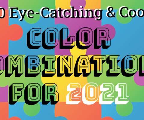
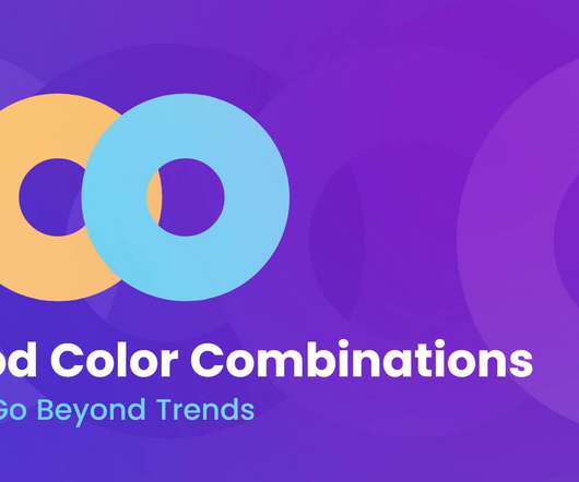
When it comes to design, finding the perfect color combination can be your winning secret to having an eye-catching creation. The truth is, color makes a design come alive. But without any design inspiration or design principles to follow, it can be hard to come up with a winning color combination from scratch.
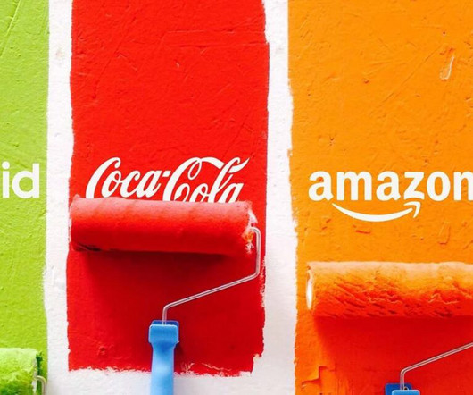
To create an effective and long-lasting relationship with your prospects, you need to use the right colors. 85% of shoppers place color as a primary reason for why they buy a particular product. Besides, color increases brand recognition by 80%. If not, is there any other color you would like to experiment with.
He mastered colortheory and pigments and painting technique, and for years his full color paintings were in high demand from the top magazines and advertisers in America. Austin Briggs studied hard to become a full fledged painter.
In the world of photography, the color image has long held an inferior reputation to black-and-white, which connoisseurs historically deemed to be more dignified. Today, vibrant images are embraced in a wide range of fields, from fine art and fashion to advertising and journalism. Martin Parr, “Common Sense.”
We organize all of the trending information in your field so you don't have to. Join 66,000+ users and stay up to date on the latest articles your peers are reading.
You know about us, now we want to get to know you!
Let's personalize your content
Let's get even more personalized
We recognize your account from another site in our network, please click 'Send Email' below to continue with verifying your account and setting a password.


Let's personalize your content