Remove 2001 Remove Presentation Remove Print Remove Production
article thumbnail

I ?? NY

Fonts in Use

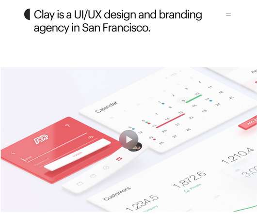
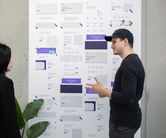
“I ❤️ NY” presentation board, two-line version, 1976, as archived in the MoMA collection. “I ❤️ NY” presentation board, one-line version, 1976, as archived in the MoMA collection. The logo can be seen on a range of merchandise products, from mugs and stickers to bags.

article thumbnail

Design inspiration: our favourite projects from November

Design Week

Liverpool-based studio Dorothy has designed a new print which takes inspiration from 35 of the most loved albums from the last 60 years (from British, North American and European bands). The studio has also designed a poster for Liverpool museum British Music Experience featuring only British bands, from 1950s pop to the present day.

Insiders

Sign Up for our Newsletter

This site is protected by reCAPTCHA and the Google Privacy Policy and Terms of Service apply.

article thumbnail

Design inspiration: our favourite projects from November

Design Week

Liverpool-based studio Dorothy has designed a new print which takes inspiration from 35 of the most loved albums from the last 60 years (from British, North American and European bands). The studio has also designed a poster for Liverpool museum British Music Experience featuring only British bands, from 1950s pop to the present day.

article thumbnail

Sega logo (1976–present)

Fonts in Use

That said, the tint and hue varies due to the constraints of screen displays or printing — or simply a failure to follow the corporate style guidelines. Source: [link] Image derived from PS2 Press Information September 2001, Sega_Logo_Guidelines.tif as republished on Sega Retro. License: All Rights Reserved.

article thumbnail

The 24 Most Professional Fonts to Use

Inkbot Design

The fluid serifs and sturdy letterforms allow Times New Roman to be readable in print. Jones is often preferred for clarity on screens and modern printing presses. The condensed proportions occupy less real estate, allowing more content presentation. Product Sans is the primary Google font applied in branding and communications.

Fonts 76
article thumbnail

90s Graphic Design: A Trip Back in Time to Millennial Land

Creative Market

In this ad from 1996, the use of comical and casual typography is again present. The presentation of the ad also emphasizes the use of bright colors, which makes sense for a kid’s toy. From the leopard print on Lisa Turtle’s skirt to the diamond patterns on Screech’s shirt, the still is a study in visual texture. Guess Jeans.

article thumbnail

How to Make the Best Magazine Cover Design (& Learn the Anatomy of a Magazine Cover)

Tuts Plus

Price and Bar Code Bar codes are taken care of by the printing house, but you do have to make sure to leave room for them. Product Mockup. Iconic Magazine Covers Print may be almost dead, but magazine covers are still very relevant. Print Design. Create a Magazine Mockup Using InDesign and Photoshop. Mohammad Jeprie.