This site uses cookies to improve your experience. To help us insure we adhere to various privacy regulations, please select your country/region of residence. If you do not select a country, we will assume you are from the United States. Select your Cookie Settings or view our Privacy Policy and Terms of Use.
Cookie Settings
Cookies and similar technologies are used on this website for proper function of the website, for tracking performance analytics and for marketing purposes. We and some of our third-party providers may use cookie data for various purposes. Please review the cookie settings below and choose your preference.
Used for the proper function of the website
Used for monitoring website traffic and interactions
Cookie Settings
Cookies and similar technologies are used on this website for proper function of the website, for tracking performance analytics and for marketing purposes. We and some of our third-party providers may use cookie data for various purposes. Please review the cookie settings below and choose your preference.
Strictly Necessary: Used for the proper function of the website
Performance/Analytics: Used for monitoring website traffic and interactions
Introduction By way of preparation, you should already be comfortable using Layers and know how to Install Photoshop Brushes and how to Rotate them since a good deal of the heavy lifting in this lesson will be done with layers and multiple brushes. **Special Thanks to Jillian Clark at 100LayerCake.com for permission to base this […].
The Hamilton Manufacturing Co. traces its roots back to the very first wood types made in the United States. Darius Wells produced the first American wood type in 1828; his business was reorganized into Wells & Webb, then acquired by William Page, later passing back to the Wells family, and finally sold to Hamilton sometime before 1880. The product of this consolidation was a type specimen book issued in 1900, Hamilton’s Catalogue No. 14, which offers a good survey of American display
Here's how it goes: There are details that hum and details that sing. There are details that accumulate like silt when the artist isn't paying enough attention, and smother the picture. Then there are details where artists with impeccable technique find refuge from larger questions of meaning and purpose. Wrightson There are details that are diamantiferous.
Most graphic designers choose the fonts that best fit their projects. Brian Hennings does the opposite: he chooses the projects that best fit the fonts. A resident designer at Hoefler&Co, Brian shares with me the responsibility of creating all of the sample art you’ll find on this site. His is a strange universe of the fictitious: signage programs for mythical cities, book jackets for unwritten novels, product literature for items you cannot buy, broadcast graphics for live sporting ev
Speaker: Amber Asay, Creative Director and Founder of award-winning design studio Nice People
Understanding what trends are happening and how they’re impacting the competitive landscape is crucial to providing top dollar design strategy to your clients. With so many trends coming and going, it can be overwhelming to determine which ones you should capitalize on and which ones might not be worth the trouble. In this exclusive webinar with Amber Asay, we’ll explore graphic design trends that need to die, trends that are starting to pick up and why, trends that have come and gone, and how t
It is 1953, and you are a graduate student at the Yale University School of Art. Alvin Eisenman has just established a new discipline called “graphic arts,” in which you are studying — under the legendary Josef Albers, Herbert Matter, and Alvin Lustig — a new approach to design, which will come to be known as Modernism. Five years from now, the world will witness the birth of Helvetica and Univers, typographic milestones that will forever affirm the ascendancy of the Swis
Twenty years ago, John Downer and I were introduced by a mutual friend. He’d introduced us as “type designers,” a flattering description of my professional achievements to date (I was a recent refugee from graphic design), and a somewhat elliptic summary of John’s credentials. Whether or not he was intentionally vague, I’ll never know, but it set me up for a very entertaining afternoon.
This morning’s post by the always-fertile Grain Edit reminds me that I’ve wanted to write something in appreciation of Mark Weaver. As with so many things I like, Weaver’s work is difficult to classify: design? illustration? art? The term “collage” might do as a formal description, but it’s a shabby word to describe Weaver’s mysterious inventions, which so successfully bypass both the senses and the intellect and go straight to the mid-brain.
This morning’s post by the always-fertile Grain Edit reminds me that I’ve wanted to write something in appreciation of Mark Weaver. As with so many things I like, Weaver’s work is difficult to classify: design? illustration? art? The term “collage” might do as a formal description, but it’s a shabby word to describe Weaver’s mysterious inventions, which so successfully bypass both the senses and the intellect and go straight to the mid-brain.
Changing fashions in movie titles are one of the richest veins in typography’s fossil record. On his website, graphic designer Christian Annyas has put together a nice collection of movie title stills — both opening and end credits — offering a handy synopsis of twentieth century lettering. Rather than an exhaustive survey, Annyas has curated a small and personal collection that’s conveniently organized by decade: dipping into any period offers a convenient way of getting
“Designers…” I knew I wanted to work with type by the time I turned eleven. Back then, my curiosity about letter-making could only be satisfied in oblique and solitary ways, most of which involved borrowed sheets of Presstype, and goofing off with the family typewriter. The Mac couldn’t have come soon enough. Young typophiles today have more outlets for their enthusiasm (you are here), but next Monday will gain rare access to the profession as well: National Design Week b
Manhattan’s urban grid is a vaunted model of simplicity, a rectilinear plan of numbered streets intersecting numbered avenues. Never mind that West 4th Street crosses West 10th, that those walking from Fifth Avenue to Third Avenue will seldom encounter Fourth Avenue, and that “North” in the New York sense differs from conventional “North” to the tune of 29° It’s this kind of accuracy, transparency and accountability that makes New York the perfect home fo
Introduction Each downloadable file below contains a simplified.psd with an empty layer for you to paste your photo into along with fully editable text layers (fonts included in the download). Simply paste your photo into the designated area, adjust the text as desired and save the file as a.jpg or.tiff. These are […].
Brands must create and share impactful content to thrive, but they have less people, tighter budgets, and fewer resources to do so. Learn how to publish and market digital content with the same professionalism as organizations with million-dollar budgets.
Continuing its celebration of the tenth anniversary of the National Design Awards, The Cooper-Hewitt National Design Museum is offering a wealth of excellent programming this season. On display through April 4, 2010 is Design USA: Contemporary Innovation; if you’re planning a visit soon, make it next Tuesday evening, when you can also attend Thinking in Type , a lecture by Jonathan Hoefler and Tobias Frere-Jones.
Continuing its celebration of the tenth anniversary of the National Design Awards, The Cooper-Hewitt National Design Museum is offering a wealth of excellent programming this season. On display through April 4, 2010 is Design USA: Contemporary Innovation; if you’re planning a visit soon, make it next Tuesday evening, when you can also attend Thinking in Type , a lecture by Jonathan Hoefler and Tobias Frere-Jones.
An enchanting bit of Gotham seen en route to ATypI Mexico: timbered lettering, on the storefront for Guru, a gallery and design emporium in Cuauhtémoc owned by graphic designer Quique Ollervides. Thanks for sharing this, Nick! —JH.
Leonardo da Vinci might have made scientific studies of the vascular system and designed the steam cannon, but today he’s best remembered as the painter of the Mona Lisa. Some identify Johann Sebastian Bach with his concerti, cantatas, and brilliant fantasias for the keyboard, but most know him only as the tunesmith behind that staple of afternoon weddings, “Air on the G String.” It’s a cruel fate, to be remembered only for your least ambitious work, as type designers fro
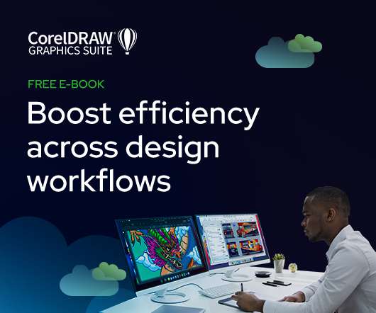
As the design industry evolves, teams are facing new challenges and a need to produce more outstanding creative work than ever. Leaders must learn how to adapt their processes to solve today’s—and tomorrow’s—unique design challenges. In this e-book, you’ll learn how to establish your creative workflow and leverage the power of CorelDRAW® Graphics Suite to streamline the entire design process, from start to finish.
Since you’ll be at home tomorrow anyway, hopped up on leftover miniature chocolate bars that you couldn’t pawn off on discerning neighborhood kids, tune in to Wisconsin Public Radio to hear To the Best of Our Knowledge: tomorrow’s program will be about fonts. Join me, Tobias Frere-Jones, and Matthew Carter for an hour of typography, either on the air or online.
This afternoon, typography joins the ranks of the wonderfully obscure on Please Explain, my favorite segment of the Leonard Lopate Show : Steven Heller and I will be on hand to discuss, if not actually explain, typography. If you’re in the New York area, join us around 1:20pm EST at WNYC-FM 93.9 or AM 820, or follow the podcast at wnyc.org. —JH.
In Fast Company , Ellen Lupton writes: The graphic designer Michael Bierut, a partner working in the New York office of the firm Pentagram, designed a 21-foot sign for the new U.S.-Canada border crossing at Massena, New York. The sign, as well as the building, which was designed by architects Smith-Miller & Hawkinson, has received substantial praise as a bold and daring piece of federal design.
An optometrist’s business card, the packaging for a rubber band gun, a basketball court, a scented candle, the concrete signage markers for subtropical hiking trails: these are just a few of the marvelous projects for which designers have chosen fonts from Hoefler&Co They’re sharing their work over on our Facebook photo page , where more than 3,000 fans are currently perusing the collection.
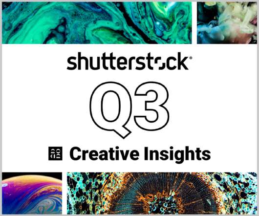
In today’s competitive markets, how do you make sure that your content not only stands out but performs well? How can you predict whether certain design choices will result in clicks, engagement, downloads, and other drivers of ROI? Shutterstock’s Creative Insights Report (Q3) is your window into the hottest trends that are transforming the creative world.
An optometrist’s business card, the packaging for a rubber band gun, a basketball court, a scented candle, the concrete signage markers for subtropical hiking trails: these are just a few of the marvelous projects for which designers have chosen fonts from Hoefler&Co They’re sharing their work over on our Facebook photo page , where more than 3,000 fans are currently perusing the collection.
I have for exactly one year been waiting to open up the monumental copy of Ornamented Types of L. J. Pouchée that we have in the office, to find the example of the delicately curlicued shamrock type that historian James Mosley attributed to an unknown punchcutter he designated “Master of the Creeping Tendril,” and to post it here. This is not that type.
Type designers are accustomed to approaching the line between homage and parody with great care. It’s especially daunting when its subject is a living colleague, as was the case last Friday when our own Tobias Frere-Jones presented an award of his own design to Wim Crouwel , winner of the 2009 Gerrit Noordzij Prize. (In keeping with the tradition , the current holder of the prize designs the award given to its next recipient.
Tobias is the fourth and current holder of the Gerrit Noordzij Prize, which was presented to him in 2006. Every few years, the Royal Academy of Art in The Hague celebrates an individual for his “unique contributions to type design, typography, and type education,” qualities which honor both the recipient and the prize’s namesake: Gerrit Noordzij, as an instructor, a designer, and a type designer, has influenced generations of typographers, and has been singularly instrumental i
Speaker: Eden Spivak, Design Expert and Editor at Wix & Nir Horesh, Accessibility Lead and Senior Product Manager at Wix
When we design products or websites for people like ourselves, there are many others who are, as a result, left out. From visually impaired users who rely on assistive technology, to people with a temporary injury such as a broken arm, tech users are forever diverse and beautifully unique. The products we design can, and should, reflect the extremely wide range of human experiences and needs.
Sophie Herbert You should turn to ink only when you are no longer afraid of commitment. If you're looking for a more casual relationship, choose a pencil because I guarantee you, ink will still be there in the morning when you wake up, and she ain't leaving after breakfast. Newer art tools, from the etch-a-sketch to its successor, the WACOM tablet, sometimes give us the impression we can make all our mistakes disappear.
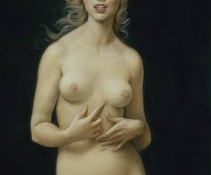
I consider Adrian Gottlieb one of the finest young figurative painters working in the classical tradition today. His timeless work speaks with a quiet authority. On the other hand, the most financially successful figurative painter working in the classical style today is John Currin: Currin lacks Gottlieb's talent, but this painting recently sold for $5,458,500-- a thousand times more than a painting by Gottlieb.
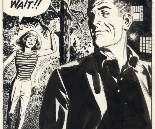
What is it? A slashing tempest? A rugged granite cliff? A rolling river? The tail plumage from a firebird? Nah, it's just the way Robert Fawcett draws the face of his friend Al Dorne: This intense little portrait (approximately 4 inches tall) is a virtuoso performance by a master draftsman. Look at the speed and facility with which Fawcett employs a dazzling array of marks on paper to channel the designs of nature.
Cosmic disturbances sometimes engulf our planet in violent magnetic storms, yet you can sit there calmly sipping your jasmine tea and munching cucumber sandwiches, oblivious to the vast drama going on around you because our senses can't detect magnetic storms. You'd have to look at a compass and see the needle going haywire to figure out that something was taking place.
This session will answer business law questions that people are asking most during the pandemic. If my business can’t pay its bills, can my creditors come after my personal assets? Do I have to pay the rent on my co-working space or office? Can my clients cancel signed contracts? Can I cancel contracts for things I no longer need because my business has slowed down?
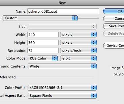
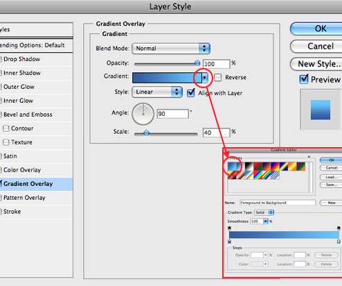
Step 1 Lets start by taking a look at the original ad below. From the start we can see that they’ve used a few basic Layer Styles like Gradient Overlay and Bevel and Emboss to do most of the work. After a little trial and error I even found the exact font used here called […].
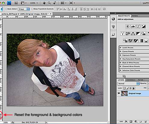
Step 1 Obviously a photo effect requires a photo. I find this effect works awesome on photos of people, so here’s a photo of this funny looking surfer I know. Step 2 With the photo open, lets first make sure our foreground and background colors are set to Black & White by pressing the D […].
Some would argue for Bleak House, others Middlemarch. The Great Gatsby has its proponents as well, along with Lolita and Heart of Darkness. But for me, it is none of these: there is a clear winner in the category, a single book that is the finest work of literature written in the English language. It is English As She Is Spoke , an 1853 phrasebook by Pedro Carolino, offered to Portuguese speakers as a guide to the English language.
Thomas Edison once said “Vision without execution is hallucination.” This statement applies not just to invention, but to graphic design. One of the greatest strengths of graphic designers is the ability to first develop a concept and then execute it to make it real. From visualization and ideation all the way through to actuation and execution, each step of this process takes skill and expertise.
We organize all of the trending information in your field so you don't have to. Join 66,000+ users and stay up to date on the latest articles your peers are reading.
You know about us, now we want to get to know you!
Let's personalize your content
Let's get even more personalized
We recognize your account from another site in our network, please click 'Send Email' below to continue with verifying your account and setting a password.


Let's personalize your content