This site uses cookies to improve your experience. To help us insure we adhere to various privacy regulations, please select your country/region of residence. If you do not select a country, we will assume you are from the United States. Select your Cookie Settings or view our Privacy Policy and Terms of Use.
Cookie Settings
Cookies and similar technologies are used on this website for proper function of the website, for tracking performance analytics and for marketing purposes. We and some of our third-party providers may use cookie data for various purposes. Please review the cookie settings below and choose your preference.
Used for the proper function of the website
Used for monitoring website traffic and interactions
Cookie Settings
Cookies and similar technologies are used on this website for proper function of the website, for tracking performance analytics and for marketing purposes. We and some of our third-party providers may use cookie data for various purposes. Please review the cookie settings below and choose your preference.
Strictly Necessary: Used for the proper function of the website
Performance/Analytics: Used for monitoring website traffic and interactions
Unlimited Downloads Over 1,500,000+ Fonts, Mockups, Freebies & Design Assets Mockups 6,131 items Fonts 5,191 items Download Now GDJ has forecasted 10 top visual trends for 2025 : [ Hide ] Table of Content Introduction to Visual Trends in 2025 Trend 1: Minimalism Meets Maximalism What is Minimalism?
Have you ever sketched an idea, designed a font, or created a piece of art and thought, “People would love this” ? Maybe you pictured it on a t-shirt, as a beautiful print hanging on a wall, or even as a digital tool used by other creatives. For type designers, the product is often the font file itself.
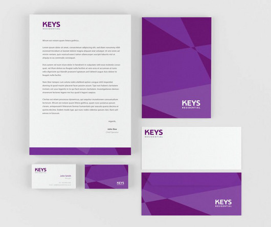
Elements of Standout Stationery Typography and Font Selection Now that you're tuned into your clients' preferences, let's pivot to the elements of standout stationery that truly capture attention. Typography and font selection. The right font can evoke feelings and set the tone, much like the opening line of a novel. The result?
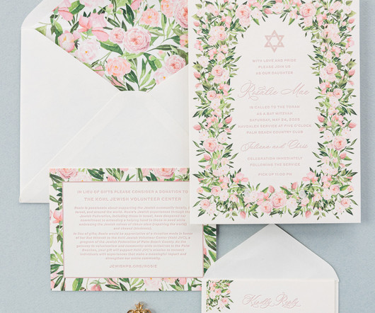
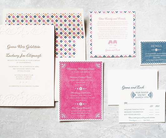
The invitation text is letterpress printed while the Star of David is digitallyprinted in the same color, Old Rose, to coordinate perfectly. The reply card features two floral motifs in opposite corners, keeping the rose theme while introducing a unique look. The same floral artwork adorns the liner.
The bold sans-serif font of the original was replaced with a refined script font, giving the invitation a more classic feel. The program stays true to the theme, but mixes things up slightly by featuring digitalprinting in vine on spruce 1-ply. The overall look is chic and perfect for the garden-themed reception.
Undoubtedly, putting up a website based on the best artist WordPress themes is the most effortless and affordable way to do that. Using the extensive possibilities of WordPress Themes for Artist s you can easily build online galleries, inform your site visitors about the latest art exhibitions and installations you partake in.
Undoubtedly, putting up a website based on the best artist WordPress themes is the most effortless and affordable way to do that. Using the extensive possibilities of WordPress Themes for Artist s you can easily build online galleries, inform your site visitors about the latest art exhibitions and installations you partake in.
Different architectural flourishes can spruce up plain square signage even without a themed topper object. Avoid bland fonts and play with different weights, styles, sizes, and positions of the type. Use stylised fonts, all caps, small caps, underline, italic, varying space between letters , etc.
These timeless typefaces aren't just aesthetically pleasing; they also convey a sense of personality and character that modern fonts often struggle to replicate. These tactile elements create a sense of luxury and craftsmanship often lacking in modern, digitally-printed materials.
By the late 1700s, publication printing was established. Printing Technology Advances Print production technologies, enabling graphic design and art innovations, transformed Japan's history. Similarly, today’s innovations in digitalprinting drive creativity. How has Japanese typography changed over time?
Print Formats Testing Some formats, like brochures or business cards, demand more thorough colour checks because what gets printed should match what was designed digitally. Printing may change colours due to ink types or even paper quality.
An example of retro cereal packaging using vintage illustrations and fonts. Incorporating nostalgic fonts and typography Chunky, whimsical fonts that mimic sign painting or old typewriter print evoke nostalgia. Certain font styles tie to previous eras through their unique shapes, weights, and finishing.
Some die-cut shape ideas include: Product or company logo Simple geometric shapes – circles, triangles, stars Holiday-themed silhouettes like a Christmas tree, dreidel, or witch's hat Whimsical shapes like animals, flowers, hearts The dimensional aspect of a die-cut envelope makes it tactile and visually appealing.
Why Fonts Matter by Sarah Hyndman. Fonts have different personalities that can create trust, mistrust, give you confidence, make things seem easier to do or make a product taste better. The book offers the reader techniques to develop new forms, fonts, logos and patterns dealing with every designer’s best friend—the grid.
Why Fonts Matter by Sarah Hyndman. Fonts have different personalities that can create trust, mistrust, give you confidence, make things seem easier to do or make a product taste better. Mark van Wageningen uses wood-type printing to create award-winning multicoloured typefaces. Buy the book. Buy the book. Buy the book.
The insert cards also carried the theme from the invitation, but with unique accents of their own to set them apart. The digitallyprinted envelope liner tied all the colors of the suite together. They used blind deboss accents on the top and the bottom of the design to create a subtle, yet whimsical impact.
The glimmer of the foil, particularly the prism shine foil, perfectly complements the cosmic theme. The night sky artwork of the party card is digitallyprinted, allowing for stunning colors and a high level of detail. This artwork is also creatively used to fill in the block text on the cover of the pocketfold. flat, 6.56
Our Lincoln die cut, coupled with the script font, further elevates the look and sets the tone for a lavish affair. 2 are perfect for a garden-themed wedding. 2 are perfect for a garden-themed wedding. 2 are perfect for a garden-themed wedding. 2 save the date added dimension. 2 has a tropical flair.
We organize all of the trending information in your field so you don't have to. Join 66,000+ users and stay up to date on the latest articles your peers are reading.
You know about us, now we want to get to know you!
Let's personalize your content
Let's get even more personalized
We recognize your account from another site in our network, please click 'Send Email' below to continue with verifying your account and setting a password.


Let's personalize your content