Remove bw-gradual
article thumbnail

Norsk Etikett Branding by Studio Oker

We And The Color

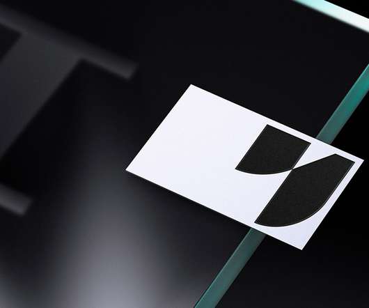
Both logo and corporate font (Bw Gradual) are based on contrasting soft and hard elements, giving the design its distinctive style. Studio Oker came up with a visual experience that has a timeless look drawing inspiration from labels in motion—being printed, cut, or pasted on a product. Below you can see a few images.

Brand 145
article thumbnail

Reviewed: New Logo and Identity for Regent's Place by DixonBaxi

Under Consideration / Brand

The wordmark, typeset in BW Gradual , is an interesting complement that adds a touch of urban edginess to the monogram -- I wonder if the notches in the letters should have been rounded at the corners to make it more cohesive with the monogram.

Insiders

Sign Up for our Newsletter

This site is protected by reCAPTCHA and the Google Privacy Policy and Terms of Service apply.

Trending Sources

article thumbnail

Wavemaker’s rebrand is designed to “provoke positively”

Design Week

Wavemaker is now written out in full for the wordmark, in a slightly altered version of BW Gradual Extra Bold (from Branding with Type foundry). The orange tone is most notable in a circle which replaces part of the r in the wordmark. These (intentionally) resemble dominoes and sets up imagery used throughout the identity.

article thumbnail

Revitalized Branding: Rockwear's New Visual Identity Journey

Abduzeedo

A notable aspect of the redesign is the new wordmark, utilizing the BW Gradual Regular typeface. The new design features cleaner lines and a vibrant color palette, achieving a balance between minimalism and playful character. The result is a visual representation that conveys both strength and approachability.

Brand 57
article thumbnail

Noted: New Logo and Identity for Wavemaker by NB

Under Consideration / Brand

The new logo is typeset in what looks like BW Gradual (which also made an appearance earlier this week ) and while it may be seem like a slightly gratuitous choice I like how a) it avoids any wavy treatments and b) sets up the domino-like objects that make up the identity through the thick slabs in the “W” and “M”.

Media 84
article thumbnail

Village Montréal

Typewolf

Fonts: Lydia , Maison Neue , Bw Gradual , Neue World , Gascogne , Media Sans , Begum

Fonts 85
article thumbnail

BERA

ID Identity Design

We used BW Gradual to create a customised wordmark, choosing the font for its pure shapes and fast curves which lent themselves to a “Star” like effect. More from How&How.

Patterns 113