This site uses cookies to improve your experience. To help us insure we adhere to various privacy regulations, please select your country/region of residence. If you do not select a country, we will assume you are from the United States. Select your Cookie Settings or view our Privacy Policy and Terms of Use.
Cookie Settings
Cookies and similar technologies are used on this website for proper function of the website, for tracking performance analytics and for marketing purposes. We and some of our third-party providers may use cookie data for various purposes. Please review the cookie settings below and choose your preference.
Used for the proper function of the website
Used for monitoring website traffic and interactions
Cookie Settings
Cookies and similar technologies are used on this website for proper function of the website, for tracking performance analytics and for marketing purposes. We and some of our third-party providers may use cookie data for various purposes. Please review the cookie settings below and choose your preference.
Strictly Necessary: Used for the proper function of the website
Performance/Analytics: Used for monitoring website traffic and interactions
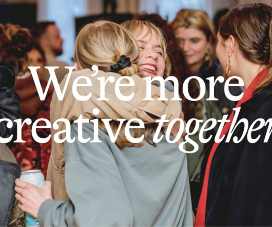
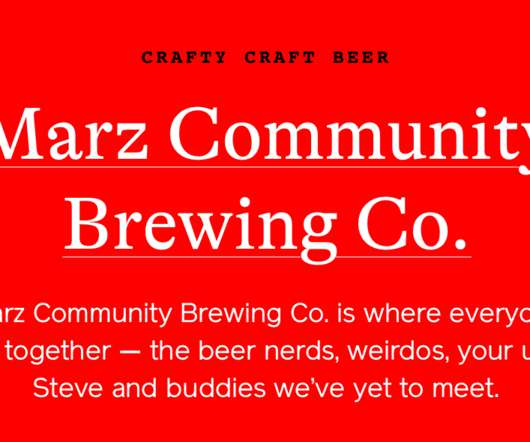
Visual elements Fiasco's visual identity pairs the serif GTAlpina with the sans-serif Nacelle , to give the designs a nostalgic tinge whilst still feeling fresh and current. As Nathalie says: "members don't just use the space: they shape it."
H2 Evoking Mother Nature For the brand typography, Scorpion Rose Studio opted for GTAlpina by Grilli Type paired with Poppins by Google. The combination of this beautiful serif with personality and the geometric sans-serif perfectly represents the whole brand.
A nod to the fonts, Vinila by @plaudesign and GTAlpina Fine by @grillytype, for adding depth and character to the designs. Behind this transformative journey were the creative minds of Florian Cornut, who led the direction, supported by Brand Director Byron Regej and Creative Talent Director Casey Leigh Jordan.
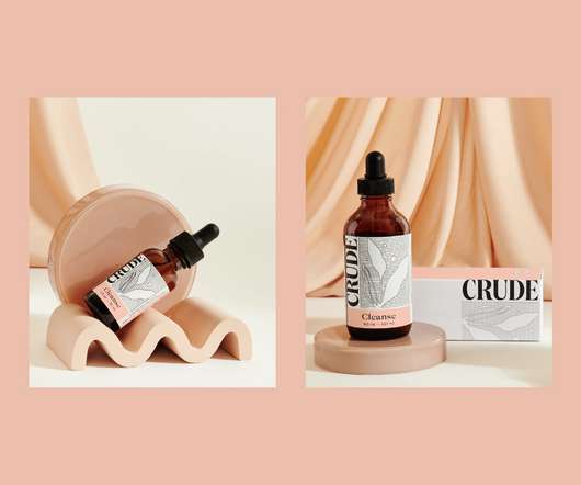
They paired the bold and expressive typography of GTAlpina (primary typeface) and the structured grotesque GT America (secondary typeface) with the condensed and curvaceous Domain Display (CRUDE’s new logo). Typography plays a key role is communicating CRUDE’s edgy, playful, and straight-forward tone of voice.
They are paired with GTAlpina in italics which “barges into that harmony”, the designer explains. The typefaces FK Grotesk Neue and FK Roman Standard – both designed by Florian Karsten studio – have been used to “bring a level of sophistication and harmony” to the identity, Ottignon says.
A marshmallow is sweet, soft, pliable. Yet they are also resilient and surprisingly strong – who among us hasn’t enjoyed watching them perform surprisingly well under a hydraulic press compared to substances that much more obviously scream ‘structural integrity’? Perhaps this soft-yet-strong dynamic is why the name works for an insurance company.
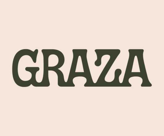
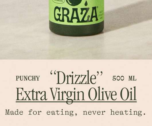
Using olive oil has never been so squ-easy. That’s how Andrew Benin, founder of Graza, would like us to feel. As Kelsey McClellan reports for the Wall Street Journal, Benin knew the last thing the world needed was another snobby olive oil and the key goal was finding ‘the sweet spot between flavor and affordability’.
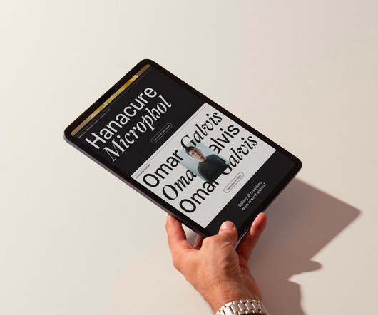
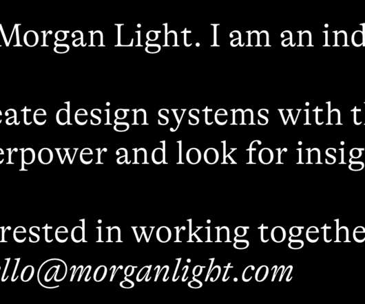
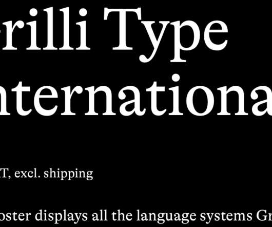
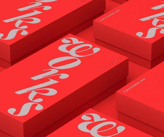
GTAlpina is described by type foundry and BP&O regular GrilliType as a workhorse serif that also delights in playing with the very meaning of concept, reaching into the ‘grab bag of typographic history to resurrect shapes some may falsely see as too expressive’.
Packaging design artifacts Credits Printed at Chalaguier Photographed by Enric Badrinas Fonts in use: FK Screamer by Florian Karsten & GTAlpina by Grilli Type For more information make sure to check out Pràctica website.
There has always been something borderline magical about the fields of beauty, makeup and skincare – a hint of esoteric or mystical knowledge. When it comes to visual storytelling, this association offers plenty of rich inspiration, along with established style signifiers that are easy to follow.
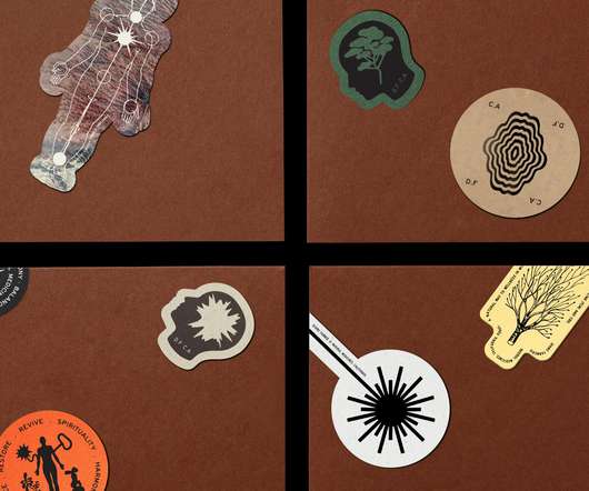
International creative studio network Base Design is behind the branding for Divine Farmer, a California-based wellness company with an identity centred on New Age-style iconography and a heavy reliance on storytelling.
At some point over the past half decade or so, someone somewhere decided that vowels were profoundly uncool: see Anthropologie’s wedding line BHLDN; “virtual sneaker” brand [what?!] and Nike acquisition RTFK; Blndr (yes, it’s a blender) and the likes of Tumblr, Pixlr, and Flickr, which dared to sneak in just the one.
Typefaces: GT Flexa, GTAlpina by Grilli Type. As a result, a bright and complementary color palette within a fancy serif style of typographic approach with sans-serif guidelines orientates us to the feel of the three-dimensional stage space while were looking at a compilation of Suzan's selected works. WORKS by SUZAN TUNCA.
We organize all of the trending information in your field so you don't have to. Join 66,000+ users and stay up to date on the latest articles your peers are reading.
You know about us, now we want to get to know you!
Let's personalize your content
Let's get even more personalized
We recognize your account from another site in our network, please click 'Send Email' below to continue with verifying your account and setting a password.


Let's personalize your content