This site uses cookies to improve your experience. To help us insure we adhere to various privacy regulations, please select your country/region of residence. If you do not select a country, we will assume you are from the United States. Select your Cookie Settings or view our Privacy Policy and Terms of Use.
Cookie Settings
Cookies and similar technologies are used on this website for proper function of the website, for tracking performance analytics and for marketing purposes. We and some of our third-party providers may use cookie data for various purposes. Please review the cookie settings below and choose your preference.
Used for the proper function of the website
Used for monitoring website traffic and interactions
Cookie Settings
Cookies and similar technologies are used on this website for proper function of the website, for tracking performance analytics and for marketing purposes. We and some of our third-party providers may use cookie data for various purposes. Please review the cookie settings below and choose your preference.
Strictly Necessary: Used for the proper function of the website
Performance/Analytics: Used for monitoring website traffic and interactions
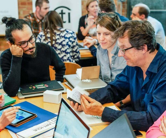
Read on to hear her insights on how visual context is an essential part of communication design , along with the importance of telling a story, knowing your users and using visuals in designstrategy to establish a relationship with your audience. The visual context in your designstrategy puts your message in perspective.
Website usability entails the concise presentation of information and usability features. Accompany your written content with photographs and infographics to capture your readers’ attention. There’ll always be something new in web design. Many likes on social networking platforms don’t make a design the best or free of mistakes.
Graphic Design by David Underwood. Taught by David Underwood, the Graphic Design course is structured to provide you wither the tools in order to generate professional looking reports, resume, presentations, and Powerpoints using techniques and practices that have been refined through years of practical use. Learn More.
They are arranged sequentially so that anyone wanting to get their feet wet with design can start with the basics and gain confidence as they go. Design and Make Infographics. Ever wanted to visualize and present data in a way that truly grabs the audience's attention? Introduction to User Experience Design.
So, even though you might have an inspiring business story to share, without a designstrategy in place, it’s most likely to fall flat. Not a designer? You can get started with annual report design templates to create reports that keep readers interested. Here’s an example of a well-designed annual report.
Using infographics to simplify complex information Utilising infographics is a powerful strategy for simplifying complex information and making it more digestible for your audience. So, infographics offer a visually engaging solution that enables you to convey key messages quickly and effectively!
Infographic on search mechanics for mobile applications Principle 1. The choice of entry point for the search should be justified based on the user’s needs and the characteristics of the application itself to ensure maximum usability and alignment with the overall navigation and designstrategy of the application. Principle 2.
3 – Canva Canva is a free graphic design platform with an easy-to-use drag-and-drop interface. Great for non-designers to create social media graphics, presentations, posters, documents, and other visuals. Can create everything from logos and infographics to website mockups.
Using the latest web development frameworks , designers can build websites with flexible layouts and elements that adapt for an optimal viewing experience, whether on a desktop monitor or a mobile phone screen. The goals and audience of a business also guide modern web designstrategy.
This infographic shows the range of both positive and negative emotions humans have in relation to different colours, based on historical, cultural, and scientific associations. Infographic created by Blue Whippet Studio. Harness data-driven strategies to present content that emotionally resonates with your users.
Q3: How do you presentdesign work and explain your rationale to clients? A: I structure presentations around a narrative to guide clients through each step in my process. I present polished mockups in context, like posters on a wall or ads on a phone. Q4: How would you display complex data in an infographic?
Therefore, do not attempt to transform these singular signifiers into multi-functional data displays reminiscent of mini-infographics. These alterations are anything but random; they're strategic choices made to keep pace with where the brand is headed next while still speaking loudly enough to resonate with who it's talking to presently.
We organize all of the trending information in your field so you don't have to. Join 66,000+ users and stay up to date on the latest articles your peers are reading.
You know about us, now we want to get to know you!
Let's personalize your content
Let's get even more personalized
We recognize your account from another site in our network, please click 'Send Email' below to continue with verifying your account and setting a password.


Let's personalize your content