This site uses cookies to improve your experience. To help us insure we adhere to various privacy regulations, please select your country/region of residence. If you do not select a country, we will assume you are from the United States. Select your Cookie Settings or view our Privacy Policy and Terms of Use.
Cookie Settings
Cookies and similar technologies are used on this website for proper function of the website, for tracking performance analytics and for marketing purposes. We and some of our third-party providers may use cookie data for various purposes. Please review the cookie settings below and choose your preference.
Used for the proper function of the website
Used for monitoring website traffic and interactions
Cookie Settings
Cookies and similar technologies are used on this website for proper function of the website, for tracking performance analytics and for marketing purposes. We and some of our third-party providers may use cookie data for various purposes. Please review the cookie settings below and choose your preference.
Strictly Necessary: Used for the proper function of the website
Performance/Analytics: Used for monitoring website traffic and interactions
Insisted on a logo crammed with all the trendy tropes of the time – swooshes (not the good kind), gradients, a fussy script font. Don't underestimate the power of a well-chosen or custom-designedfont. Embrace Constraints: Colour, Elements, Fonts Constraints are your friend in the pursuit of simplicity. They mature.
If you’re just briefing a designer on colours and fonts, you're missing the entire point. Our most successful projects at Inkbot Design begin not with a discussion about aesthetics, but with a deep dive into the business itself. You can explore our graphic designservices to see how strategy underpins everything we do.
Just the word “Fanta” in a dark, angular, sans-serif font. The Hidden Genius: The Orange, the Leaf, the Brand It wasn't just the font. So they hired Koto's design studio to do what corporations love: create a single, unified “global brand identity. Who designed the Fanta logos? 💡 Need Design Help?
It Started With Music, Not a Grand Design (1966-1983) Before the blue and yellow big-box stores, there was a single shop. The brand wasn’t born in a high-rise agency with whiteboards and focus groups. The Forgotten Power of “Good Enough” Design Here’s a point that gets lost in design schools. But who cares?
However, not every freelancer has the budget for a full branding agency. Luckily, tools like Looka and Canva offer ready-made templates and easy design options, so you can create a logo that fits your style and field. Use Fonts and Colours That Make Your Brand Stand Out People remember brands because of the little things.
” Your colours and fonts are powerful non-verbal communicators. Ensure the font is, above all, readable. There's no point in having a “personality-filled” font that no one can read on a phone screen. Consistency Is Your Superpower This is the most critical “design rule” for any small business.
The font is cheesy. The jagged, comic-book font was retired. They hire a big agency that sells them on a “cleaner, more modern identity.” They flatten the logo, swap the characterful font for a generic sans-serif, and strip out every ounce of personality that customers connected with in the first place. It was tactile.
The first widely used PayPal logo was brutally simple: the word “PayPal” in a heavy, no-nonsense sans-serif font. The font became thinner and more spaced out. You expect a revolution when you hire an agency with The Rolling Stones and Microsoft on its client list. Not the font, not the style, not the weight.
Reflecting its commitment to social change, the Hague-based designagency has crafted a colourful and impactful new identity for itself. Located in The Hague, Netherlands, JUST is a designagency deeply committed to making a societal impact. End with magic".
10 Stunning Trends for Website Designers to Follow in 2020. 21 Fresh Free Fonts for Graphic Designers. Over 1,500,000+ Fonts, Mockups, Freebies & Design Assets. Here is the list of 27 Business Flyer Templates created by some hard-working and dedicated designers. Creative DesignAgency Flyers.
This article explores 30 creative branding design and logos that will ignite your imagination and inspire you to build a brand identity that stands out. The designs we’ve compiled below are not only visually captivating but also serve as examples of how effective branding can convey a message without saying a word.
Finally, AI mockup generators empower designers to take on more projects without sacrificing quality. The efficiency gains free up valuable time, allowing them to expand their client base or dedicate resources to additional designservices. This AI-powered suggestion system would push the boundaries of mockup creation.
These tools are covering all the aspects you need for your website, i.e., website creation, logo, invoicing, fonts and icons, optimizations and development. Within seconds, the platform will show you thousands of logo design ideas. 99 Robots is a premium digital agency that will stimulate the growth of your online. Deeezy.com.
For a professional logo, you’ll need to hire an experienced designer who will work with you to visualise your company into a simple image. Finding a good designer is simple. Most of them are picked up by professional graphic designagencies who make producing a great logo easy. The question of designservices.
Let’s say you’re at a coffee shop and you happen to meet a local business owner who is in need of graphic designservices, or you’re at a big conference or convention and potential clients are everywhere. When it comes to designing greeting cards, there’s a saying that goes, “the art attracts and the verse sells.”
Whether you are a full-time professional graphic designer or a part-timer offering graphic designservices, creating a sleek graphic design portfolio is important to showcase your unique style and highlight your skills in today’s design industry. Design To Redesign. Movie Posters. Album Cover.
This statistic showcases the importance of finding the right graphic design partner for your brand's success. Why waste time researching and comparing graphic designagencies when you can just throw darts at a wall of website names and hope for the best? This led to designs that didn't match her vision and lacked creativity.
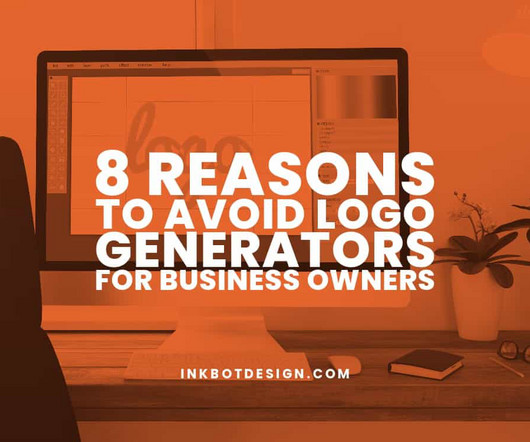
Therefore, you should invest in professional logo designservices or work with a graphic designer. They will also guide colours, fonts, and visual elements that fit your message. Logo generators are great tools for creating logos without professional design skills. Your brand is unique and deserves a tailored logo.
This article will explore Herb Lubalin's origins, chronicling his early graphic design career leading advertising agencies, his founding of the studios International Typeface Corporation (ITC) and Lubalin, Smith, Carnase (LSC), as well as the development of many timeless logos, typefaces, and designs over his lifetime.
To get a professionally designed logo , it’s essential to work with a reputable and experienced logo design company. And to help you choose the best logo designservices, we’ve compiled a list of the top 8 logo design companies and DIY logo designers. Logo designservices.
This article reveals the world of passive income and the strategies freelance graphic designers can use. Designers can use their skills to create templates, fonts, and graphics. Freelancers can partner with brands and promote their products or services on their platforms. Money can be made even when they sleep!
Any reputable web agency needs to have a well-structured responsive website to present itself professionally. Various agencies. It is suitable for business-related websites, qualification portfolio, web agency, landing page for IT company, personal use much more. IT Solution Softech WordPress Theme. Professional portfolio.
Resources for visually improving your website – we have included a resource for illustrations and icons together with a font identifier. The Trafft booking software’s White Label Option is a top feature that web developers or digital agencies can use when working with their clients. Are you a shop creator? Product Rating: 4.89/5
– SEO agencies. If you are looking for a full-service website designagency for web tools and web design. services like: • Branding. Graphic Design. Website Design & Development. • You should work with AMG DESIGN, a popular agency with enormous experience. Complete SEO.
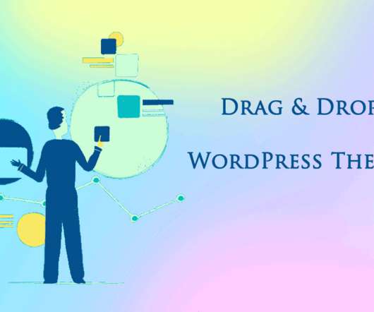
Web DesignAgency WordPress Theme. If you provide designingservices, you should consider using WordPress Themes For Artists, which already can make your website look amazing. This is a flexible artistic WordPress theme for web design companies. Music Agency WordPress Theme. Mobile-friendly design.
Every presentation designservice focuses on creating visually compelling and engaging slides to help clients achieve specific objectives. Why Only Professional Services Can Communicate Your Ideas Effectively? Font, background, structure, and infographics all convey an extensive presentation design experience or lack thereof.
We suggest: Non-disclosure agreement ( NDA ) – Have the designer(s) sign an NDA, ensuring they do not share or keep any of your branding, images, or other IPs. Request original files – Have the designer include packaged original art source files with each deliverable so your team or new agency can edit down the road.
Graphic Design Career: Skills, Salary, and Opportunities Crucial to visual communication, graphic designers use computer software or hand skills to create visual concepts. They work in advertising, publishing or specialised designservices to help businesses reach audiences visually.
Designers employ their abilities to relate stories visually, evoke sentiments and direct the viewer’s eye across a tactically planned visual journey. This is where aesthetics meets usefulness: each part should contribute towards the bigger picture – from colour schemes to font selections – to communicate effectively.
Awareness of each model's pluses and minuses allows you to negotiate optimal terms as you evaluate and select an agency. This pricing model incentivises efficiency and benefits longer-term relationships. What is the Cheapest Option? Looking to keep costs down?
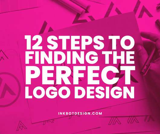
Some business owners actively participate in the logo design process, while others leave it to professional logo designservice providers and regularly share their ideas. The trick is to choose wisely when finding a perfect logo design to provide a sound basis for your marketing strategy. Use online services and tools.
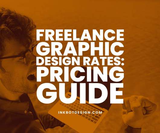
Whether you are freelance, work for an agency, or work for yourself, this is true. Remember that you may be paid less than your hourly rate if you work for an agency. In this case, the amount should be based on the project's size and the design's complexity. Tips for pricing your services. How much to charge.
Logo.ai’s powerful artificial intelligence algorithms shorten the process and make the design more accessible than ever while allowing unlimited edits until the user is satisfied. Logo.ai's extensive library of icons and fonts provides an almost endless selection, allowing users to create designs beyond their imagination.
After learning about Shillington from a family friend, she knew this would be the perfect opportunity to upskill and become a better designer. Since graduating, Oyinkan is back in Nigeria and founded the Aseda DesignAgency specializing in brand strategy. After Shillington, I had the opportunity to work with Atmosphère again.
And while the best-known fonts and the major foundries have a lot to offer, it's often a good idea to shake things up by looking further afield. From bold, experimental styles to classic serif revivals, these innovative studios are redefining the landscape of type design. For more details, read our news story on the launch.
You can play around with various styles, colours, and fonts until you find your perfect match. Prioritising your brand identity in a scalable design can enhance your overall marketing strategy. The other important use of the software is to play around with the design. Ensure you have a solid sample size to get reliable results.
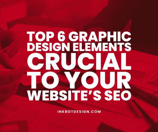
However, you might not know that your website’s graphic design elements impact your search engine rankings! Many marketing agencies and industry experts focus on keyword density and link building as their primary search engine optimisation strategies. 2 — Mobile-First Design. 3 — CTA Buttons.
Understanding the demand for specific designservices can help you tailor your offerings and target new markets. Explore New Niches Niche Markets : Identify emerging markets or industries with high demand for designservices. Consider diversifying your client base to reduce dependency on a few major clients.
Web DesignAgency WordPress Theme. If you provide designingservices, you should consider using WordPress Themes For Artists, which already can make your website look amazing. This is a flexible artistic WordPress theme for web design companies. That is not a problem if you do not like any default design elements.
You do not need to be a coder or hire a professional web agency. Unlimited choice of fonts, colors, stock images, and other features will allow creating a professional and exclusive look of your web resource. The Model Agency template is an exquisite option for your female modeling agency business. Conclusion.
Location of Design Team App design teams span locations and time zones. Where you choose to hire has cost implications: United States – $100-$150+ per hour for app designservices. London, Amsterdam, Paris and Berlin have excellent digital design talent. How much does app design cost per hour?
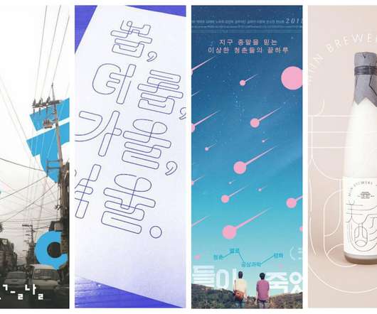
There’s something absolutely fascinating about the Korean culture. It has taken over the entire world, with Korean pop stars, Korean makeup, Korean fashion, and everything else Korean dominating the scene everywhere you look. Of course, among the trends are Korean…
These individuals do not work for agencies like most creatives or freelance exclusively as designers; instead, they act more akin towards marketers/social media experts than anything else. Here are some common monetisation strategies they use: Sponsorships: Teaming with brands to create content around their products or services.
Now, while it is awesome that the barriers to entry are lower, it is harder to find good quality references because anyone can slap together a font. For typography-specific resources, these are my favourites: Font Review Journal. He is the co-founder of a branding agency based in Paris, called Brand Brothers. Sidebearings.
We organize all of the trending information in your field so you don't have to. Join 66,000+ users and stay up to date on the latest articles your peers are reading.
You know about us, now we want to get to know you!
Let's personalize your content
Let's get even more personalized
We recognize your account from another site in our network, please click 'Send Email' below to continue with verifying your account and setting a password.


Let's personalize your content