Remove plantin
article thumbnail

Fresh new fonts for September to satisfy that 'back to school' feeling

Creative Boom

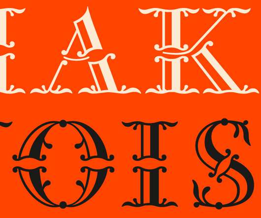
Martina Plantijn is a new type family informed by the workhorse qualities of Frank Hinman Pierpont's well-known 1913 typeface, Plantin. This new design expands upon Pierpont's research of 16th-century type at the Museum Plantin-Moretus in Antwerp, making digital updates across its roman and italic cuts.

Fonts 362
article thumbnail

Top 20 Fonts That Will Be Popular with Designers in 2020

Shillington

An old-style serif named after the 16th-century printer, Christophe Plantin, this typeface was created in 1913 by the British Monotype Corporation for its hot metal typesetting system. Body text in Plantin has a rich texture and is ideally suited for editorial or book designs – though it performs perfectly well on screens as well.

Fonts 115
Insiders

Sign Up for our Newsletter

This site is protected by reCAPTCHA and the Google Privacy Policy and Terms of Service apply.

article thumbnail

Top 10 Times New Roman alternatives for designers

Creative Boom

Morison used an older typeface, Plantin, as the basis for his design but made revisions for legibility and economy of space and also took inspiration from Perpetua and Baskerville. Tiempos began life as an optimisation of Galaxie Copernicus (based on Plantin) for a Spanish newspaper redesign. Tiempos by Kris Sowersby.

article thumbnail

10 best business card fonts

Moo

Plantin Developed in 1913, Plantin is a timeless serif typeface thats still going strong over a century later. Why it makes the best business card font: Most famously used in Monocle Magazine , Plantin is a reliable choice for print at any size.

Fonts 98
article thumbnail

50 fonts that will be popular with designers in 2024

Creative Boom

Ivyora by Ivy Foundry Ivyora is a Dutch Old Face revival produced from historical specimens found at the Museum Plantin-Moretus in Antwerp, mostly from a folio sheet called Proef van Letteren from the widow of Dirck Voskens issued in 1695. It's also available as a variable font.

Fonts 546
article thumbnail

Michael Wolff: How I designed the Labour rose

Design Week

We produced a strong logotype in a typeface called Plantin and just the single and simple word ‘Labour’ We also had in mind a typographic system that would bring about a coherent look and feel to the slogans, policies and claims that Labour intended to use for their campaign. It was a beautiful painting.

article thumbnail

How Three Designers Created the Rosart Project, a Typeface Revival and a Labor of Love

Eye on Design

When Walda Verbaenen, Michel Paré, and Lukas Schneider met as classmates among a diverse international group of six students at Antwerp’s Plantin Institute of Typography in 2015, they had no inkling that an intensive, multi-year typographical adventure lay ahead of them post-graduation.

Print 100