article thumbnail

Dark Mode: Implementing Dark UI in Your Web Design Strategy

Inkbot Design

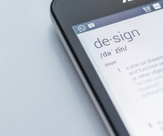
Dark Mode: Implementing Dark UI in Your Web Design Strategy Dark Mode in UI/UX refers to a design aesthetic where the interface features predominantly dark colours, as the name suggests. This web design trend offers a viable alternative to light-themed user interfaces.

article thumbnail

Welcome to the World of Modern Web Design

Inkbot Design

Welcome to the World of Modern Web Design The internet has come a long way since plain-text websites and bulbous fonts. These days, web design is an art form that balances aesthetics, user experience, and performance. So, what defines modern web design in 2024? With over 1.1

Insiders

Sign Up for our Newsletter

This site is protected by reCAPTCHA and the Google Privacy Policy and Terms of Service apply.

Trending Sources

article thumbnail

Top 10 Packaging Design Tips for Captivating Products

Inkbot Design

You'll uncover valuable nuggets of information, like which colours, fonts , or imagery resonate most with your audience. With this knowledge, you can design packaging that catches their eye and speaks directly to their desires and needs. Different fonts, sizes, and styles can convey various messages and evoke specific emotions.

article thumbnail

Small Budgets, Tight Deadlines, Important Work

Eye on Design

“In the commercial world, it’s more flashiness that stimulates [the client] relationship,” says Deroy Peraza, co-founder of Hyperakt , a nonprofit agency whose clients range from Girls Who Code to Pete Buttigieg. Nonprofit design is also about understanding the history of an organization.

Client 134
article thumbnail

Guide to Legal Requirements for Website Designers

Inkbot Design

Privacy by Design The notion of “privacy by design” referenced under GDPR provides helpful guidance for developers even when not legally required. The concept emphasises baking privacy protections into website design rather than leaving it as an afterthought. protections like copyright and trademarks.

Coding 90
article thumbnail

Why Your Website Needs a Mobile-First Design

Inkbot Design

The name is pretty self-explanatory – a mobile-first website is a website that starts with a mobile-friendly design, which is then adapted to work on desktops and larger screens. A responsive website is reactive, adapting to work well on mobile devices instead of specifically designed for mobile use. Navigation.

article thumbnail

20+ UX Design Tips for Creating User Experiences

Inkbot Design

Using colour schemes, fonts, and designs appropriately can increase engagement. At its core, UX design is about empathy. A responsive design ensures that your digital creation adapts seamlessly to various screen sizes, providing users with a consistent experience. Key Tips: Prioritise a mobile-first design strategy.

Animation 141