Remove bookmania
article thumbnail

10 Fonts That’ll Be Popular With Designers in 2023

Shillington

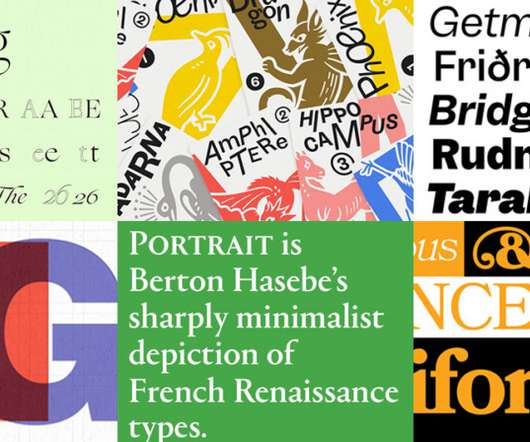
Designed by Mark Simonson, Bookmania is a fresh digital revival of the Bookman typefaces of the 20th century, which were known for their ornate swashes. Bookmania features a generous 680 swash characters and is a good choice for evoking a vintage 1970s look within your designs.

Fonts 52
article thumbnail

Reviewed: New Logo, Advertising, and Packaging for Iron City Beer by Top Hat

Under Consideration / Brand

The tagline, in either Bookman or Bookmania , has an instant vintage flair, which is good, but I kind of wish there was some additional work on it to make it more unique and feel less like it just came out of the box. with the ornate borders maybe a little too finicky relative to the boldness of the rest of the logo.

Insiders

Sign Up for our Newsletter

This site is protected by reCAPTCHA and the Google Privacy Policy and Terms of Service apply.

article thumbnail

Dementia wellbeing brand Relish reveals “sensorial” redesign

Design Week

Bookmania from Adobe has been chosen as the typeface owing to its “easy-to-recognise” letterforms, Willis says. Circular shapes are used throughout the identity, which aims to reinforce the clarity of the communications, according to Willis. Packaging details. Packaging was designed with the retail space in mind, Willis says.

Brand 99
article thumbnail

Chop Chop

Typewolf

Fonts: Bookmania , Harbour , GT Super , Aktiv Grotesk , Bureau Grotesque , Lydia

Fonts 59
article thumbnail

Reviewed: New Logo and Identity for Museum of Ice Cream by The Working Assembly

Under Consideration / Brand

With the museum as a backdrop, the identity elements -- the wordmark, the icon, the use of Bookmania , and a rainbow color palette -- all they have to do is quietly support the experiences and modestly enhance and unify them, which they do appropriately and engagingly. Entrance.

Travel 61