Remove ladybird
article thumbnail

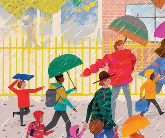
Ladybird rebrand is the publisher's biggest change in over 100 years

Creative Boom

Publishing giant Ladybird Books has today unveiled a fresh new look that captures the playful spirit of the iconic brand. If you grew up in the UK, chances are you've picked up a Ladybird book at least once in your life. And today sees the biggest shake-up Ladybird has seen in all that time.

article thumbnail

How Ladybird’s classic nature books were updated for a new generation

Design Week

In the 1950s, Ladybird’s What to Look for series launched with a playful look at spring and autumn. The season-inspired books were written by E.L. The series has now been revived for the first time in 60 years by Ladybird, Penguin’s design-led children’s imprint.

Insiders

Sign Up for our Newsletter

This site is protected by reCAPTCHA and the Google Privacy Policy and Terms of Service apply.

Trending Sources

article thumbnail

Mother Design’s mermaid-inspired identity for Penguin imprint Michael Joseph

Design Week

Penguin already has strong colour associations; the parent company’s orange, as well as Puffin’s yellow and Ladybird’s red branding. The studio chose an “aquatic-jade” which is inspired by the colophon and “pops” in the monochrome identity.

article thumbnail

“Learning New Words”: Educational Children’s Book Parody By Miriam Elia

Design You Trust

Featured below are some of the funniest examples from the Dung Beetle Learning books – brilliant dark humor parodies of the much-loved British Ladybird early learning children’s books of the 1960s. Created by Miriam Elia.

article thumbnail

Rivian Wants to Redesign EV Shopping Into an Inviting Space

Design Milk

“Through Spaces, we want to inspire people to imagine where they can go and what they can do in a Rivian.” Austin Space will offer direct access to the Ladybird Lake biking and running trail in the city’s South Congress district and a rooftop patio. Rivian’s 10,000 sq.

article thumbnail

True North designs Royal Mail Yearbook 2019

Design Week

In the section covering Queen Victoria’s Bicentenary, which also includes a feature on the Great Exhibition, for example, the line form has been inspired by the window frames at Crystal Palace, where it was held in 1851. The gold colour of the line also reflects the gold accents of the stamp mini-sheet itself.