This site uses cookies to improve your experience. To help us insure we adhere to various privacy regulations, please select your country/region of residence. If you do not select a country, we will assume you are from the United States. Select your Cookie Settings or view our Privacy Policy and Terms of Use.
Cookie Settings
Cookies and similar technologies are used on this website for proper function of the website, for tracking performance analytics and for marketing purposes. We and some of our third-party providers may use cookie data for various purposes. Please review the cookie settings below and choose your preference.
Used for the proper function of the website
Used for monitoring website traffic and interactions
Cookie Settings
Cookies and similar technologies are used on this website for proper function of the website, for tracking performance analytics and for marketing purposes. We and some of our third-party providers may use cookie data for various purposes. Please review the cookie settings below and choose your preference.
Strictly Necessary: Used for the proper function of the website
Performance/Analytics: Used for monitoring website traffic and interactions
Image source: Apple.com / WWDC 2025 presentation Apple made its boldest UI move since iOS 7 (presented in 2013), when the company abandoned skeuomorphism and buried textures in favor of flat design. A calm, inclusive look at Apple’s most radical UI shift. Years have passed. What lessons can designers take from this shift?
We’ve built our list of the Top Fonts for Comic Books and Cartoons to make this process easy so you can get back to exactly what you want to be doing: creating incredible artwork. With our list of Comic Book Fonts and Cartoons Fonts, you can draw ahead! Comication – Cute Typeface for Kids – free with subscription.
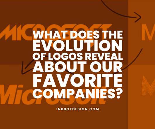
What Does the Evolution of Logos Reveal About OurFavorite Companies? But what does this evolution of logos reveal about our favourite companies? It is one approach to set a business apart in a cutthroat market where daily graphic components compete for our attention. But there is another side of the story.
Back Story: Ever since the early days of Swiss type foundry Dinamo, which was founded in 2013, the team has been interested in the idea of updating light traps — typographic nuances that originally compensated for the low resolution of early television screens in the ’60s and ’70s — for the digital age. ABC Camera by Dinamo.
We organize all of the trending information in your field so you don't have to. Join 66,000+ users and stay up to date on the latest articles your peers are reading.
You know about us, now we want to get to know you!
Let's personalize your content
Let's get even more personalized
We recognize your account from another site in our network, please click 'Send Email' below to continue with verifying your account and setting a password.


Let's personalize your content