This site uses cookies to improve your experience. To help us insure we adhere to various privacy regulations, please select your country/region of residence. If you do not select a country, we will assume you are from the United States. Select your Cookie Settings or view our Privacy Policy and Terms of Use.
Cookie Settings
Cookies and similar technologies are used on this website for proper function of the website, for tracking performance analytics and for marketing purposes. We and some of our third-party providers may use cookie data for various purposes. Please review the cookie settings below and choose your preference.
Used for the proper function of the website
Used for monitoring website traffic and interactions
Cookie Settings
Cookies and similar technologies are used on this website for proper function of the website, for tracking performance analytics and for marketing purposes. We and some of our third-party providers may use cookie data for various purposes. Please review the cookie settings below and choose your preference.
Strictly Necessary: Used for the proper function of the website
Performance/Analytics: Used for monitoring website traffic and interactions
At its core, it strips away unnecessary elements to emphasize the essentials, often using clean lines, monochromatic colorschemes, and ample negative space. For example, websites can dynamically adjust their layouts, colorschemes, or imagery based on a user’s preferences, browsing history, or even current mood.
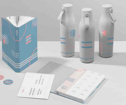
The company ditched its black-and-white ‘U’ logo design and adopted a new icon with a different colorscheme. It’s also important to choose colors that convert effectively between different color modes, like CMYK and RGB,” Rodgers adds. However, choosing a color palette isn’t easy. The problem?
Look at a shiny modern digitalprint, and you’ll probably place it as having being made recently. You might guess the age of a print with slightly more pixelation and a duller color as being of the 1950s or 1960s. Everything ages, and time has an influence on how retro design elements appear depending on how old they are.
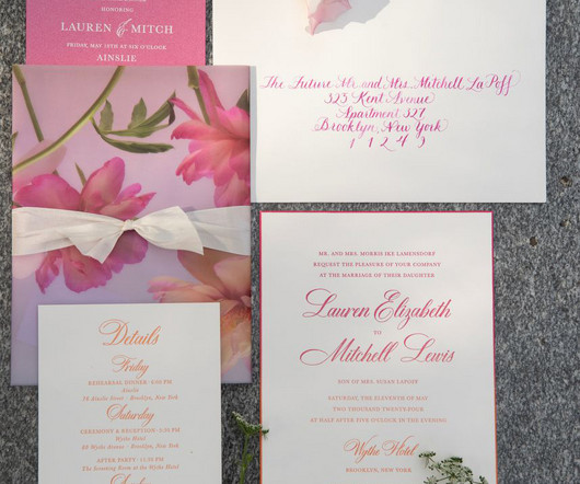
A dreamy colorscheme and plenty of flowers set the perfect tone for Lauren and Mitchells wedding. The first thing guests noticed about the invitations was the digitallyprinted vellum gatefold. See all of the luxurious details, including the ombre invitations, in the feature on Carats & Cake.
We organize all of the trending information in your field so you don't have to. Join 66,000+ users and stay up to date on the latest articles your peers are reading.
You know about us, now we want to get to know you!
Let's personalize your content
Let's get even more personalized
We recognize your account from another site in our network, please click 'Send Email' below to continue with verifying your account and setting a password.


Let's personalize your content