This site uses cookies to improve your experience. To help us insure we adhere to various privacy regulations, please select your country/region of residence. If you do not select a country, we will assume you are from the United States. Select your Cookie Settings or view our Privacy Policy and Terms of Use.
Cookie Settings
Cookies and similar technologies are used on this website for proper function of the website, for tracking performance analytics and for marketing purposes. We and some of our third-party providers may use cookie data for various purposes. Please review the cookie settings below and choose your preference.
Used for the proper function of the website
Used for monitoring website traffic and interactions
Cookie Settings
Cookies and similar technologies are used on this website for proper function of the website, for tracking performance analytics and for marketing purposes. We and some of our third-party providers may use cookie data for various purposes. Please review the cookie settings below and choose your preference.
Strictly Necessary: Used for the proper function of the website
Performance/Analytics: Used for monitoring website traffic and interactions
GoldenTextEffect in Figma - FREE abduzeedo 0801—23 A few weeks back, we embarked on an exciting journey together, exploring the realm of goldentexteffects in Photoshop. Using layer styles, we converted everyday text into a lustrous gold that truly caught the eye.
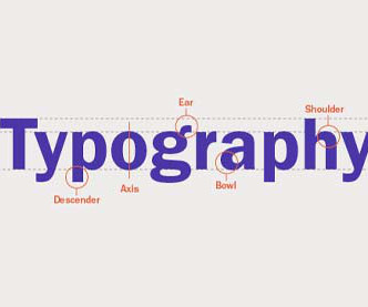
Check out this round-up of free lessons on graphic design theory. Today, we've put together a list of free graphic design theory lessons for you. Typography is one of the most essential tools in graphic design and therefore has a huge impact on how text is viewed. 8 Golden Rules for Better Interface Design.
The golden rule is that related content should be chunked together in ways that make sense to human minds. Too many enormous blocks of text will quickly overwhelm visitors and cause them to bounce. We don't want to read giant walls of text – we prefer to skim and snack on bite-sized bits of information quickly.
We saw this as a golden opportunity to embrace UX research and uncover valuable insights to guide our design decisions. Contrast (Enhanced) , and 1.4.11: Non-text Contrast , illustrative images are not mandated to meet minimum contrast requirements. However, certain variables have shown effectiveness in accommodating most cases.
Step 2: Master the Design Principles & Process Graphic design is the effective visual communication of an idea or concept. On the other hand, contrast is a method to create emphasis within a design for impact, which can be seen in color choices, scale, or making specific text bold thereby creating a central focal point.
Those golden arches against that bright red background. Hence, ensure its effect is suitable before using any bright, saturated hue on large background areas. Feel free to go back and update selections whenever needed due to brand or design needs changes. Tools like Figma and Adobe XD will help streamline this process.
It sounds as though we are declaring the end of technology’s golden age, both for those who make it and for those who use it. to screenless innovation As a result of our screen addiction, one of the side-effect is developing more interfaces that use fewer screens. And it’s already happening.
We organize all of the trending information in your field so you don't have to. Join 66,000+ users and stay up to date on the latest articles your peers are reading.
You know about us, now we want to get to know you!
Let's personalize your content
Let's get even more personalized
We recognize your account from another site in our network, please click 'Send Email' below to continue with verifying your account and setting a password.


Let's personalize your content