Remove 2001 Remove Art Remove Book Design Remove Publishing
article thumbnail

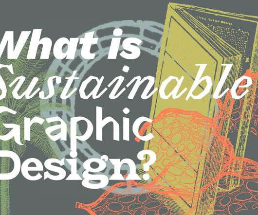
“Books remain stubbornly, thrillingly relevant”: the enduring value of book design

Design Week

The American Institute of Graphic Arts (AIGA) has been judging books by their covers for over 100 years. ” And while there might not be one rule to good book design — Strelecki calls it a “process” between designers and clients — the jurors bring together a wealth of experience.

article thumbnail

10 Fresh Font Pairings for Editorial Design in 2020

Shillington

ARS Maquette and Copernicus Book. Designed by Angus R. Shamal and released through ARS Type in 2001, its pleasing geometrics are both super-friendly and supremely readable. Copernicus Book is a much more traditional serif that exudes authority and a sense of formality, yet still with friendly and approachable letter-shapes.

Fonts 69
Insiders

Sign Up for our Newsletter

This site is protected by reCAPTCHA and the Google Privacy Policy and Terms of Service apply.

article thumbnail

What is Sustainable Graphic Design?

UX Collective

Sustainable Graphic Design is DIFFERENT Sustainable Graphic Design defined this way is different than “regular,” cultural production. All life flourishing is not the traditional goal of business, culture, and design. If our world view is “the welfare of all life,” how does that shift what and how we graphic design?

article thumbnail

The art of the interactive storyteller

UX Collective

Whether it be film, television, radio, newspaper, a book, music, digital imaging, an app or the internet a story is only as effective as one’s mastery of the medium. Participation I once stood in front of an Andy Warhol painting of Marilyn Monroe in a gallery at the Museum of Modern Art. Where might we go from here?

Art 87
article thumbnail

How Hjärta Smärta Challenged the Male-Dominated Status Quo in the Early 2000s

Eye on Design

Long before higher education in art and design was within reach for me, and before my imagination stretched to even considering book design as something one could do for a living, I accidentally found a publication in the school library that absorbed me and still sits in my heart as one of the “magic” books of my life. .

article thumbnail

Why are we attracted to open up certain apps?

UX Collective

The Charles Schwab logo was last designed in 2001 and it comprises of a wordmark (the full name of the brand, spelled out in all the letters). So with my eyes set on solving this design problem, I took out pen and paper and began the process. This can be attributed Charles Schwab app’s slightly outdated logo. Love it or hate it?

Color 105