article thumbnail

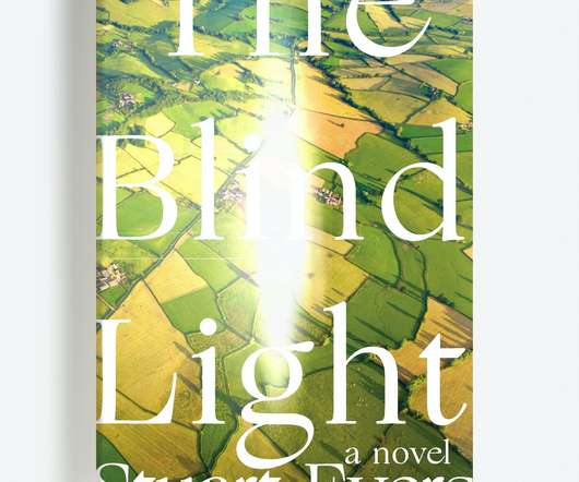
The best book cover designs of 2020

Creative Review

Yet there’s no denying that, as with pretty much every job in every sector across the country, the worlds of design and publishing have had to change and adapt accordingly throughout most of 2020. The fact that the medieval-seeming wolf/dog illustration casts a convincing shadow only adds to the mix of strangeness going on.

article thumbnail

How the Tokyo 2020 Olympics was designed

Design Week

The Tokyo 2020 Olympics finally begins this week. Courtesy of Ververidis Vasilis / Shutterstock.com While details of the opening ceremony are typically kept secret, Tokyo 2020 has confirmed some key elements for this year’s celebration. Opening ceremony. The torch leaves Athens, Greece.

Sports 101
Insiders

Sign Up for our Newsletter

This site is protected by reCAPTCHA and the Google Privacy Policy and Terms of Service apply.

Trending Sources

article thumbnail

Retro Packaging Design: Bringing Back Vintage Styles

Inkbot Design

An example of retro cereal packaging using vintage illustrations and fonts. Relying on heritage imagery and themes Grainy photographic filters, illustrations with retro family scenes or activities, and other stylised heritage visuals make packaging look authentically old school. Specific illustration aesthetics tie to beloved decades.

article thumbnail

Is It Art, or Is It Type? What We Learn When Language is Built, Not Written

Eye on Design

One of the best (albeit one-sided) illustrations of how a designer might approach type differently than an artist is a 2009 essay by David Reinfurt (who used to make up one-half of Dexter Sinister) titled “Adam, Why Arial?” Shannon Finnegan, Do you want us here or not, 2020, Carleton University Art Gallery. Photo by Justin Wonnacott.

Art 96