This site uses cookies to improve your experience. To help us insure we adhere to various privacy regulations, please select your country/region of residence. If you do not select a country, we will assume you are from the United States. Select your Cookie Settings or view our Privacy Policy and Terms of Use.
Cookie Settings
Cookies and similar technologies are used on this website for proper function of the website, for tracking performance analytics and for marketing purposes. We and some of our third-party providers may use cookie data for various purposes. Please review the cookie settings below and choose your preference.
Used for the proper function of the website
Used for monitoring website traffic and interactions
Cookie Settings
Cookies and similar technologies are used on this website for proper function of the website, for tracking performance analytics and for marketing purposes. We and some of our third-party providers may use cookie data for various purposes. Please review the cookie settings below and choose your preference.
Strictly Necessary: Used for the proper function of the website
Performance/Analytics: Used for monitoring website traffic and interactions
When we designed the Knockout type family, which celebrates the exuberance of nineteenth century wood type, we wondered: what designer would knowingly use the fonts to recall a world of quack medical cures and traveling vaudevillians? The answer, as it so often turns out to be, is “smart aleck Canadian advertising agencies.” Behold the truly excellent Grip Limited , who have created a typographic tour-de-force in Knockout (and a little Archer ) that really repays scrolling in all dir
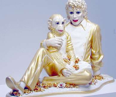
Has every bad thing that can possibly be said about the art of Jeff Koons been said already? It is worth revisiting this question at regular intervals because you don't want to let an opportunity go by. You never know when someone might invent a new word for "stinks." There are many reasons for disliking Koons' work. My personal favorite is that he pilfers images from honest, underpaid commercial artists, sprinkles them with an invisible layer of irony and resells them as "fine" art for huge sum
We organize all of the trending information in your field so you don't have to. Join 66,000+ users and stay up to date on the latest articles your peers are reading.
You know about us, now we want to get to know you!
Let's personalize your content
Let's get even more personalized
We recognize your account from another site in our network, please click 'Send Email' below to continue with verifying your account and setting a password.


Let's personalize your content