Remove Color Remove Color Theory Remove Infographics Remove Patterns
article thumbnail

What Is the Difference Between Tints, Shades, Hues, and Tones?

Creative Market

Throw hue and tone into the mix, too, and you’re left with four, distinct color terms that everyone uses, yet not everyone understands. The mix-up among tint, shade, hue, and tone is understandable since they’re all related to color theory and refer to similar concepts within design. Defining Tint vs. Shade, Hue, and Tone.

article thumbnail

How to Apply Visual Communication Strategies to Design

Design Wizard

Infographics are more than mere pie charts, histograms, or bar graphs. Here are some basic theories that help designers and visual communicators organize information and create eye-catching logos, brand images, and overall great designs. Color Theory. This theory also applies to branding. Visual Hierarchy.

Insiders

Sign Up for our Newsletter

This site is protected by reCAPTCHA and the Google Privacy Policy and Terms of Service apply.

Trending Sources

article thumbnail

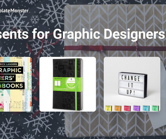
Ideas for Christmas Gifts for Graphic Designers

Template Monster

Designers and illustrators will appreciate the service since the subscription includes the "Graphics" section, where you can find PSD sources, logo templates, illustrations, and even infographic elements. The patterns on the tights are handmade in limited editions which guarantee their uniqueness. Creative pricing plan ($5.75/month

article thumbnail

The Designer Guide to Web Design Colours

Inkbot Design

You’ll find websites like Coolors, Adobe Color, and ColorHunt that offer just that and generators if none of their suggestions fit what you're after. Iterate and Evolve: Color palettes are living things. You can get inspired by nature, but you can also look at curated colour palettes such as Adobe Color, Coolors and Colour Hunt.

article thumbnail

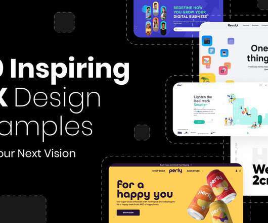
30 Inspiring UX Design Examples For Your Next Vision in 2022

Graphic Mama

MILU is one of our top user experience design examples for a couple of reasons: not only does the color palette indicates who these products are for, but there are a lot of high-quality images and videos, and on top of that – there are explanations of each product (ingredients, target audience, etc.) Interactive infographics.

article thumbnail

A Quick Guide to Color Blind Design: How to Present Data to Everyone

Noupe

Reduced color perception or the capacity to distinguish between colors are symptoms of color blindness. Color blindness affects 1 in 200 women and 1 in every 12 men. Do digital resources like websites and educational materials affect color blindness? Create a color palette in advance. Absolutely!

Color 120
article thumbnail

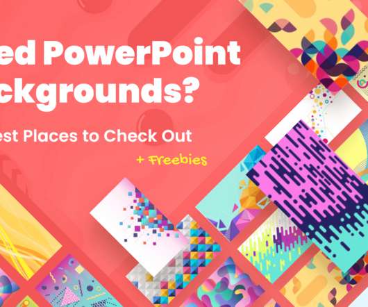
Need PowerPoint Backgrounds? The Best Places to Check Out [+ Freebies]

Graphic Mama

Freepik’s filters (photos, colors, style, etc.) A really cool feature is each image has color variations, so you can keep a theme but differentiate key slides, areas, or show progress. Click on colors scale for the Presentation tab. 120 rooms of all shapes, sizes, and colors. Free-power-point-templates.