This site uses cookies to improve your experience. To help us insure we adhere to various privacy regulations, please select your country/region of residence. If you do not select a country, we will assume you are from the United States. Select your Cookie Settings or view our Privacy Policy and Terms of Use.
Cookie Settings
Cookies and similar technologies are used on this website for proper function of the website, for tracking performance analytics and for marketing purposes. We and some of our third-party providers may use cookie data for various purposes. Please review the cookie settings below and choose your preference.
Used for the proper function of the website
Used for monitoring website traffic and interactions
Cookie Settings
Cookies and similar technologies are used on this website for proper function of the website, for tracking performance analytics and for marketing purposes. We and some of our third-party providers may use cookie data for various purposes. Please review the cookie settings below and choose your preference.
Strictly Necessary: Used for the proper function of the website
Performance/Analytics: Used for monitoring website traffic and interactions
What’s Trending in Type Font Lists Lookbooks Checklist Free Fonts Learning Resources Velora Site of the Day · June 25, 2025 Fonts — Arizona Flare , Oracle , Pangram Sans Type Pairing Lookbooks Font research done for you.
What’s Trending in Type Font Lists Lookbooks Checklist Free Fonts Learning Resources Azione Site of the Day · June 24, 2025 Fonts — Editorial Old , Saans , Favorit Mono Type Pairing Lookbooks Font research done for you.
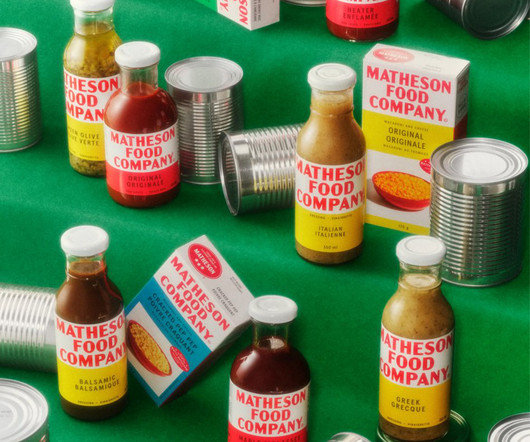
And industrial-inspired Apercu Mono by Colophon Foundry in all-caps is used for supporting copy such as addresses and signage to establish a strong yet approachable tone. When it comes to typography, headlines are cast in the neo-grotesk font Aeonik, with bold weight in all caps; this "exudes a direct and simple tone of voice," says Jack.
Created as a bespoke typeface for the National Norwegian Design Awards, Visuelt was spawned from a more considered and constrained version of Apercu (see above). Specifically designed to fit more words into a column without sacrificing legibility, this font represents a great choice for both running copy and headlines.
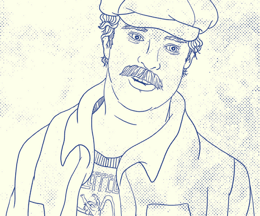
We merged nostalgic halftone illustrations with contemporary typography — utilizing Plaak and Apercu — to create a packaging system that feels both modern and rooted in history. We carefully lifted Mike’s signature “Mike the Mike” sign-off from his original recordings, and reproduced directly on the cassettes.
If nostalgia is a powerful force, arguably ‘fauxstalgia’ – that sense of longing and yearning for something that we never actually experienced – is even more so.
We organize all of the trending information in your field so you don't have to. Join 66,000+ users and stay up to date on the latest articles your peers are reading.
You know about us, now we want to get to know you!
Let's personalize your content
Let's get even more personalized
We recognize your account from another site in our network, please click 'Send Email' below to continue with verifying your account and setting a password.


Let's personalize your content