This site uses cookies to improve your experience. To help us insure we adhere to various privacy regulations, please select your country/region of residence. If you do not select a country, we will assume you are from the United States. Select your Cookie Settings or view our Privacy Policy and Terms of Use.
Cookie Settings
Cookies and similar technologies are used on this website for proper function of the website, for tracking performance analytics and for marketing purposes. We and some of our third-party providers may use cookie data for various purposes. Please review the cookie settings below and choose your preference.
Used for the proper function of the website
Used for monitoring website traffic and interactions
Cookie Settings
Cookies and similar technologies are used on this website for proper function of the website, for tracking performance analytics and for marketing purposes. We and some of our third-party providers may use cookie data for various purposes. Please review the cookie settings below and choose your preference.
Strictly Necessary: Used for the proper function of the website
Performance/Analytics: Used for monitoring website traffic and interactions
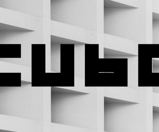
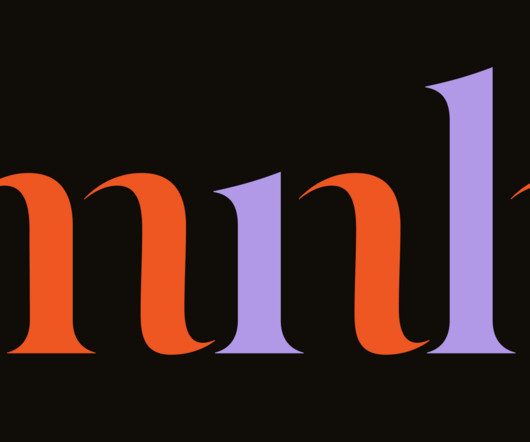
Read the book, Typographic Firsts This month, Steven Heller takes a closer look at the layer font family, Steam by Type Forward. The post Steven Hellers Font of the Month: Cubo appeared first on I Love Typography.
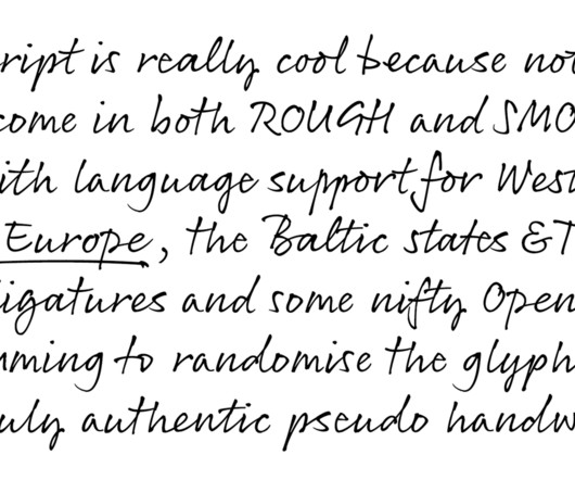
Read the book, Typographic Firsts This month, Steven Heller takes a closer look at the layer font family, Steam by Type Forward. The post Steven Hellers Font of the Month: Steam appeared first on I Love Typography.
Read the book, Typographic Firsts This month, Steven Heller takes a closer look at the Vibro font family. The post Steven Hellers Font of the Month: Vibro appeared first on I Love Typography.
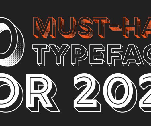
Read the book, Typographic Firsts Ten quality curated must-have font families for 2025. The post 10 Must-have Typefaces for 2025 appeared first on I Love Typography.
Read the book, Typographic Firsts This month, Steven Heller takes a closer look at the Gigafly font family. The post Steven Hellers Font of the Month: Gigafly appeared first on I Love Typography.
Read the book, Typographic Firsts This month, Steven Heller takes a closer look at the Roadhouse font family. The post Steven Heller’s Font of the Month: Roadhouse appeared first on I Love Typography.
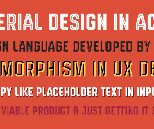
Read the book, Typographic Firsts How important are fonts in user interface and user experience design? You guessed it: they’re all but indispensable. It seems like an easy answer. Today’s UI/UX design is mainly focused on electronic devices and, more specifically, the programs (apps) running on these devices. Usually, the ‘interface’ of a device is a screen on which type […] The post Expert Lists: Fonts for UI/UX design appeared first on I Love Typography.
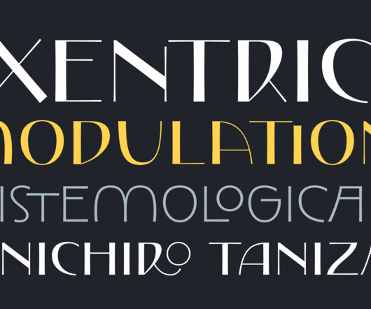
Read the book, Typographic Firsts This month, Steven Heller takes a closer look at the Exentrica font family. The post Steven Heller’s Font of the Month: Exentrica appeared first on I Love Typography.
Read the book, Typographic Firsts Steven Heller takes a closer look at Jamie Clarke’s 3D Rig Solid font family. The post Steven Heller’s Font of the Month: Rig Solid appeared first on I Love Typography.
Read the book, Typographic Firsts Steven Heller takes a closer look at the Doublethink font family, from Barnbrook Fonts. The post Steven Heller’s Font of the Month: Doublethink appeared first on I Love Typography.
Read the book, Typographic Firsts Steven Heller takes a closer look at the Sisters font family, designed by Laura Meseguer. The post Steven Heller’s Font of the Month: Sisters appeared first on I Love Typography.
Read the book, Typographic Firsts Steven Heller takes a closer look at the Moron font family from Barnbrook Fonts. The post Steven Heller’s Font of the Month: Moron appeared first on I Love Typography.
Read the book, Typographic Firsts Although the tools available to typographers have changed quite a bit over the past 500 years, the underlying principles have not. Many typographic principles are inextricably connected to the human form — the length of our arms, the acuity of our eyes — these determine fundamental aspects of typography like type size, leading, and line […] The post Typography Matters appeared first on I Love Typography.
Read the book, Typographic Firsts Steven Heller takes a closer look at the Sandhouse font family from Tipastype. The post Steven Heller’s Font of the Month: Sandhouse appeared first on I Love Typography.
Read the book, Typographic Firsts A typeface is a series of conversations happening simultaneously between different characters. For example, in the Latin script, the lowercase b talks to the d, talks to the p, talks to the q, and they respond. So there is this ongoing conversation between the b, d, p, and q, and then there is this other […] The post The Music of Type Design appeared first on I Love Typography.
Read the book, Typographic Firsts Steven Heller takes a closer look at the Atol font family. The post Steven Heller’s Font of the Month: Atol appeared first on I Love Typography.
Read the book, Typographic Firsts Steven Heller takes a closer look at the Atol font family. The post Steven Heller’s Font of the Month: Atol appeared first on I Love Typography.
Read the book, Typographic Firsts Steven Heller takes a closer look at the Cuatro font family, designed by Francis Chouquet. The post Steven Heller’s Font of the Month: Cuatro appeared first on I Love Typography.
Read the book, Typographic Firsts Steven Heller takes a closer look at the Chutz font family, designed by Designed by Michael Rafailyk. The post Steven Heller’s Font of the Month: Chutz appeared first on I Love Typography.
Read the book, Typographic Firsts Steven Heller takes a closer look at Juan Luis Blanco’s new font family, Basati. The post Steven Heller’s Font of the Month: Basati appeared first on I Love Typography.
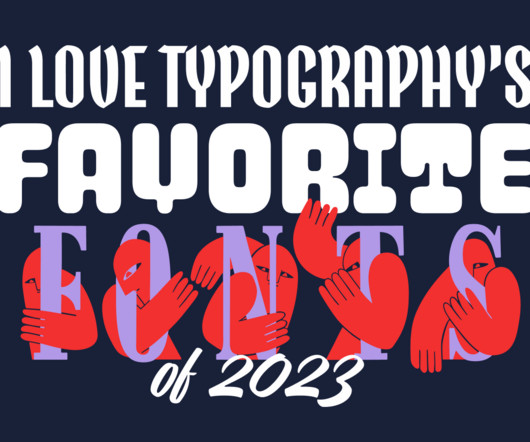
Read the book, Typographic Firsts It’s that time of year again. Join us as we look back at some of our favorite new fonts released on ILT in 2023. The post ILT’s Favorite Fonts of 2023 appeared first on I Love Typography.
Read the book, Typographic Firsts Steven Heller goes back to the future with the retro Letraflex , font family, designed by Art Grootfontein. The post Steven Heller’s Font of the Month: Letraflex appeared first on I Love Typography.
Read the book, Typographic Firsts Steven Heller falls in love with JAF Herb , a tightly spaced, contemporary blackletter with a brush-script vibe. The post Steven Heller’s Font of the Month: JAF Herb appeared first on I Love Typography.
Read the book, Typographic Firsts An experiment in single-letter logos. The post Single letter logos: What do you see? appeared first on I Love Typography.
Read the book, Typographic Firsts I set myself the task of building a small font library on a budget. Here’s what I picked, but before that, a few points on how I got started: The post How to build a font library on a budget appeared first on I Love Typography.
Read the book, Typographic Firsts The new Johnson & Johnson logo is more than a typographic blunder. It’s also a massive branding gamble with a high risk strategy. The post The New Johnson & Johnson Logo appeared first on I Love Typography.
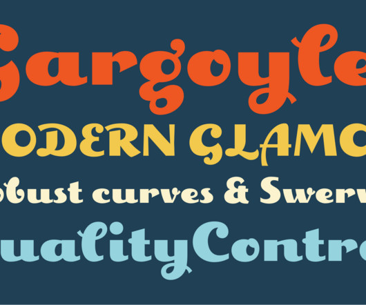
Read the book, Typographic Firsts If I were to design a new magazine that needed to be both traditional with the hint of edge attitude, I would consider the Amberwood font family. It is a sans serif with a touch of quirk. Its key feature is the brush letter curves that at once gives it a carnival poster sensibility that feels as though it was designed to suggest carefully contoured ribbon.
Read the book, Typographic Firsts Web fonts are more than just a way to make your text look nice. They’re a powerful tool to communicate your brand’s personality, message, and values to your audience. Web fonts also affect the readability, usability, and accessibility of your website — factors which have a direct impact on your conversions and revenue.
Read the book, Typographic Firsts Perhaps the ideal way to appreciate Francis Chouquet’s 2023 typeface Scusi is to imagine the classic film posters painted and designed in the 60s and 70s by Italian film poser designer Sandro Symeoni, whose custom letter forms and typefaces adorned a bevy of imported Hollywood films destined to be translated or dubbed for Italian audiences as well as those originals made Cinecitta, the legendary film studio in Rome.
Read the book, Typographic Firsts In case you missed part one, catch up here. Today we have four more fantastic font families that are definitely worth checking out. Let’s jump straight in. The post New releases, fresh new fonts! — episode 2 appeared first on I Love Typography.
Read the book, Typographic Firsts We have some great new typefaces to tell you about! From blocky and fun display families like Scusi to eccentric scripts like Exentrica (we love the name), to the elegant high contrast of Copperscript — oh, and a tall slim gem called Amberwood. The post New releases, fresh new fonts! — episode 1 appeared first on I Love Typography.
Read the book, Typographic Firsts Somewhere, squirreled away in almost every pre-digital graphic designer’s flat files near to the old rubber cement remover and the hand-roller used for flattening out galleys, under the piles of rubylith, a box of ruling tape and a T-square from the ancient paste-up days, is a small collection of dry transfer type sheets (also known as press type).
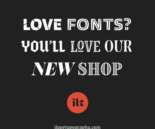
Read the book, Typographic Firsts Looking for a new sans serif typeface to add to your design arsenal? Look no further! We’re currently offering six of our most popular sans serif typefaces at a special sale price. The post The L in ILT appeared first on I Love Typography.
Read the book, Typographic Firsts Steven Heller takes a closer look at Beast of England’s new Acorn font family in this latest issue of Font of the Month. The post Steven Heller’s Font of the Month: Acorn appeared first on I Love Typography.
Read the book, Typographic Firsts Looking for a new sans serif typeface to add to your design arsenal? Look no further! We’re currently offering six of our most popular sans serif typefaces at a special sale price. The post Save Big on 6 Popular Sans Serifs appeared first on I Love Typography.
Read the book, Typographic Firsts In part one , we took a look at three typefaces recommend for fashion or luxury brands. Of course, your final decision about font choice will depend on a variey factors, such as the brand's personality, its target audience, and the kind of message it wants to convey. And, although, we tend to typically associate high contrast typefaces with high fashion, they're by no means our only choice.
Read the book, Typographic Firsts Steven Heller takes a closer look at Barnbrook Fonts’ bold and angular font family, Hopeless Diamond. The post Steven Heller’s Font of the Month: Hopeless Diamond appeared first on I Love Typography.
Read the book, Typographic Firsts For a limited time, you can get 50% off a selection of quality fonts, including some of our most popular designs. Whether you’re a graphic designer, marketer, or simply someone who loves typography, this is an opportunity you won’t want to miss. Our carefully curated library of fonts is designed to help you create stunning […] The post 50 % off Fonts appeared first on I Love Typography.
Read the book, Typographic Firsts Typography is an essential element in any design, and choosing the right typeface makes all the difference. That’s where Mackay comes in — a powerful transitional serif designed for both screen and print. Mackay is available in six weights, ranging from a fragile thin to a blustering black, with matching italics for each weight.
Read the book, Typographic Firsts Steven Heller takes a closer look at Derek Weathersbee’s retro-futuristic font, Ray Gun. The post Steven Heller’s Font of the Month: Ray Gun appeared first on I Love Typography.
Read the book, Typographic Firsts We’ve talked about fonts for fashion here on the blog before. And there’s a big overlap between the kinds of fonts used in fashion (especially the high-end stuff) and those used for other luxury brands. It’s also worth mentioning that there’s a recent trend towards simple and unfussy sans serifs even for well-established luxury brands […] The post Fonts for Luxury Brands appeared first on I Love Typography.
Read the book, Typographic Firsts We’re always excited to tell you about the launch of great new additions to the ILT Font Store. Here are some recent releases we thought you’d like to hear about. And don’t forget they’re all available as webfonts too. Time to meet the new kids on the block: The post Hot New Fonts: spring 2023 appeared first on I Love Typography.
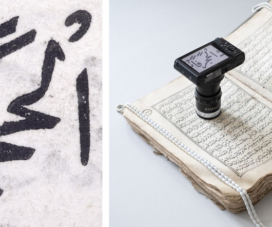
Read the book, Typographic Firsts Tabrizi Jali is the first type revival based on the early Persian Naskh types of Iranian presses from the nineteenth century. It is a product of several years of extensive research into the history of printing and typefounding, and practical experiments. Thus, it is a great pleasure to announce its release on the first day of spring and the Persian New Year (Nowruz), the 20th of March, 2023.
We organize all of the trending information in your field so you don't have to. Join 66,000+ users and stay up to date on the latest articles your peers are reading.
You know about us, now we want to get to know you!
Let's personalize your content
Let's get even more personalized
We recognize your account from another site in our network, please click 'Send Email' below to continue with verifying your account and setting a password.


Let's personalize your content