Remove 2001 Remove Book Design Remove Fonts
article thumbnail

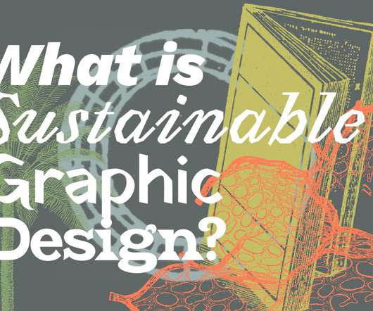
10 Fresh Font Pairings for Editorial Design in 2020

Shillington

And one of the most important factors in all that is choosing fonts that complement each other well, both aesthetically and functionally. With millions of potential font combinations open to you, though, it can be difficult to know where to begin. Elena is a lovely font designed specifically for digital text.

Fonts 69
article thumbnail

Why are we attracted to open up certain apps?

UX Collective

The Charles Schwab logo was last designed in 2001 and it comprises of a wordmark (the full name of the brand, spelled out in all the letters). The logo consists of two font types, a serif font and a sans serif. So with my eyes set on solving this design problem, I took out pen and paper and began the process.

Color 117
Insiders

Sign Up for our Newsletter

This site is protected by reCAPTCHA and the Google Privacy Policy and Terms of Service apply.

article thumbnail

The Cult of the Complex

A List Apart

In 2001, more and more of us began using CSS to replace the non-semantic HTML table layouts with which we’d designed the web’s earliest sites. But as a designer who understood, at least on a basic level, how HTML and CSS were supposed to work together, I chafed. Cry, the beloved font tag. And the div cries Mary.

Coding 109
article thumbnail

What is Sustainable Graphic Design?

UX Collective

Should Sustainable graphic design then carry with it additional new forms and aesthetics? An example: Selecting a font Should a font’s appearance matter as much as the energy and material and social ills it saves? Is selecting a font that uses minimal ink the best way to select a font? Can we combine the these?