

Circling back on design and everything else
UX Collective
MARCH 19, 2023
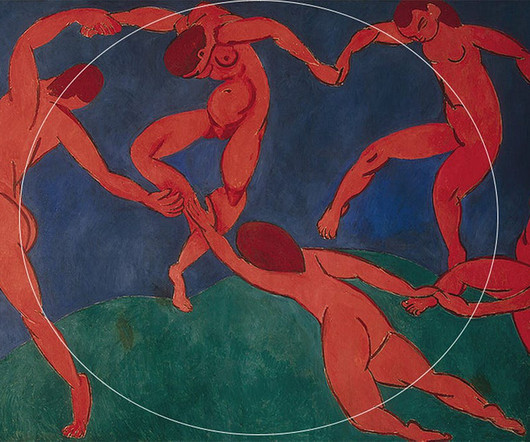
Although the iOS7 icon grid was a guide for designers to help app icons look "harmonious," an astute Redditor also spotted the uncanny use of the same grid in Apple’s devices. Along with the right choice of colors, Matisse’s painting achieves the same “harmonious” relationship. Or when art meets science?


Let's personalize your content