Sat.Mar 22, 2014 - Fri.Mar 28, 2014

article thumbnail

Introducing Surveyor

Fonts by Hoefler&Co.

We’re delighted to introduce Surveyor, a new family of fonts for print and web, and sizes large and small. I love maps, and not just for their vintage charm. I admire them as highly functional pieces of design, packing extraordinary amounts of information into small spaces, and invisibly educating readers about how they’re meant to be read.

Fonts 40
article thumbnail

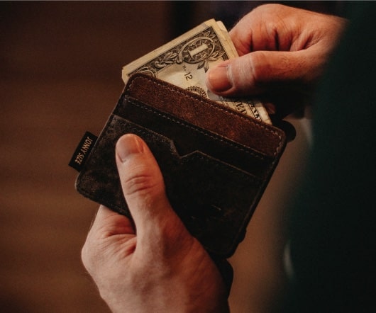
How to be rich like me

Paul Jarvis

People assume that if they’ve heard of you, you must be raking it in. The theory goes something like this: If you work for yourself and make things that other people buy, your income magically skyroc.

48
article thumbnail

The Making of Neon Signs

Fonts by Hoefler&Co.

Every neon sign has a “start and stop position,” a point on each letter where a tube begins and ends. I’ve just learned how a signmaker chooses this point, and it’s something I’d never have guessed. It is fascinating. It’s nothing to do with a letter’s traditional form, or its cultural dimensions. These are the first ways that neon speaks to us, whether it’s the plainspoken sans serif on a liquor store or the elaborate fantasy of a Las Vegas casino

Sports 41