June, 2008

article thumbnail

Letterror at the Graphic Design Museum

Fonts by Hoefler&Co.

When we first met at the ATypI conference in 1989, Erik van Blokland, Just van Rossum and I were branded the “young turks” of typography, presumably because we were fifteen years younger than ATypI’s next-youngest member. Erik and Just were already notorious for their Beowolf project, which hacked the PostScript format in order to produce self-randomizing letterforms; this mischievous bit of culture jamming was enough to endear them to me, and to a generation of designers who h

article thumbnail

Illustration Art - Untitled Article

Illustration Art

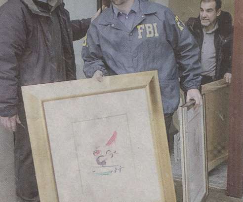
In February, the FBI seized the inventory of a Chicago art gallery accused of selling tens of millions of dollars worth of fake prints by Picasso, Miro, Dali and Chagall. Photo by Richard Chapman / Chicago Sun Times The copies looked exactly like the real thing. (Local newspapers reported, "Even the experts are amazed at how good the stuff is.") Each print was sold with an impressive looking "certificate of authentication.

Gallery 36
Insiders

Sign Up for our Newsletter

This site is protected by reCAPTCHA and the Google Privacy Policy and Terms of Service apply.

Trending Sources

article thumbnail

What’s in a Font Name

Fonts by Hoefler&Co.

For as long as fonts have had names, they’ve had bad names. Historical inaccuracies have been common for two hundred years: typefounders of the Industrial Revolution groped for historical labels to apply to newly-invented styles ( Egyptian , Gothic , etc.), and it wasn’t long before typefaces began to bear the recognizable names of unrelated historical figures.

Fonts 41
article thumbnail

The World’s First Graphic Design Museum

Fonts by Hoefler&Co.

On my first trip to Amsterdam in 1992, I spent a couple of hours having lunch at a pleasant café on Willemsparkweg. I’d come from seeing an exhibit of the year’s best book covers, and planned to spend the rest of the afternoon exploring the city’s many graphic design bookshops. A passing waiter, noticing my open sketchbook, idly asked me what I was designing.

article thumbnail

Let's Talk Trends: Designing for Maximum Impact

Speaker: Amber Asay, Creative Director and Founder of award-winning design studio Nice People

Understanding what trends are happening and how they’re impacting the competitive landscape is crucial to providing top dollar design strategy to your clients. With so many trends coming and going, it can be overwhelming to determine which ones you should capitalize on and which ones might not be worth the trouble. In this exclusive webinar with Amber Asay, we’ll explore graphic design trends that need to die, trends that are starting to pick up and why, trends that have come and gone, and how t

article thumbnail

The Living Glagolitic

Fonts by Hoefler&Co.

Last month’s post about Cyrillic and Glagolitic Alphabet Day prompted some great responses from our Croatian colleagues, where the Glagolitic alphabet, a national treasure, lives on. Vjeran Andrašić wrote from the island of Krk , home to some of Croatia’s most significant Glagolitic inscriptions, and this morning I learned of this marvelous Glagolitic font, made by designer Nikola Djurek during his time at the Type & Media program at KABK in Den Haag.

Fonts 40

More Trending

article thumbnail

My Thoughts Exactly

Fonts by Hoefler&Co.

Hey where can I get that Brady Bunch font. Hey where can I get that Star Wars font. Hey where can I get that Red Dwarf font. Do you have font that looks like bird feet? Do you have font that looks like cat paws? Do you have any “futuristic” fonts? Do you have any “hip hop” fonts? Do you have any “retro” fonts? Do you have fonts that are retro but don’t look retro?

Fonts 40
article thumbnail

Favicon Unmasked

Fonts by Hoefler&Co.

Designer Randy Pfeil wrote to ask the burning question, “what the heck is the favicon for typography.com? All I can see is a pixelated masked-man. What’s the story?” In a signature bit of H&Co atavism, it’s a sort, otherwise known as a piece of printing type, seen in profile. The printing surface — uncoincidentally called the “type face” — is at the top.

Print 40
article thumbnail

Springtype

Fonts by Hoefler&Co.

I’ve been trying to find a type specimen book from the Italian foundry of Nebiolo for twenty years, and this morning one finally turned up: the Campionario Caratteri e Fregi Tipografici of 1928. Here’s a sample of what’s inside, perfect for a beautiful spring day in New York! —JH.

40