article thumbnail

Recharger Unwind

Mindsparkle Mag

Caserne developed the visual identity using a warm palette following 2021’s most popular trend, color gradients! Luckily, the printing industry rapidly improved its technology, so we can now witness sleek color transitions on paper. And nothing says more ‘digitalized world’ than this technique.

article thumbnail

“Ray’s Hand” Illuminates Half of the Iconic Eames Partnership

Design Milk

Her focus was always about identifying, extrapolating, and creating for the need of each situation, in both her personal life and professional life – from a bouquet for a photograph to an exhibit graphic to a toy to a picnic to a furniture prototype.” The visuals she paints of the Eames Office are eye-bogglingly good.

Insiders

Sign Up for our Newsletter

This site is protected by reCAPTCHA and the Google Privacy Policy and Terms of Service apply.

Trending Sources

article thumbnail

Serving Sculpture

Mindsparkle Mag

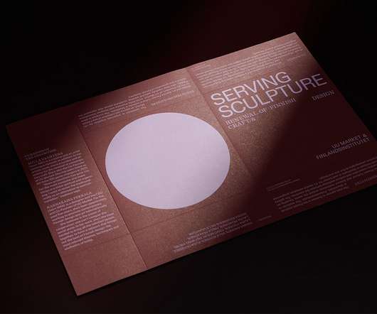
All the visual elements, from imagery to colors and typography, express this contrast of classy versus playful; function versus fun. The objective was to create a bold, fun, yet credible visual identity. It now distinguishes itself from Nordic design brands’ conventionally minimalistic, fair, and polished visuality.

article thumbnail

21 Famous Graphic Designers That Anyone in the Design Industry Needs to Know in 2023

Shillington

She also designed the exhibition graphics for the Filipino American Centennial Exhibition in 1998, which featured playful typography and bright colours to celebrate Filipino-American culture. Eddie Opara Eddie Opara is a British-born graphic designer of Nigerian descent.