This site uses cookies to improve your experience. To help us insure we adhere to various privacy regulations, please select your country/region of residence. If you do not select a country, we will assume you are from the United States. Select your Cookie Settings or view our Privacy Policy and Terms of Use.
Cookie Settings
Cookies and similar technologies are used on this website for proper function of the website, for tracking performance analytics and for marketing purposes. We and some of our third-party providers may use cookie data for various purposes. Please review the cookie settings below and choose your preference.
Used for the proper function of the website
Used for monitoring website traffic and interactions
Cookie Settings
Cookies and similar technologies are used on this website for proper function of the website, for tracking performance analytics and for marketing purposes. We and some of our third-party providers may use cookie data for various purposes. Please review the cookie settings below and choose your preference.
Strictly Necessary: Used for the proper function of the website
Performance/Analytics: Used for monitoring website traffic and interactions
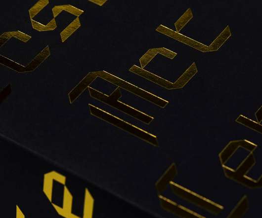
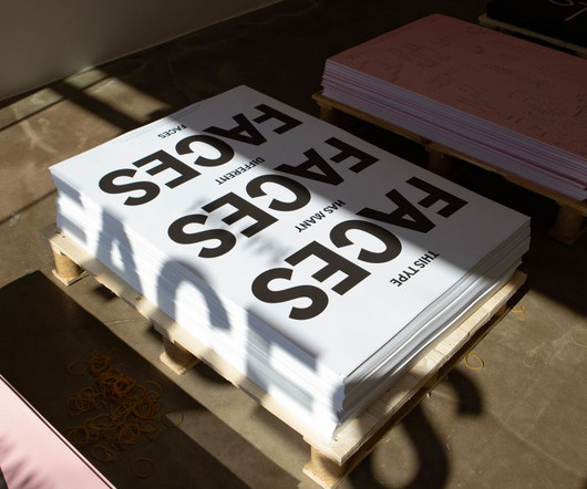
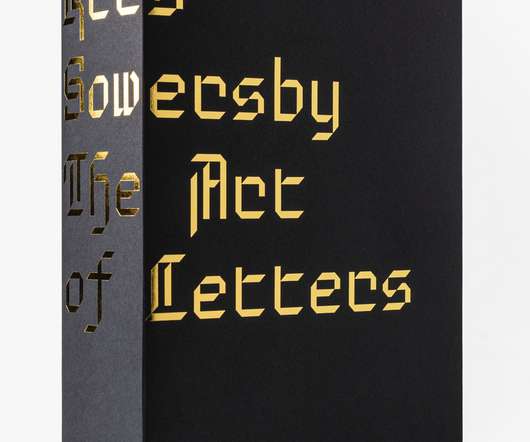
KrisSowersby: The Art of Letters. Formist Editions has released KrisSowersby: The Art of Letters, a visual feast of letterforms celebrating one of the world’s leading type designers. We are surrounded by letters. As Sowersby expresses, “There is no definitive form of the alphabet.
The result is a clear system of letters and symbols that takes information beyond standard text communication, making it a great choice for wayfinding and signage. Netto's extensive set of symbols and pictograms have been designed to integrate with the look and systematic design of its letters.
South East is a sans serif type family loosely inspired by the shapes and compositions seen in the curved forms and varying letter heights of Hangul, the Korean alphabet, which is intended for vertical reading. This tension between strict geometry and loopy, hand-held lettering was central to the design of the new font.
Running to a hefty 800 pages, and filled with double-page spreads of giant letterforms, The Art of Letters aims to question and explore the relationship between art, function and form when it comes to type design. Art of Letters is published by Formist Editions, priced $90; formisteditions.co.
Everett originally emerged during Nolan Paparelli's studies at ECAL (University of Art & Design Lausanne) in 2015 and was inspired by the work of the American photographer Daniel Everett. The serifs and the terminals are sharp, and the axis of the letters is varied. It has a mechanical skeleton, and the forms are largely geometric.
Epicene by KrisSowersby. Designer: KrisSowersby. I love the lowercase letter ‘a’ and that’s enough!”. Ale Paul, Buenos Aires-based typeface designer, educator, and art director. Yevgeniy Anfalov, Hannover-based visual designer and art director. Foundry: Klim Type. Lenora by Vojt?ch
We organize all of the trending information in your field so you don't have to. Join 66,000+ users and stay up to date on the latest articles your peers are reading.
You know about us, now we want to get to know you!
Let's personalize your content
Let's get even more personalized
We recognize your account from another site in our network, please click 'Send Email' below to continue with verifying your account and setting a password.


Let's personalize your content