Remove 2004 Remove Book Design Remove Print
article thumbnail

14 fonts to fall in love with: trending typefaces that designers adore

Creative Boom

The weights variation from Hairline to Super with corresponding italics form a coherent and versatile family, making it suitable for book design, poster design, branding, signage systems and more. This is a strongly contrasted, edgy, blazing serif typeface suitable for display purposes on screens and in print.

Fonts 546
article thumbnail

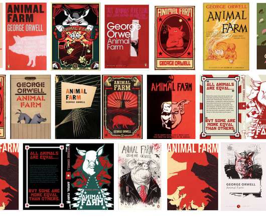
“Animal Farm” & the Evolution of the Dust Jacket

Thinking Design

Throughout the 1820s, publishers began covering annuals in a sort of wrapping paper, printed with minimal text, enough to identify the volume—these were referred to as “dust jackets”. He requested that the publisher print the title of his latest book, The Hunting of the Snark, on the spine of the “paper wrapper”.

Insiders

Sign Up for our Newsletter

This site is protected by reCAPTCHA and the Google Privacy Policy and Terms of Service apply.

article thumbnail

“Animal Farm” & the Evolution of the Dust Jacket

Thinking Design

Throughout the 1820s, publishers began covering annuals in a sort of wrapping paper, printed with minimal text, enough to identify the volume—these were referred to as “dust jackets”. He requested that the publisher print the title of his latest book, The Hunting of the Snark, on the spine of the “paper wrapper”.

article thumbnail

Patrick Thomas & his PULP silkscreen prints respond to the era of "truth decay"

Type room

A-Z presents , exhibition , Patrick Thomas , talk , Berlin , fake news , truth , artivism , silkscreen , silkscreening prints , newspaper , printing. Between 2004–05 he was Graphic Research Fellow at Liverpool John Moores University and since October 2013 he is a professor of visual communication at the Stuttgart State Academy of Art.

Print 40
article thumbnail

10 Best Books on Graphic Design: A Deep Dive into Visual Creativity

Inkbot Design

Müller-Brockmann demonstrates how they may also: Direct viewers’ eyes Create rhythm within designs Establish visual hierarchy Bring together different elements into one cohesive whole It was first published in 1981, yet Grid Systems in Graphic Design remains more relevant today. Because good design principles are timeless.

article thumbnail

The 37 Best Design Books to Level Up Your Skills

Inkbot Design

Perfect for beginners, it introduces universally applicable design concepts like proximity, alignment, contrast, scale, visual hierarchy and more across four concise chapters. With practical applications for print and digital media, mini-exercises let you put lessons into practice as you go.

article thumbnail

Uncharacteristic Characters

Fonts by Hoefler&Co.

I often use printed maps as an example of how sophisticated typography can educate users about how something works, without the need to refer people elsewhere for instructions. ” These are some of my drawings from 2005, to explore how the basic design might develop. The typographic family tree is forever growing.