Remove tiempos-headline
article thumbnail

Top 10 Times New Roman alternatives for designers

Creative Boom

Tiempos by Kris Sowersby. Tiempos began life as an optimisation of Galaxie Copernicus (based on Plantin) for a Spanish newspaper redesign. Tiempos Text is robust, legible and clear, making it perfect for economic typesetting. Tiempos by Kris Sowersby, as used by Bureau Nuits for Fimeb. Stanley by Ludovic Balland.

article thumbnail

10 Fresh Font Pairings for Editorial Design in 2020

Shillington

Tiempos Headline and Visuelt. Tiempos Headline is a modern serif for display typography. Specifically designed to fit more words into a column without sacrificing legibility, this font represents a great choice for both running copy and headlines.

Fonts 69
Insiders

Sign Up for our Newsletter

This site is protected by reCAPTCHA and the Google Privacy Policy and Terms of Service apply.

article thumbnail

Edelson

Typewolf

Fonts: Matter , Tiempos Headline , Tiempos Text , DM Mono

Fonts 129
article thumbnail

Zenchef

Typewolf

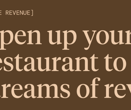
Fonts: Tiempos Headline , DM Sans , DM Mono

Fonts 64
article thumbnail

Dutch

Typewolf

Fonts: Tiempos Headline , Founders Grotesk

Fonts 59
article thumbnail

Enterprise Tech 30

Typewolf

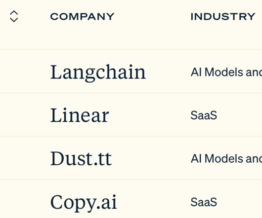
Fonts: Söhne , Tiempos Headline , Tiempos Text

Fonts 52