Tangent revitalises Turner Prize identity in a fusion of art and accessibility
Innovative design meets coastal inspiration – we take a closer look at the Glasgow branding studio's vision for one of the world's most celebrated visual arts awards.
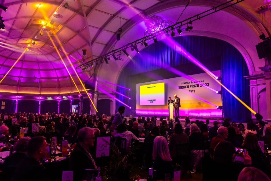
Glasgow-based Tangent has successfully reimagined the visual identity for the prestigious Turner Prize, an accolade that has been at the forefront of contemporary British art since 1984. Hosted biennially at Tate Britain and various other venues across the UK, the Turner Prize's latest iteration found a home at Towner Eastbourne, coinciding with the gallery's 100th-anniversary celebrations.
The challenge of creating a new visual identity for such a significant event fell to Tangent, a branding agency with a track record of excellence in this field. Previously, it had worked wonders for the Turner Prize hosted by Tramway in Glasgow, and its expertise was once again sought after for this year's event.
David Whyte, co-founder of Tangent, shares insights into their approach: "In the art world, identities can be exclusive. Our aim was to break this mould, creating something that resonates with everyone, mirroring Towner's inclusive ethos."
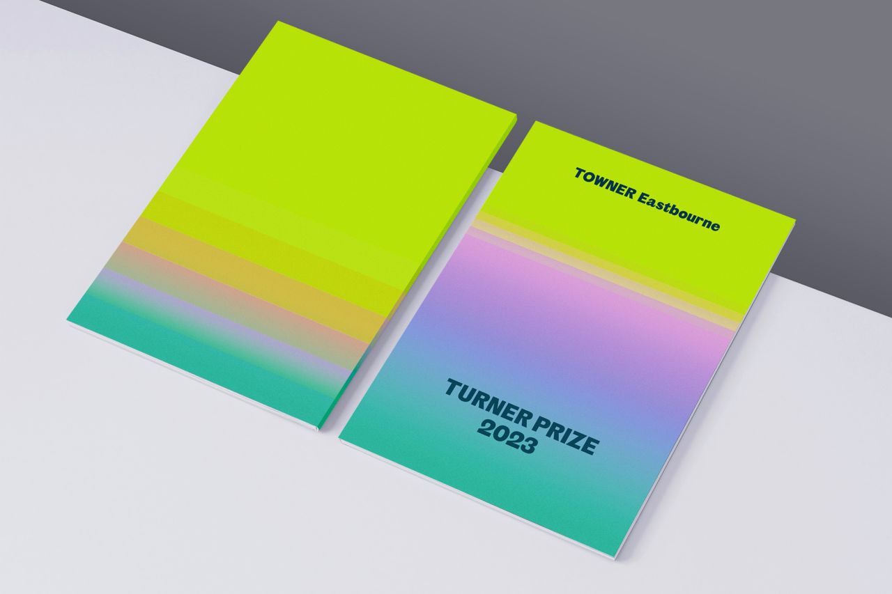
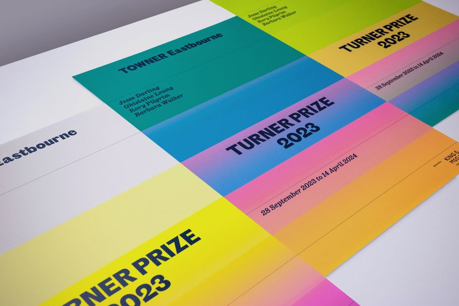
Tangent's design cleverly integrates the existing Towner brand elements, such as typography and colour, presenting the Turner Prize as a natural extension of Towner's identity. This integration was particularly pertinent given the gallery's centennial celebrations.
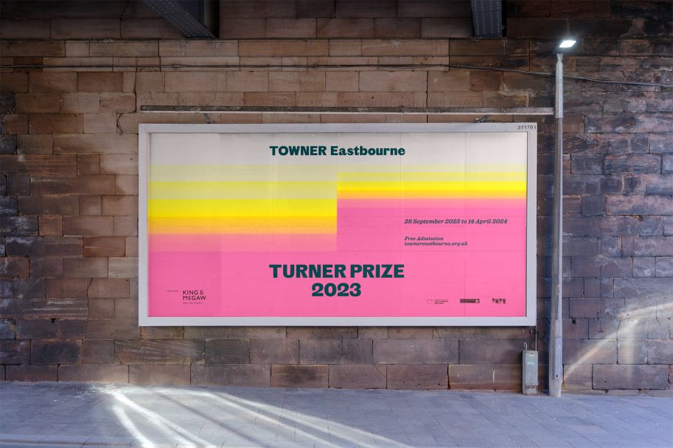
Whyte elaborates on their inspiration: "We looked to the local environment from the outset. Eastbourne is a beautiful coastal town, home to a beachfront that still bears all the hallmarks of a classic Victorian seaside resort. The identity we developed has no fixed messaging but instead presents a suggestive visual aesthetic based on the movement of tides that was used to support diverse messaging at different stages of the campaign."
But the visual theme symbolises more than just the local geography. It represents renewal, the cyclic nature of art, and the continuous public discourse fostered by the Turner Prize. "The tides flow quickly up, crash on the South Downs and recede slowly back – timeless, yet marking the passage of time", Whyte adds. "At a basic level, the visuals and warm colour scheme represent the location and serve as bearers for typography and image, but they also suggest underlying connotations that we were interested in. Renewal, things washing away, the ebb and flow of art styles and concerns over the years."
Whyte believes this 'ebb and flow' also evokes the two-and-fro of an ongoing conversation. "It conveys that the Turner Prize fundamentally exists to promote public debate around new developments in contemporary British art. The accessible, bright styling of the identity was developed to encourage the public to feel empowered to participate in this conversation," he says. This dynamic concept was reflected across various mediums, from digital and social media to print and outdoor advertising.
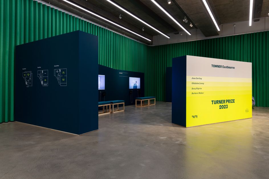
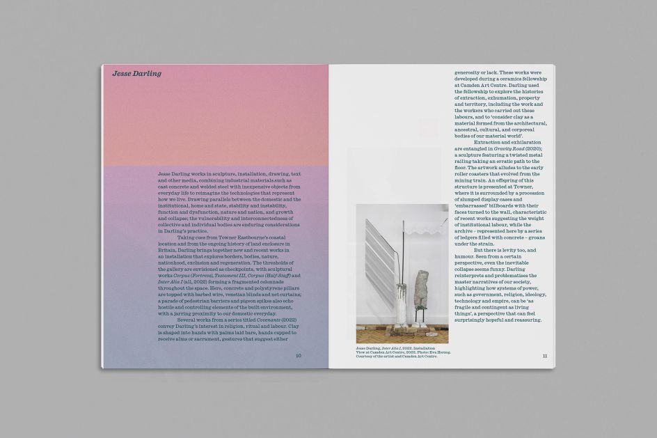
In the exhibition space, the identity was subtly reimagined, using minimalist lines and typography to complement the artworks of the shortlisted artists Jesse Darling, Ghislaine Leung, Rory Pilgrim, and Barbara Walker.
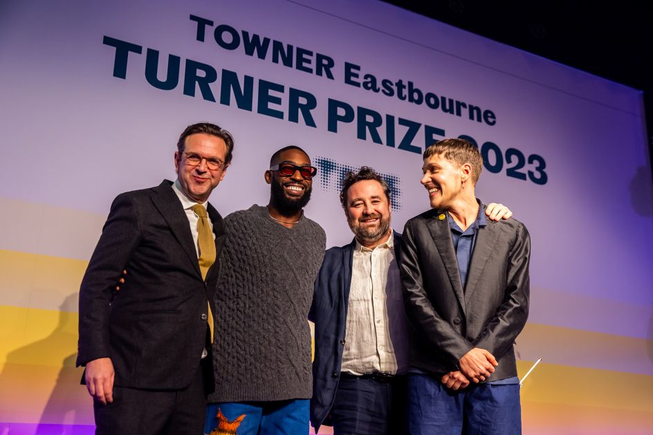
Jesse Darling, the prize recipient, captivated audiences with artwork created from materials gathered in Eastbourne that reflected Britain's contemporary political and cultural landscape. Darling's poignant acceptance speech underscored the importance of art's accessibility, reaffirming Tangent's vision for the Turner Prize identity.


](https://www.creativeboom.com/upload/articles/86/862919952c0ad18439004228895a431dc6e45ffc_732.jpg)


. Image courtesy of the designer.](https://www.creativeboom.com/upload/articles/24/24f4101f925e08ac7e10b45bb22a16936b50f6ee_732.jpg)