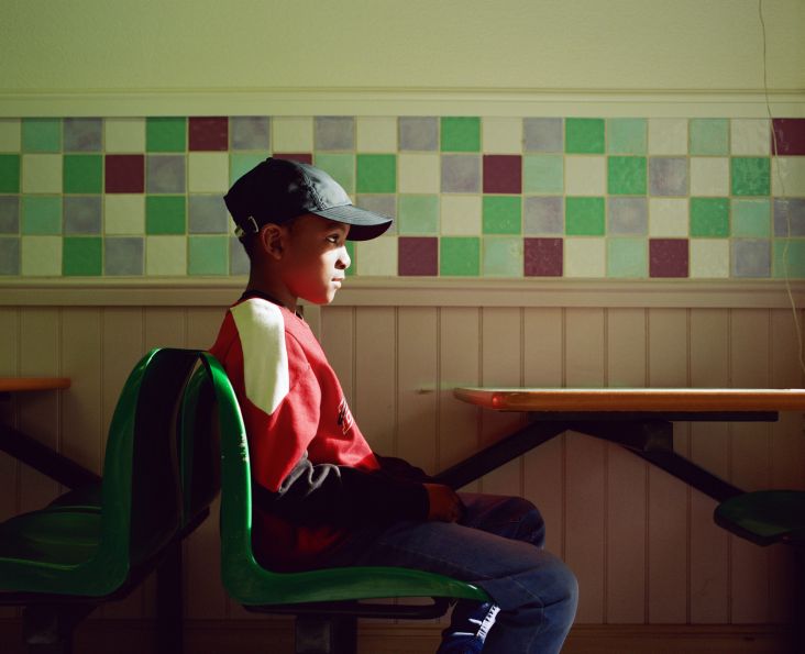
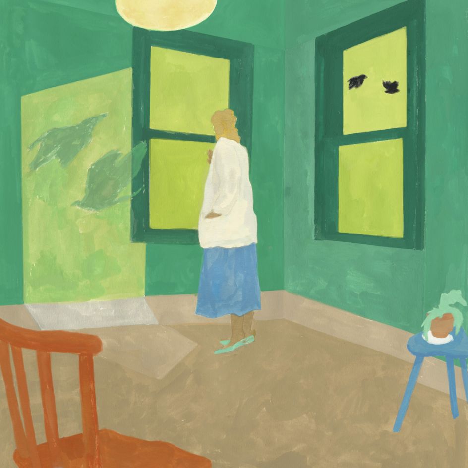
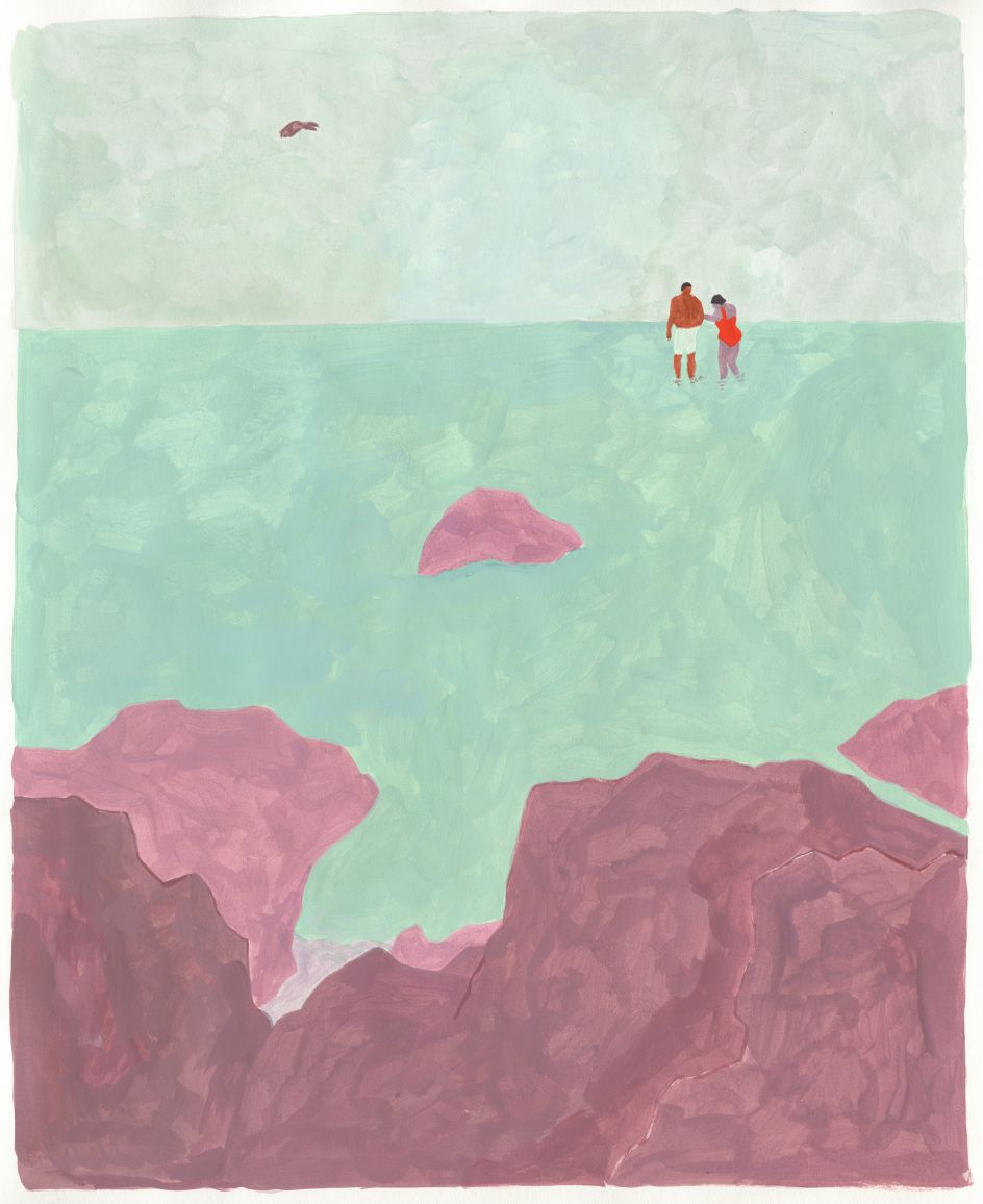
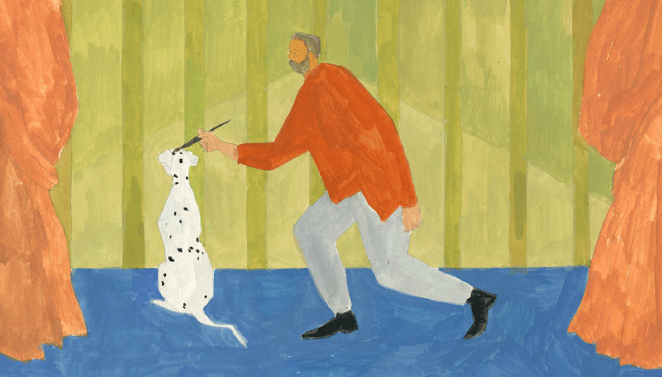
Dror Cohen's paintings use simple forms and bold colours to create a poetic sense of space
New York-based illustrator Dror Cohen creates delicate yet striking paintings that use minimal details to maximum effect. We caught up with her to learn how she applies colour and composition so expertly.
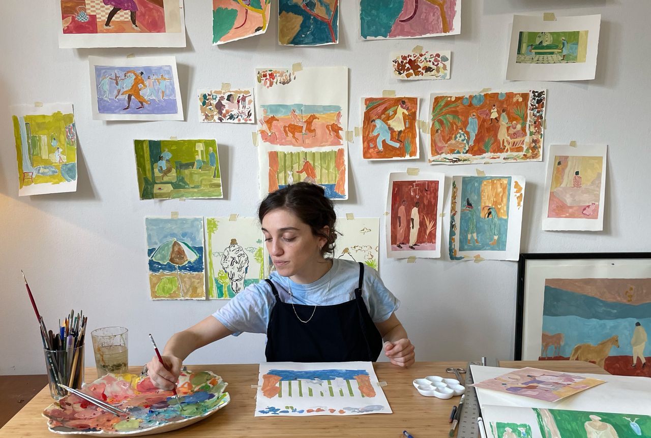
The world of illustration contains many wonderful artists who cram their pictures with intricate details and dazzling colours in order to attract attention. On the other end of the spectrum, there's Dror Cohen, whose textured paintings act as a refreshing palette cleanser and draw the viewer in with their sparse details.
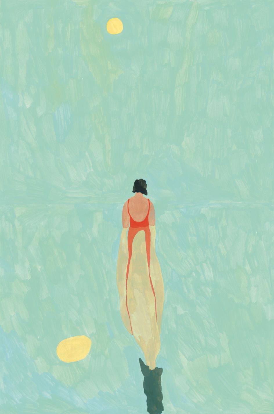
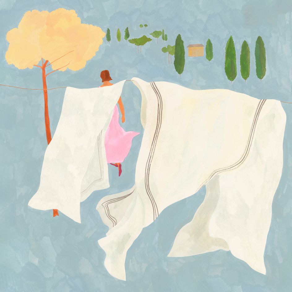
Depicting everything from hung-up laundry blowing on the line to a swimmer's reflection rippling in the water, Dror's paintings have appeared in The New Yorker, The New York Times and The Washington Post, to name a few. Hand-painted with thin layers of gouache, along with some additional pencil work, these illustrations are the culmination of her childhood fascination with drawing.
"When I was a young child - about 8 - I started going to drawing lessons," Dror tells Creative Boom. "For the entire three hours, I would just look through books of paintings and photo magazines. Even today, between and during projects, I spend a lot of time looking for references - this often includes interesting compositions, colour palettes, and people in motion or dressed in an interesting way."
Dror followed this passion through to higher education, where she studied illustration at Bezalel in Jerusalem, then later for one semester at HAW in Hamburg. "Both places had some really good teachers," she says. "As a student, I experimented with many techniques - aquarelle, pencils, oil and gouache, ink, printmaking, etc.
"I didn't stick with any one technique until after graduating. Then I moved to New York and interned at a printmaking workshop and later at a small and friendly book publisher. At the same time, I worked on my own paintings until painting took over."
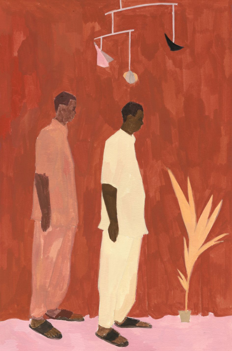
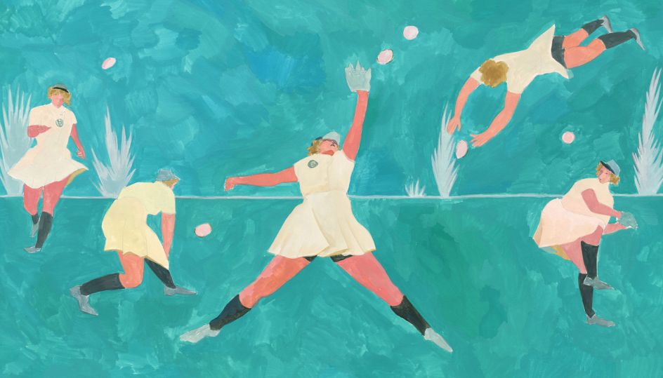
Inspired by the colour arrangement of Milton Avery and the manual composition of Jockum Nordstrum, Dror seeks to capture a similarly free and flowing style in her work. She is also interested in creating a parallel and dreamlike universe in her paintings. "For this reason, another big source of inspiration is the stage, in particular theatre and dance," she reveals. "I like the works of Pina Bausch for their everyday quality and the abundance of expression and feeling conveyed entirely through body language, costumes, and set.
"I also admire Oscar Schlemmer for the expressive lack of movement in their work and the distance between characters within a space. Recently I discovered the writing of Max Porter, which I like for its discomforting atmosphere, daydream-like storytelling and real feeling."
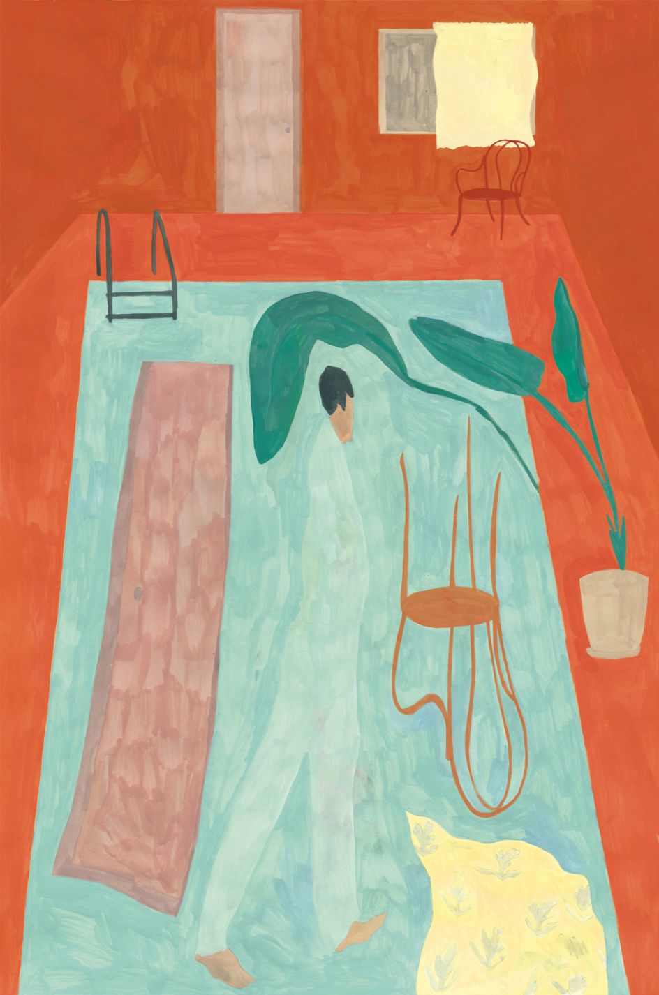
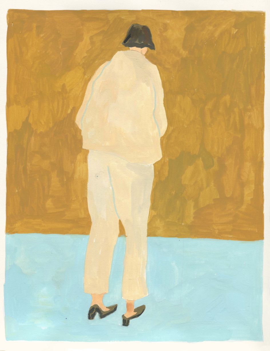
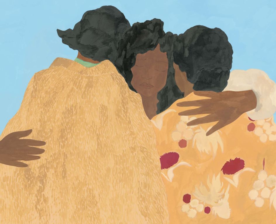
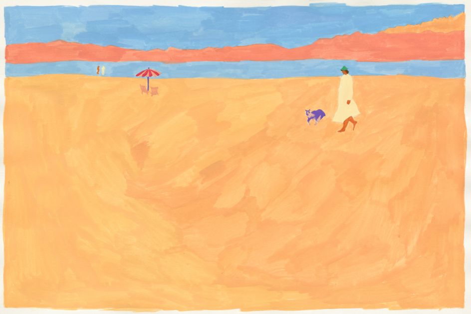
These influences have combined to create the simplified forms and bold colours that populate Dror's paintings. It's part of her aspirations to establish a "poetic sense of space" through clever use of flat perspectives, lack of spatial depth, and no real focal points. "This creates scenes that are tapestry-like or reminiscent of a stage," she explains,
"Objects and characters move in a way that slightly violates the rules of space, like in Persian miniatures or Chinese scrolls. Sometimes the space is concise, featuring only colour and a horizon line. Using flat areas of bold colour contributes to this, as well as setting the atmosphere for a scene."
Many of Dror's paintings are commissioned as editorial illustrations, providing her with an interesting starting point or story she can get her teeth into. "When I love a story, I feel like I'm collaborating with the writer, which is something that I enjoy very much," she says. The turnaround of this style of work also lends itself to the sketch-like freedom she aims to capture in her paintings. "There is something light in a sketch that is sometimes lost in a finished painting. You can see the lightness of the hand."
This lightness of brush mark is usually the last step in a long creative process, though. Dror still constantly collects imagery that can be of use for a painting, and it takes her many iterations to settle on the right colours and composition. "I move things on the page, making them a little bigger or a little smaller," she says. "As I change things around, I try to build a self-contained space. Even if the scene only has a horizon line, the objects don't appear floating, but are part of space."
Dror only starts to work in colour after laying down a general sketch. "I try different palettes in a very rough manner, trying to strike a balance. Here, I don't pay much attention to the contents of the painting; I just try to make each colourful shape work together with the one next to it and as part of a whole. It matters less if a shape is someone's hair, a vase, or a dress. All objects are the same in this respect."
Interestingly, Dror has recently noticed that her surroundings have started to inform her colour choices. "For example, moving to New York and noticing the seasons has influenced the palettes I work with. I've started using more vivid colours than I would in Israel, where everything is always more than a little dusty."
While Dror's paintings may be noticeable thanks to their hand-painted finish, she also uses her computer a lot behind the scenes. "It allows for so much flexibility in my process," she says. "Since the schedule for editorial work is usually very short, I learnt to do most of the development digitally. I can test many options for composition and colour before starting to work with actual paint.
"But when it comes to the painting itself, I have far greater confidence in my hand. I have confidence in the random way it works and even in its inaccuracies. It works better than anything I can plan and foresee. Some people can also be free like that in digital painting, but I can't. For the same reason, I always try to solve a brief by using external references rather than relying on what I can come up with on my own. It is an active and planned search for serendipity.
"I also love the material itself, seeing the brushstroke or the pencil line in the underlying sketch. I think these details invite the viewer to spend a little more time with a piece. And that's a nice quality, given that there is always so much else to see."
Editor's Picks


Trending


](https://www.creativeboom.com/upload/articles/86/862919952c0ad18439004228895a431dc6e45ffc_732.jpg)

Podcasts


Editor's Picks
Further Reading