Out of Place Studio's identity for nature education scheme hits all the right notes
The National Education Nature Park is a scheme to help educate kids about nature. Design agency Out of Place Studio explains how it crafted its visual identity.
It's a common complaint among parents and grandparents these days. "Kids never go outside and have fun in the fresh air; they just sit around staring into their phones." Well, that may be true, but is that really surprising?
When my generation was growing up in the 1970s and 1980s, most of us had no choice. On holidays and weekends, we were unceremoniously chucked out of the house in the morning and told to play outside till we were called in for tea. Nowadays, it's the exact opposite. Children are forbidden from roaming unaccompanied, and adults often don't have time to take them anywhere fun.
To help square this circle, the Natural History Museum has created the National Education Nature Park. It's not one single park but a scheme to link up a vast network of natural spaces connected with nurseries, schools and colleges, all working together.
This free programme, whose full title is The National Education Nature Park and Climate Action Awards, provides educators with the resources, support and guidance needed to put nature at the heart of education. And they've partnered with Out of Place Studio – a Bradford-based design agency specialising in arts organisations, charities and the third sector – to create a new visual identity for the scheme.
Throughout the process, Out of Place Studio worked closely with representatives from the Natural History Museum and other partners to ensure there was a unified vision from start to finish.
The brief
The Natural History Museum was commissioned by the Department for Education to lead a partnership to create the National Education Nature Park and Climate Action Awards, a programme designed to drive and increase engagement with nature for all children and young people.
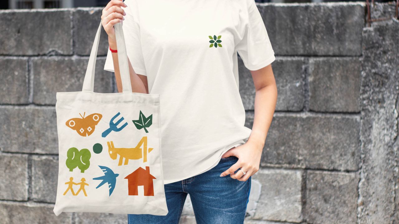
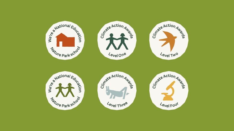
From creating pollinator-friendly habitats where diversity can thrive to digging ponds, the nature park will showcase an environment that supports climate resilience and teaches life-long skills. Out of Place was commissioned to create a visual identity that would appeal to its audience of educators and pupils from early years through to college.
The solution
Out of Place Studio's aim was to take a holistic approach. As there were many organisations within the partnership, including the Royal Horticultural Society and The Royal Society, the brand needed to appeal to a diversity of audiences while being able to sit alongside partner logos and identities in a wide range of documents.
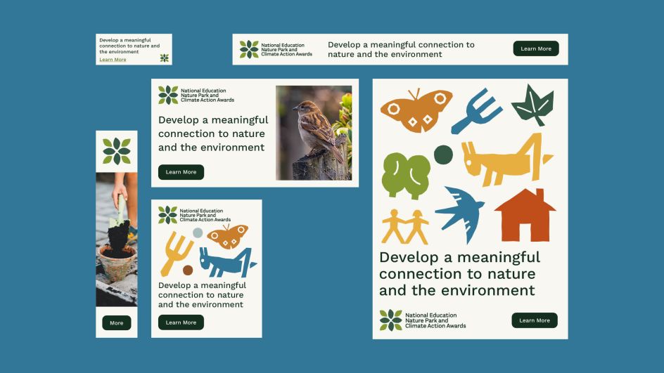
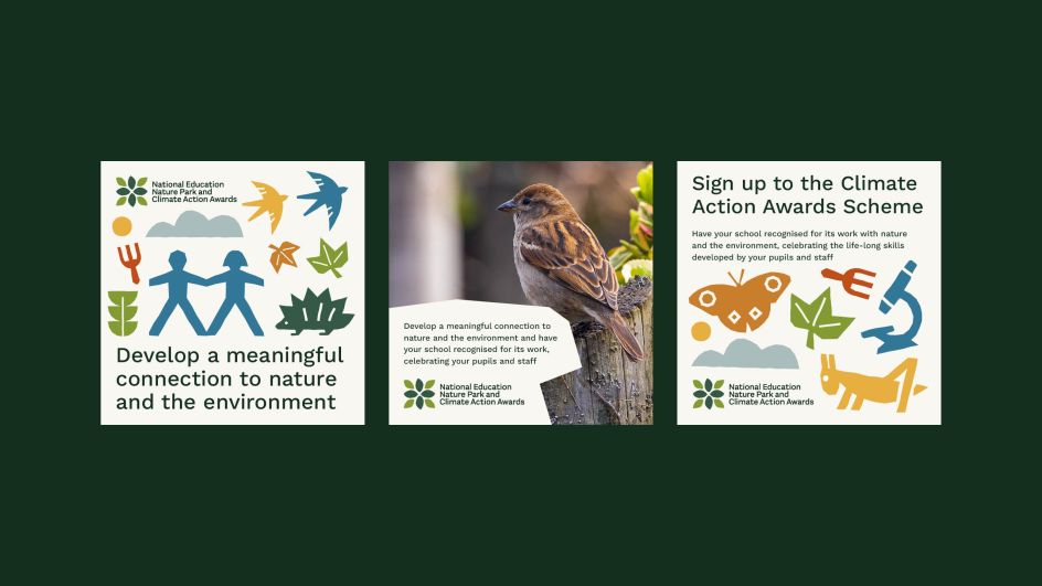
The programme is aimed at teachers and educators of young people of all ages, from early years to college and further education, and needed a wide appeal. As a result, accessibility was at the forefront of all work, using colour, type, illustration and language that is inclusive, friendly, positive and engaging.
"It was important to us that the brand could be accessible to as many institutions as possible," the studio says. "So open-source tools – for example, the typeface – were used to provide maximum flexibility and ease of use, enabling everyone from internal staff to teachers and practitioners to work with the visual identity."
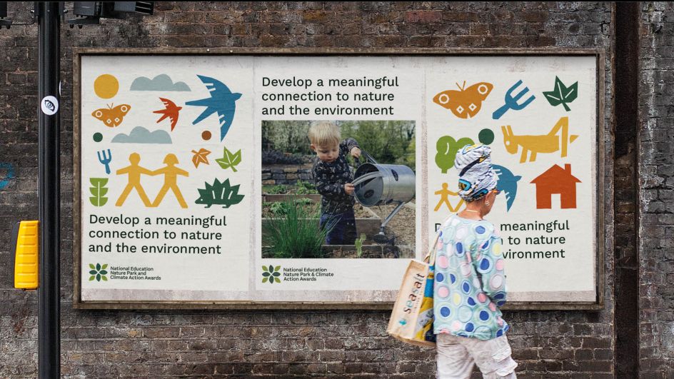
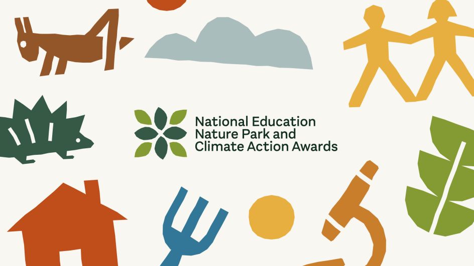
The visual identity
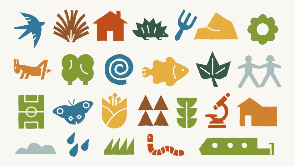
"Many approaches were tested," the studio adds. "But the one that felt the most natural was the one that harkened back to our childhoods, creating rubbings of trees and scrapbooks of plants and animal drawings. Recreating this sense of joy in exploration was something that felt paramount to the National Education Nature Park.
"Most of the illustrative elements were derived from the nature that surrounds us on a daily basis. For example, the colours that make up the brand palette are all taken from plants, flowers, and insects you can find in British gardens and parks. These were only ever so slightly adjusted – where needed – to meet accessibility requirements."
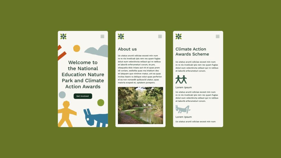
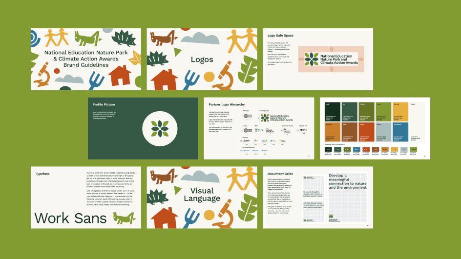
Careful consideration was given to all of the different users that would work with the brand. This included internal teams, external designers, and individuals working in education. The aim was to have a flexible system that users of varying skill levels could apply without compromising the quality of output.
"We wanted to ensure a teacher could as easily make a poster to put up in their classroom as an experienced development agency could use the brand to design and build a website," the studio says. "This level of access and usability was very important to us."
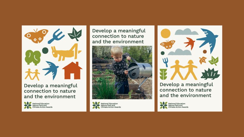
Overall, we love the way the studio has created bright and colourful imagery that will appeal to kids without being patronising to them. Indeed, if this were adult-only branding, it would still work. Given the wide age range targeted by this scheme, it's impressive that Out of Place has hit all the right notes in this way.
Laura Jacklin, communications manager of the Natural History Museum, adds: "'We are so pleased with the exciting, playful and unique design that Out of Place has produced. We needed a design that appeals to a wide audience, is flexible and adaptable for various digital and physical assets, and works for further purposes such as data visualisation and presentations.
"Out of Place worked closely with us and our partners to produce a beautiful design which has recently been used on our brand new website and ties the many elements of the programme together perfectly. We look forward to using it on future assets, helping us in our journey of empowering young people to make a positive difference to both their own and nature's future.
"Embedding nature across everyday teaching and learning will give every child and young person in England the opportunity to develop a meaningful connection to nature, contribute to nature recovery across the country and build resilience for a changing world."
Editor's Picks


Trending


](https://www.creativeboom.com/upload/articles/86/862919952c0ad18439004228895a431dc6e45ffc_732.jpg)


Editor's Picks
Further Reading