National Landscapes' new identity is a simple concept, beautifully executed
Often, the key to a visual identity is a clear concept developed thoughtfully. And the new designs for National Landscapes by Nice and Serious fall straight into that category.
Never heard of National Landscape? Don't feel dumb: neither had we. That's because it's the new name for what used to be called Areas of Outstanding Natural Beauty (AONB).
These are some of the UK's most special landscapes, with huge importance and potential in the fight against climate change and biodiversity loss. And this new brand invites all people to find their own connection with these special landscapes and help unlock their full potential.
It's the work of London agency Nice and Serious, who worked with the National Landscapes Association to unite the network of Areas of Outstanding Natural Beauty under a new, shared identity.
Brand concept
Building on the collaborative consultation work carried out by Mark Sears, Nice and Serious developed a project process built around bringing together the broadest range of perspectives possible. An internal steering group, made up of people working in different areas and roles across the UK, helped provide key insights to develop the direction of the new brand.
An external Creative Council made up of people representing underserved audiences, was also established. The council's input helped to continually strengthen the approach to inclusivity.
The main problem to solve was that awareness of Areas of Outstanding Natural Beauty was sitting below 50% – despite 66% of the UK population living within a 30-minute drive from one. Independent reviews recommended that changing these areas to be called National Landscapes – along with increased powers and resources – would help them better serve the nation.
The key theme Nice and Serious discovered through their research and exploration was centred around the unique interplay between people and landscapes. This symbiotic concept – that people shape landscapes, and landscapes shape people – became their guiding light.
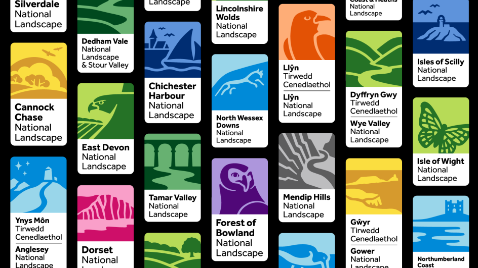
With the name change, there was an opportunity to unite the entire network of 39 AONBs behind a consistent story and design system – as well as welcoming and engaging traditionally underserved audiences.
Brand story
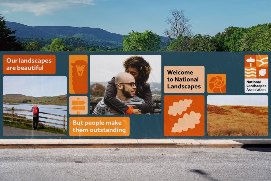
With this direction, Nice and Serious developed a brand story focussed around the idea of National Landscapes representing 'the fabric of us' – a living patchwork, where each square is as essential and unique as each person.
To welcome more people to engage with National Landscapes, they developed a tone of voice built on a foundation of inclusivity. This was based on the principles of finding common ground and acknowledging those who deserve to be seen andard.
On top of this foundation, the tone of voice was designed to be flexible for the broad range of audiences National Landscapes needs to communicate with. On the one hand, it can be bright and united for the more serious convening work they do, and on the other, it can be inquisitive and sensorial to excite and invite the public to create their own connections.
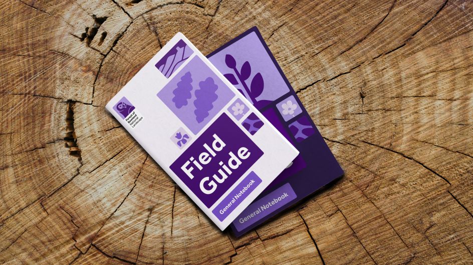
Visual design system
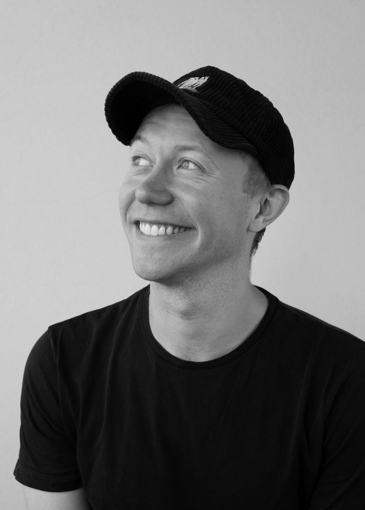
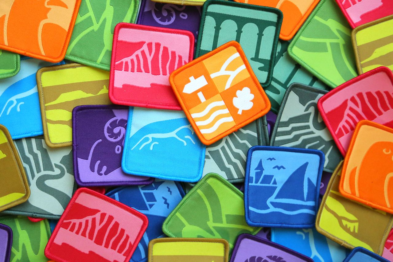
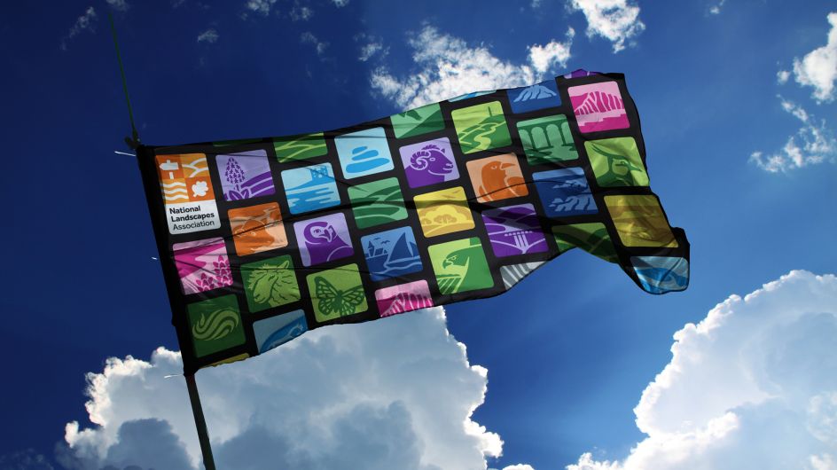
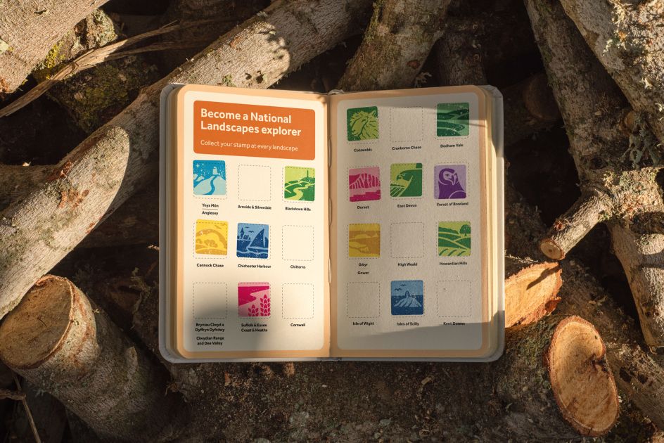
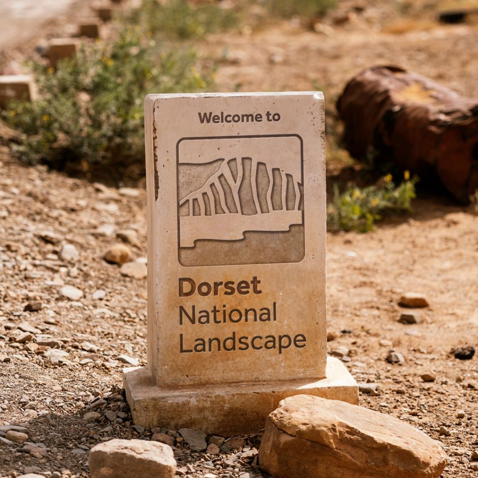
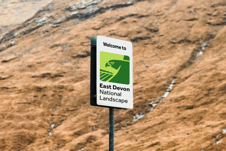
"The idea of the living patchwork underpins the visual design system," explains Peter Larkin, creative director at Nice and Serious. "Each square is as unique as the next – filled with endless patterns of people and place. Up close, these individual patches represent one part of the landscape's story, but step back, and they thread together to form our nation's fabric, one that's vibrant and full of life.
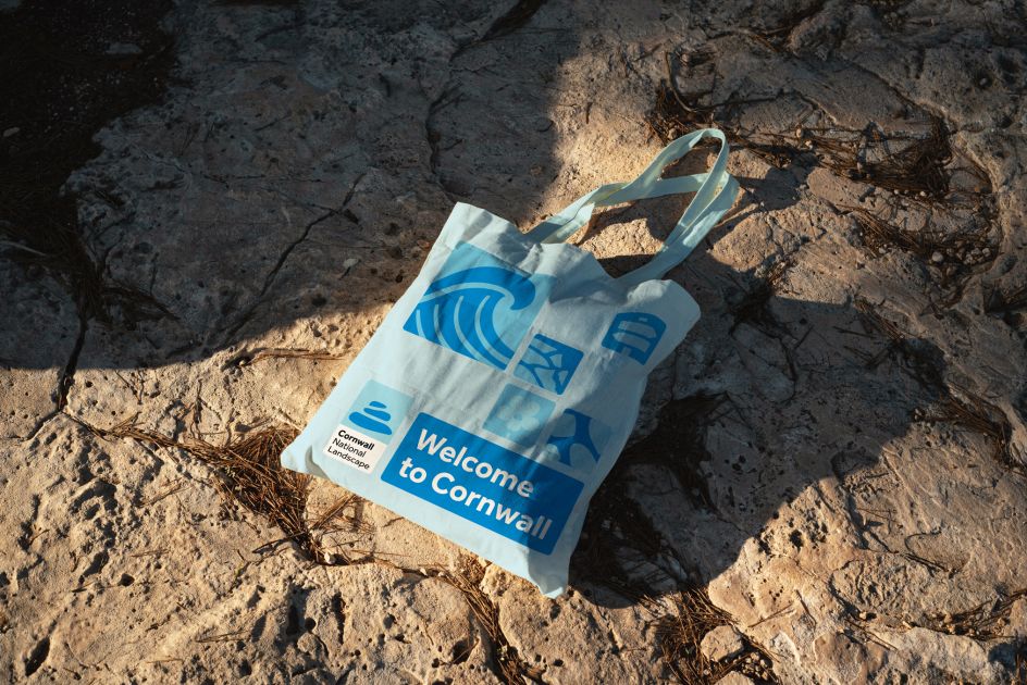
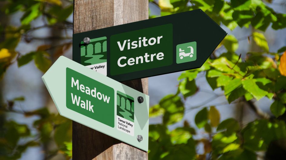
"We developed a purposely imperfect illustration style, inspired by the natural imperfections in the landscapes themselves," he continues. "This style was used to create a unique emblem for each landscape – drawing on their special qualities – which, when combined with other emblems, created the wider graphic language.
"The patchwork idea naturally lent itself to a layout system based on a flexible, dynamic grid, which could be used to house patches of photography, illustration and typography and create endless variations," Peter adds. "The colour system was influenced by the defining colours of UK landscapes, ranging from sandy dunes and rolling grasslands through to deep and vibrant moors and heathlands. This allows each National Landscape team to choose a colour that felt most true to their local personality."
Nice and Serious paid special attention to the accessibility of the visual system. Effra was selected as the main brand typeface, not only for its contemporary, humanist aesthetic but also its open characters, distinguishable letter forms and lack of 'mirroring'. All of these elements help it be more legible for people with dyslexia."
John Watkins, chief executive at the National Landscapes Association, says: "The attention to detail from the N&S team to deeply understanding our complex network of organisations meant the brand narrative they developed was clear, accurate and inspiring. Their creative work absolutely meets the brief. We now have a fresh, modern brand that reflects our organisational aims and gives the National Landscapes network a consistent look and feel, representing their national significance for the very first time."
Ruth Colbridge, communications and advocacy manager at the National Landscapes Association, adds: "The tone of voice work has given us a new way to approach our communications and a framework that will support our family of organisations to speak with a much more united voice, really showing our strength and impact as a network."
Editor's Picks


Trending


](https://www.creativeboom.com/upload/articles/86/862919952c0ad18439004228895a431dc6e45ffc_732.jpg)

Podcasts


Editor's Picks
Further Reading