Kieron Lewis updates The Brownies' Book to inspire a new generation of black children
London-based graphic designer Kieron Lewis has designed a new take on W.E.B. Du Bois' 1920s magazine for black children titled The New Brownies' Book. We caught up with him to hear how he approached the project and why it's one of his proudest pieces of work.
Between 1920 and 1921, civil rights activist and sociologist W.E.B. Du Bois released the first-ever magazine for African-American youth. Named The Brownies' Book, the publication was filled with empowering stories of black role models and inspirational art, stories, letters and activities.
Fast forward 100 years, and the magazine has been revisited by authors Karida L Brown and Charly Palmer. In their new edition, century-old content is featured alongside contemporary art and writing to continue the noble goal of inspiring and empowering black families. To show off these assets to their full potential, they enlisted the services of seasoned designer Kieron Lewis.
Having previously worked on Still Breathing: 100 Black Voices on Racism, 100 Ways to Change the Narrative, Kieron stood out as the ideal candidate to treat this project with the respect and attention to detail it deserves. "As the first periodical for African-American youth, this was an important work in the history of children's literature," he tells Creative Boom. "A century later comes the updated version of the beloved magazine. The New Brownies' Book revives its mission to inspire today's young readers."
Featuring more than 50 new black writers and artists spread out across 208 pages, The New Brownies' Book was a mammoth undertaking to design. Created in collaboration with the authors and the team at publishers Chronicle Books, Kieron quickly realised that he was allowed a lot of creative freedom and flexibility when it came to editorial design.
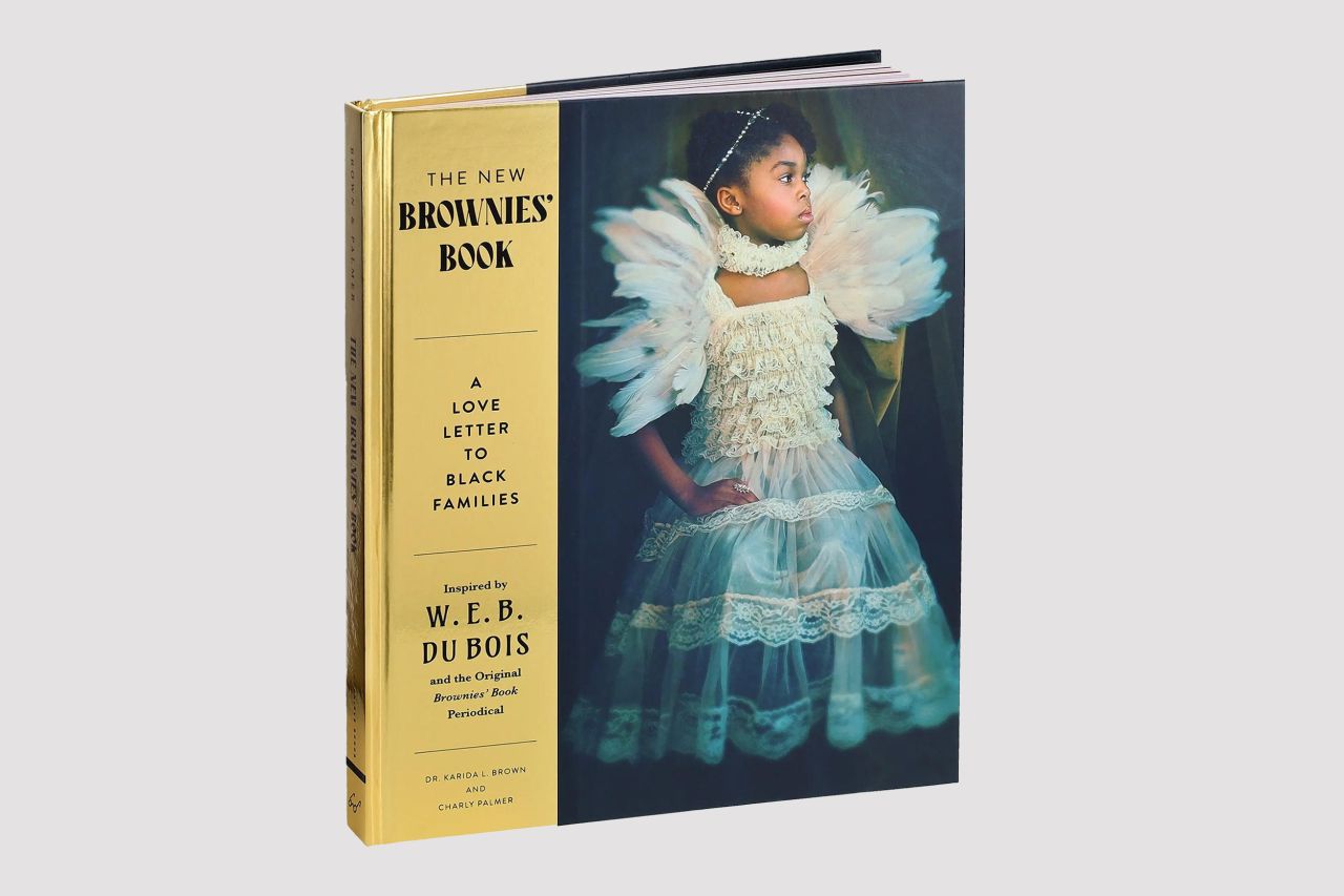
"It was clear from the brief that both Karida and Charly wanted to produce a publication that could be impactful within the black community," he explains. "Not just through the content, but through the printing material and editorial design. By introducing the gold foiling on the cover with such a striking image, we wanted readers to treat this book as almost a piece of art. Something that you would be proud to have showcased on your bookshelf.
"I also feel that a sense of trust with the publishers, authors and myself was established early in the process. As I've designed a few hardback publications of this size before, I think I had enough credit in the bank to justify, in layman's terms… 'I've got this!'"
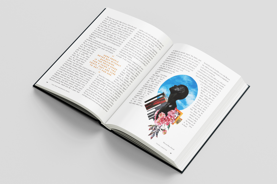
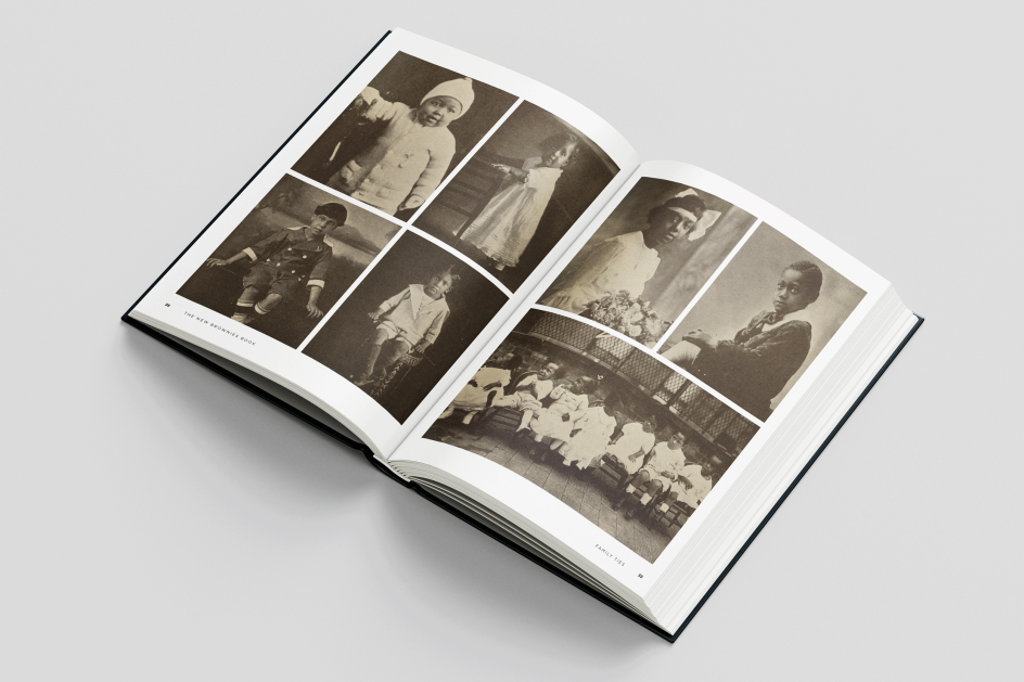
To ensure that the artwork retained its place as the core element of the book's design, Kieron used only the highest-quality imagery available. "I was fortunate to have a lot of incredible artwork sent over from those features," he says. "A lot of images were in black and white, as a lot of content dates from the 1920's. I was keen to go large on these photos to ensure quality and consistency. Especially the images of children, the essence of the publication's nature."
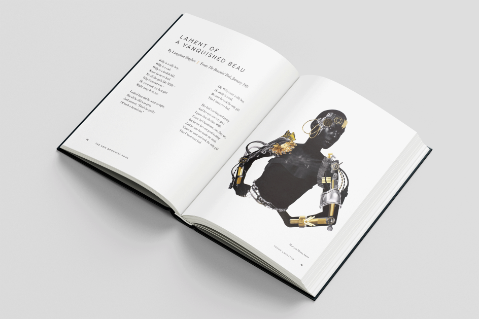
Crucially, he decided to forego graphical and typographic elements as she was keen for the artwork to be the most prominent feature on the spreads. "On selected text-only pages, I have incorporated a grain-like textured background," he adds. "This was to mirror the 'grain-like' effect that some of the original photos from the 1920s had."

Two hundred eight pages is a big design undertaking, but the project size does not seem to have intimidated Kieron. "My nature as a designer has always been that I enjoy a good challenge," he explains. "Creating a hardback publication of this scope requires much time, energy and patience. Certainly not qualities I had a lot when I was growing up, but I've definitely improved over time.
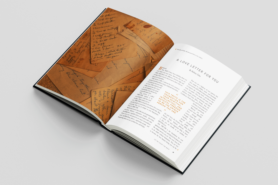
"Ensuring consistency throughout the publication is a must. Working within a 2-column grid, with Baskerville (reg) for the body copy, with Brandon Grotesque (reg, bold) and an 'off-white' background across the entire book, is the foundation of how the work was created.
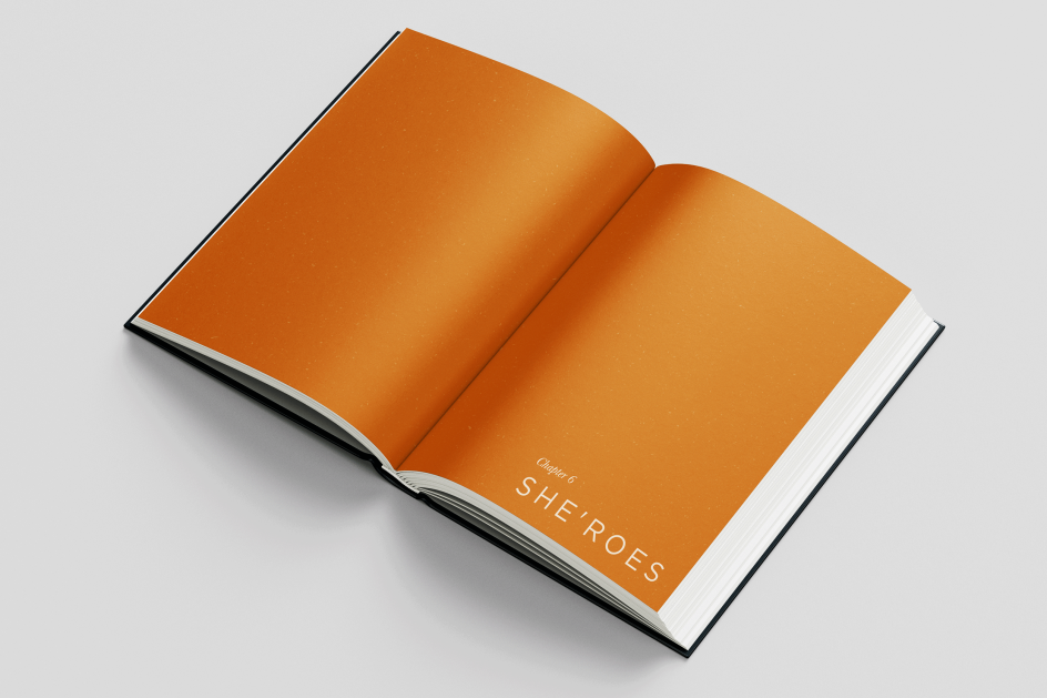
"Predominately, the publication is black and white. However, I wanted to introduce another colour palette to emphasise certain areas. On the opening chapters and the drop caps at the start of each feature, I've used a shade between orange and brown (#ba6c17). This allows the readers to distinguish certain elements clearly and keeps the book looking fresh."
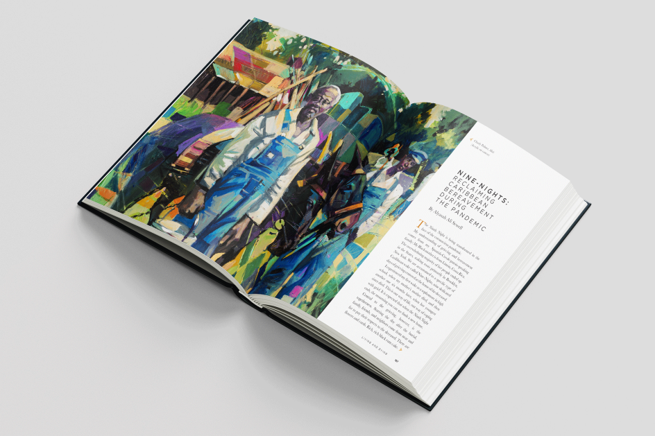
When it came to editing assets from the 1920s, Kieron would usually be working with scanned photographs from ancient archives. "I worked within a grid, usually of four," he says. "This allowed the design to breathe and for the reader to engage with the content easily. But always ensuring quality wasn't compromised." As for artwork from the artists, these could go full bleed on the design because they were presented in very high resolution.
Out of all the challenges presented by the book, though, being organised was something Kieron was keen to stay on top of. "When you have so many different artists and authors sending content at different times, it's very easy to become overwhelmed," he says. "I pride myself on being organised with the way I file assets. I'm the kind of designer who gets annoyed if I see a 'messy' desktop background – not judging anyone out there if this is you!
"I overcame this by introducing a colour-coded system to my process. This is something I do with every publication that I design. [Red = Outstanding assets / Green = Assets received and high res / Orange = Assets received, but requires art working].
"Funny story: this process I adopted when I was a junior designer at an advertising agency, and the Head of Design was obsessed with how we kept track of our assets. At first, I found it way over the top, but now I am forever grateful for this way of working."
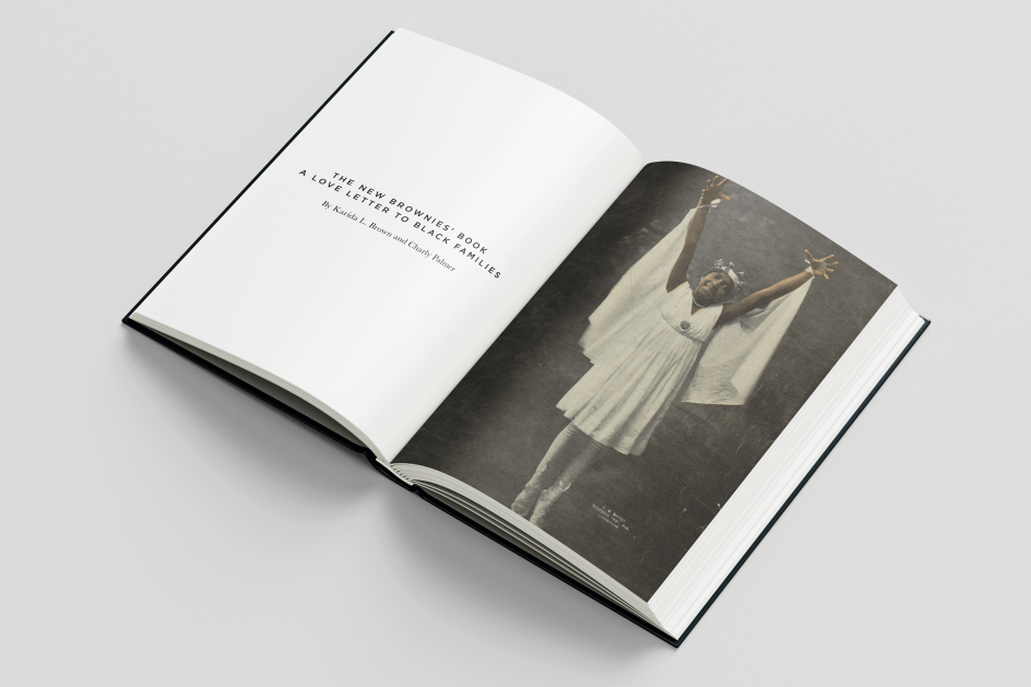
Settling on a cover image was something of a different organisational hurdle. "We had a wide variety of options for the cover, but the chosen one was the one that would have the most impact on our readers and community," says Kieron. "The cover, showing a black girl dressed in a ballerina outfit staring confidently ahead, distils the message that the book's authors want to spread of uplifting."
Kieron's hard, methodical work has paid off, though, and in fact, the New Brownies' Book has quickly become the project he is most proud of for several reasons. "On a personal level, being a black creative and having the opportunity to play a pivotal role in this project meant I could work on such an important publication," he concludes. "Hopefully, this book will positively impact my community and inspire many different people, regardless of race.
"I recently became a father four months ago, and my outlook on life has completely changed! Knowing that a publication such as this one is designed to empower and educate young black children about their history is something I want my daughter to look back on when she is older and feel proud that her father worked on a powerful book. Hopefully, she will also take comfort in reading it one day."
The New Brownies Book: A love letter to black families is now out in the US and will be published in the UK on 21 December 2023 by Chronicle Books.
Editor's Picks


Trending


](https://www.creativeboom.com/upload/articles/86/862919952c0ad18439004228895a431dc6e45ffc_732.jpg)
Podcasts


Editor's Picks
Further Reading