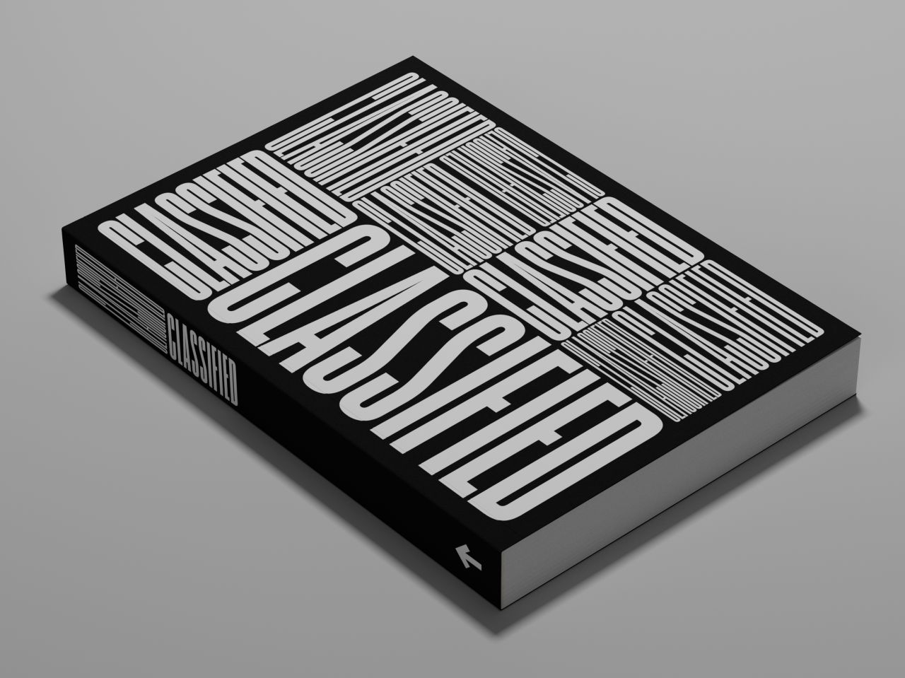
New book highlights how much graphic designers can learn from the small ads of yesteryear
Hamish Smyth discusses the making of the book Classified: Local Ads from America's Small Towns and why it's a must-read for designers in 2023.
If you haven't heard of Standards Manual, the Brooklyn-based, independent publishing imprint founded by designers Jesse Reed and Hamish Smyth in 2014, it's about time you did. They've developed a strong reputation in the creative world for archiving, preserving and publishing design history collections, such as artefacts related to the New York Subway, as well as reprinting standards manuals from the likes of NASA and EPA.
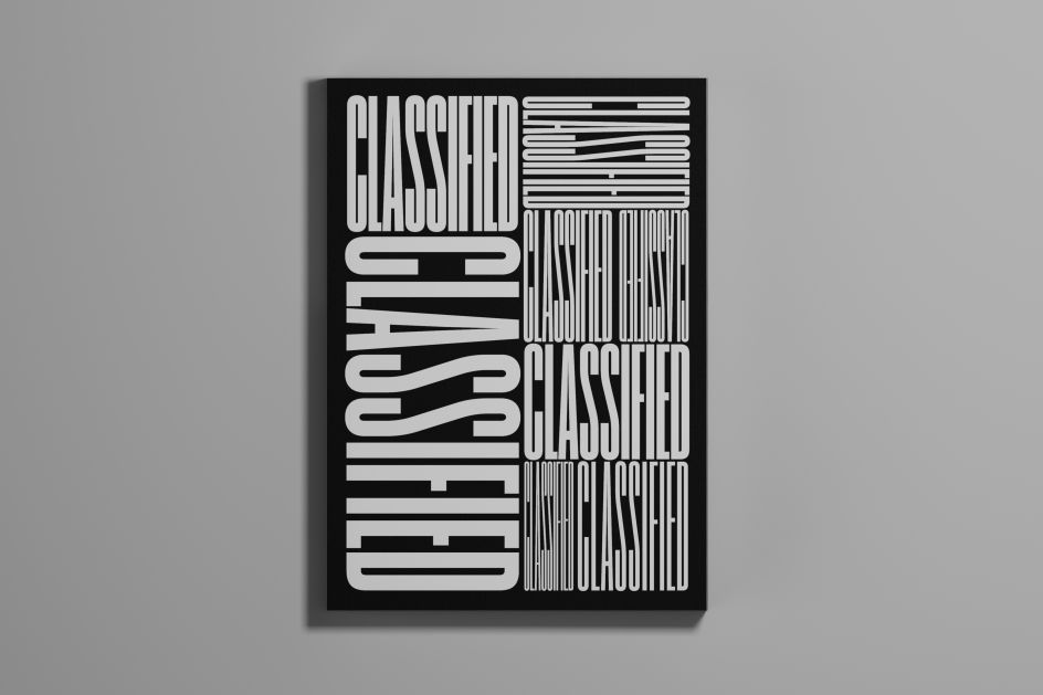
In more recent years, Standards Manual has been branching out to release Standards, a game-changing tool for creating brand guidelines online. Now, they're returning to their publishing roots with their latest book, Classified: Local Ads from America's Small Towns. It features hundreds of classified ads from 1960s and 1970s small-town America, collected and archived by Studio Carnley, a creative agency based in Birmingham, Alabama.
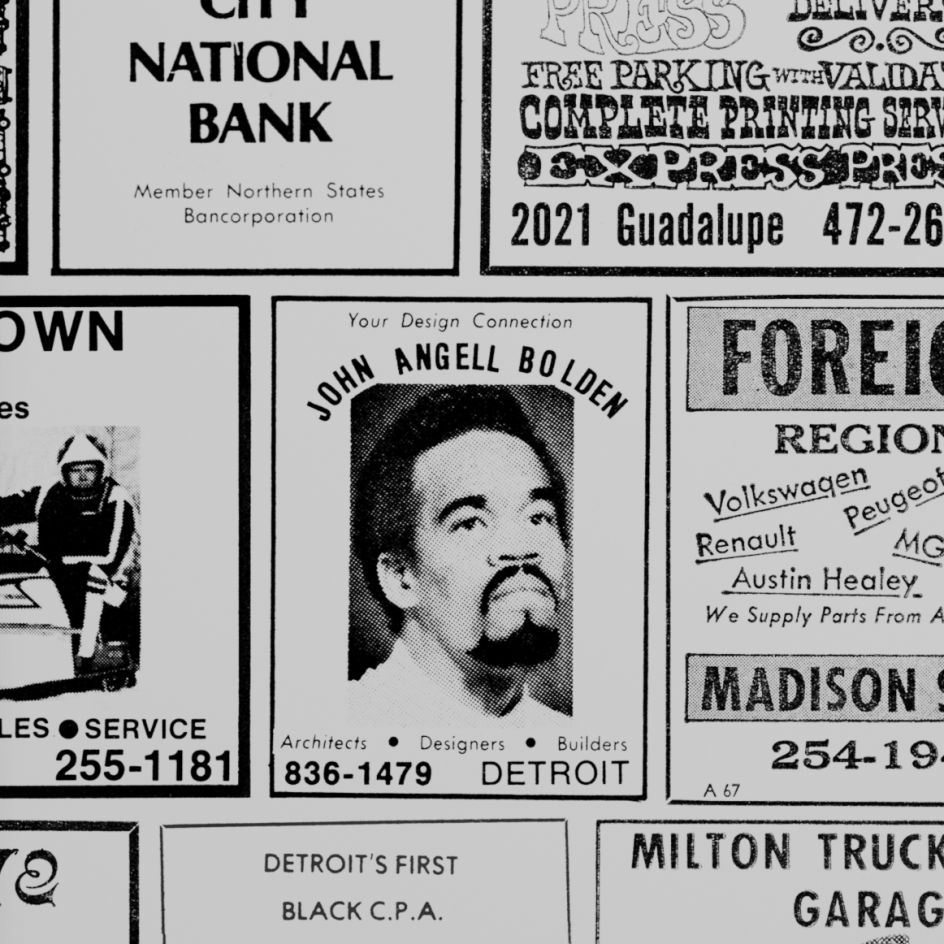
Printed at 1:1 scale and isolated on the page, the collection is a time capsule of a bygone era and a fascinating study of ephemeral graphic design from unknown illustrators, typesetters, printers and graphic artists who all faced the same challenge: how to fit a lot of information in a small rectangle and stand out on a page of other ads. We chatted to Standards Manual founder Hamish Smyth to find out more.
The inspiration
As the title suggests, Classified is a celebration of small-town advertising and the overlooked genius, ingenuity and humour in work created purely to sell but which modern-day graphic designers can now study and learn from. After all, ultimately, designers today are still trying to fit a lot in a small rectangle, just one that appears on a screen rather than paper.
Classified is the 11th title published by Standards Manual, and it's a topic that's close to Hamish's heart. "As I note in the foreword, my first office job was at my local newspaper, designing classified ads," he explains. "But beyond that, it's interesting to examine the often overlooked, everyday design that surrounds us all. This particular collection was also interesting because it focuses on a specific period and location: the small-town America of the 60s and 70s."
We ask if he has a favourite. "There's so much variety that it's hard to pick one," he responds, "but one of them is the ad for Lyles Alabama Style Bar Bar – Be – Que [shown above]. The typography mixes styles, but it all works well together. Why is the Q in Que lower than it should be? And the B in Bar-b-q. Are they mistakes, or did someone do that on purpose? Those are just super-small details, and maybe I'm weird for finding that interesting, but it puts you in the mind of the designer. Were they trying something creative, or just in a hurry?"
Design Process
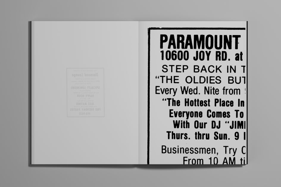
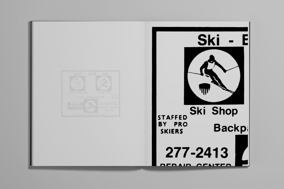
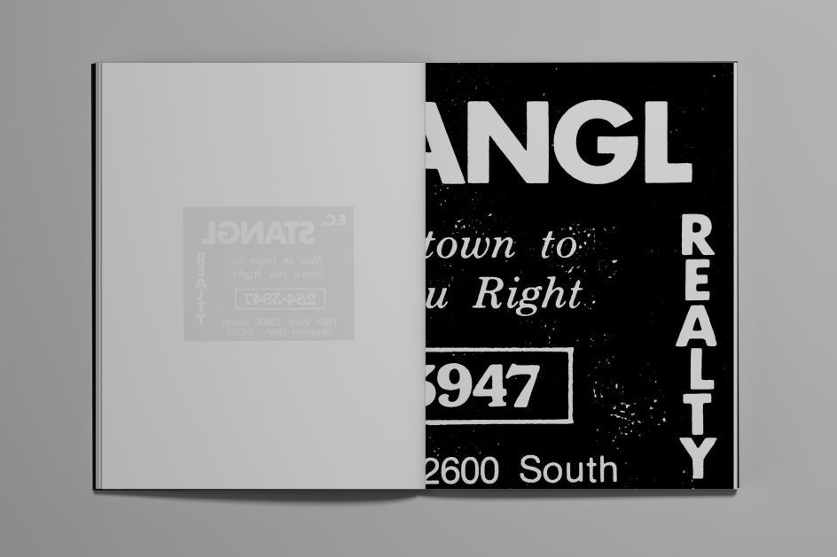
The collection was archived by Shelton and Josh Carnley of Studio Carnley, who began posting them on an Instagram account, with each ad isolated on an all-white background.
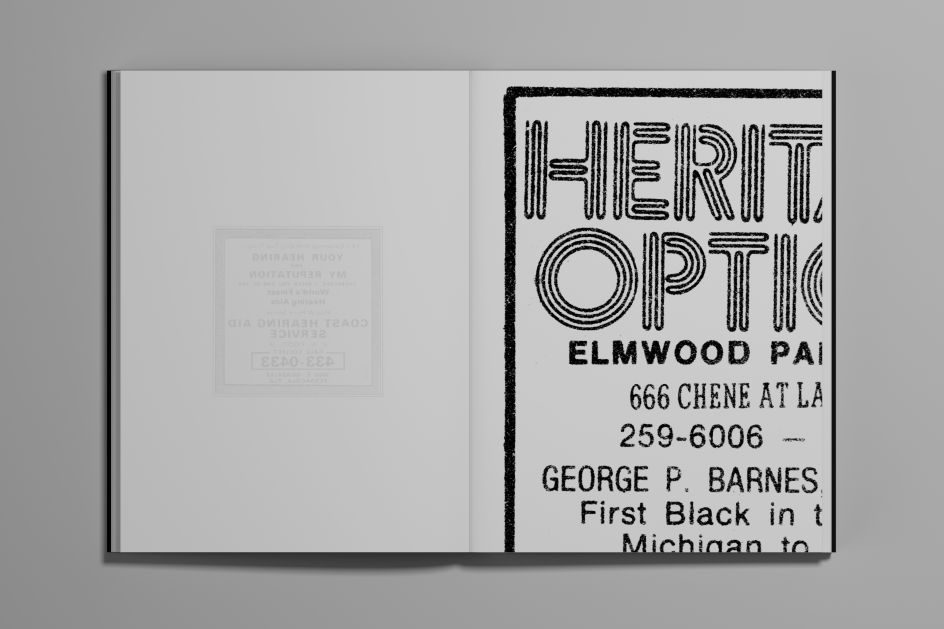
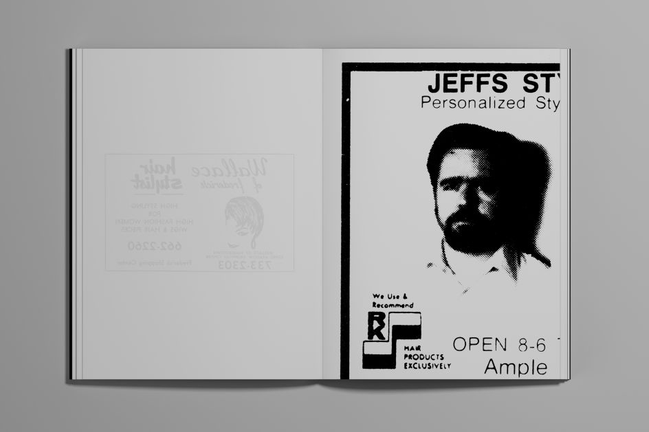
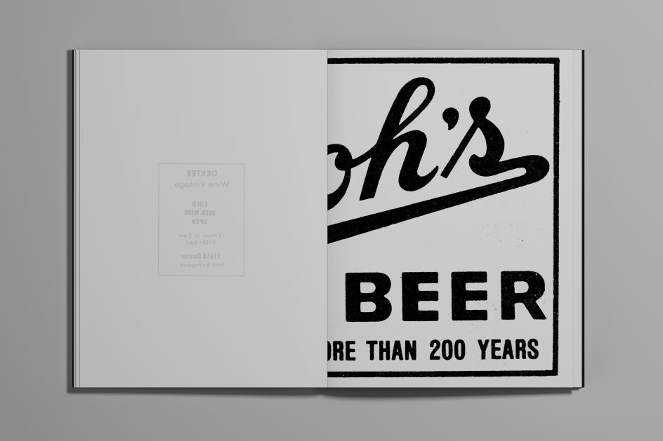
"We thought it was important to keep that aesthetic choice in the book but take it a step further by printing them on thin paper like they would have appeared in phone books," says Hamish. "That means you get show-through to the next page, so each ad is printed on the right-hand leaf – or recto in book terms – which shows through the paper when you turn the page. It makes for an interesting way to see the ad twice: one from the front and one from 'behind' as you turn the leaf."
Learning from the past
As with many Standards Manual projects, this book is a great way for designers in today's digital world to reconnect with an older, analogue design world. And that was the case for those who created it, too.
"Putting the book together was a nice experience remembering what I can of the pre-internet age," says Hamish. "There are no URLs, QR codes, or even colours. Just good old fashioned graphic design, using words and images, and black ink."
Obviously, times have changed since then. "But I think the cool thing about this collection is seeing how advertising used to be consumed," says Hamish. "Today, we avoid ads, but back then, if you wanted to find a local BBQ joint, looking in a directory at classified ads was one of the only choices you had. Today, of course, we'd reach for our phones."
But is that really progress? "For me, there's something nice about not having to scroll through reviews, second-guess yourself, check their Instagrams, and do the same thing for ten different restaurants," says Hamish. "I think I'd go straight to Lyles after seeing this ad. And in a way, there's something nice and nostalgic about the simplicity of it all."
Editor's Picks


Trending


](https://www.creativeboom.com/upload/articles/86/862919952c0ad18439004228895a431dc6e45ffc_732.jpg)
Podcasts


Editor's Picks
Further Reading