NotOnSunday crafts honest and playful identity for CBD brand Unspun
CBD is a fast-emerging category, but what's the best way to market it? NotOnSunday's experience in branding Unspun offers a number of useful pointers.
Many people are talking about CBD right now, but what exactly is it? Well, for the uninitiated, CBD stands for cannabidiol, which is a chemical compound found in the cannabis plant. However, unlike tetrahydrocannabinol (THC), the cannabinoid found in marijuana, CBD does not produce a psychoactive effect or a 'high' sensation.
Instead, it plays a useful role in regulating various physiological processes, including mood, appetite, sleep, immune response, and pain sensation. For this reason, it's widely considered to have positive therapeutic qualities by the medical profession.
Unspun is a Premium CBD brand based around products created by husband and wife team Joe and Gemma Wilde through their own experience of using CBD while living in California. They found that CBD gave them a sense of calm and focus as they balanced the demands of work and family life.
Back in the UK, they were delighted to see CBD entering the mainstream but struggled to find a brand they could trust. This is where the Unspun brand was born.
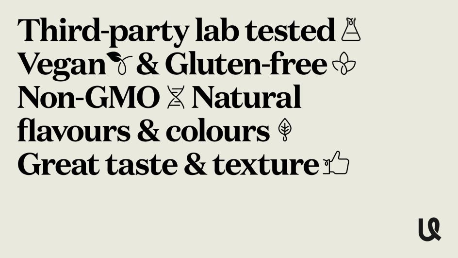
A tightly curated range of broad-spectrum CBD products are made in the UK. Only the best natural ingredients are used in their products, containing only organically grown EU-certified hemp plants that can be traced back to the hemp fields they are grown in.
The brief
London design agency NotOnSunday was tasked with bringing the name, visual identity and packaging to life. Mike Willows, co-founder and creative director, explains how the partnership came about. "Gemma and Joe came across some of our previous work that had been featured online," he recalls. "From initial conversations, we built a nice rapport with them both, and they liked how NotOnSunday explained our process and approach for creating and developing brands."
Gemma and Joe wanted to demystify the world of CBD in a streamlined, honest and fun way, he explains. "When they approached us, they had already drafted a brand strategy through customer research and competitor reviews. Their core values for Unspun were to be approachable, simple, positive and empowering, and our job was to create a brand identity that reflected this.
"Their key goals for us when creating the brand was to give them a visual identity that would differentiate them from an ever-growing crowded marketplace, raise brand awareness and help them to build trust, credibility and customer loyalty."
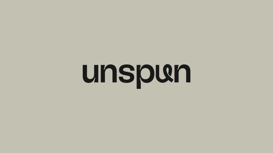
Symbol, logo and typography
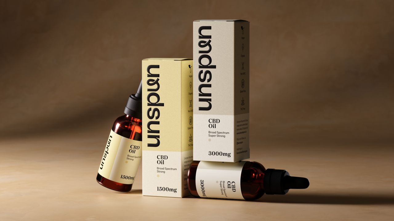
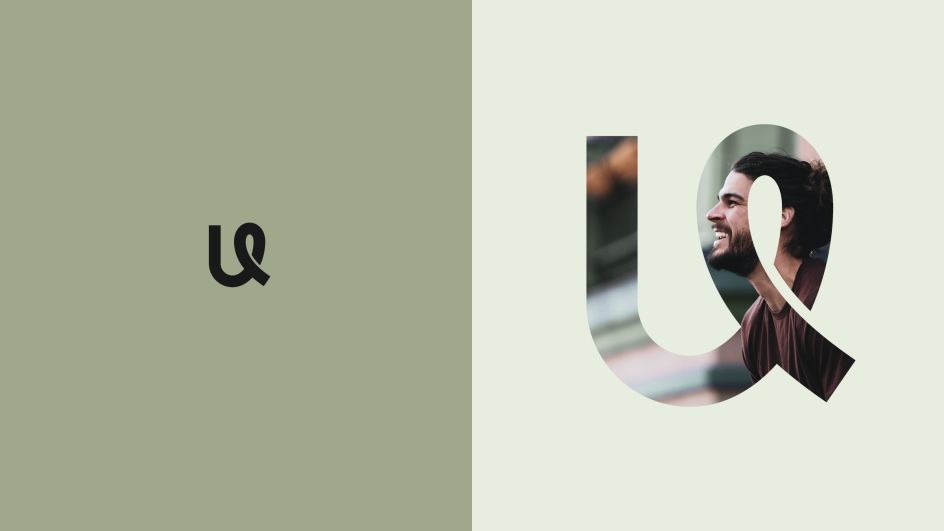
From speaking with Gemma and Joe and agreeing on the creative brief, Unspun came up with three very different approaches they presented. "One of these became the kernel of the 'Unspun u' idea," says Mike. "From our initial conversations, they wanted something that could be ownable and distinctive, so we looked at how we could create this but also ensure it had some relevance to the Unspun name."
The logo was designed and crafted over various stages. "From creating the initial 'u' symbol, we started to explore fonts that could work well and look balanced alongside the u. We found that we liked the characteristics and details of GT Flexa by the lovely Grilli Type Foundry. Once we found the right font, we aligned and adjusted the work marque and u symbol to ensure it was well balanced and had some nice symmetry when used together."
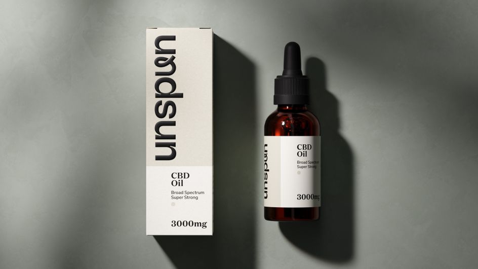
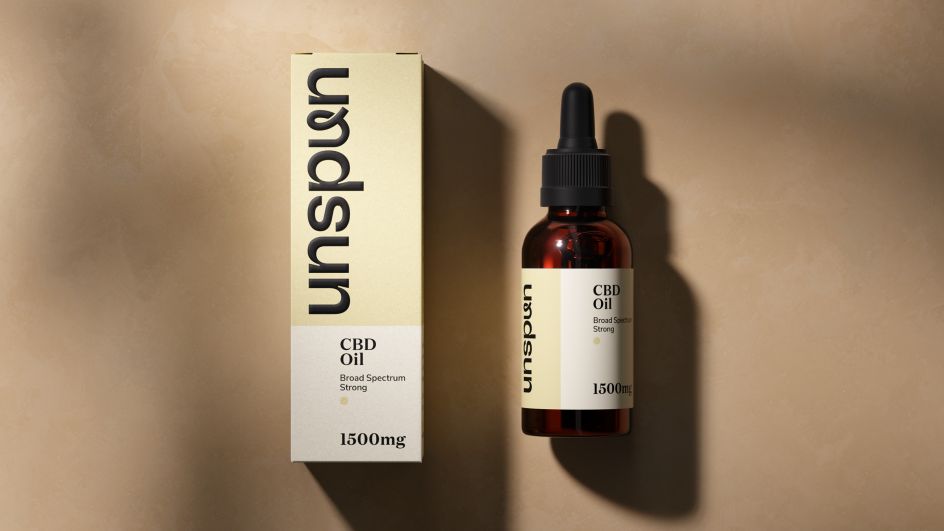
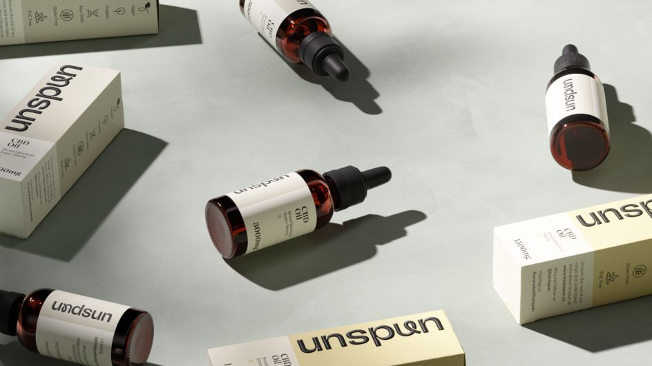
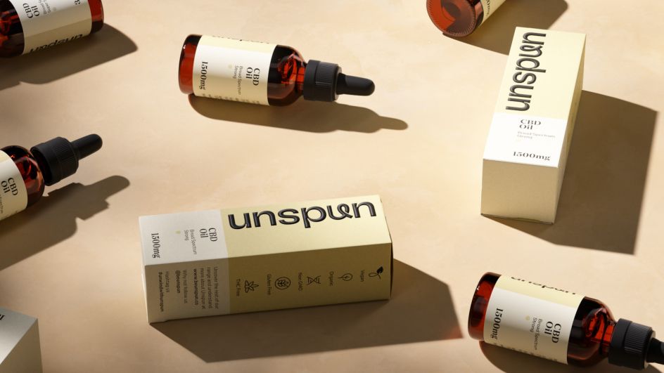
Packaging design
Gemma and Joe wanted their brand and packaging design to be approachable but not bland. "We created the packaging design in tandem with the visual identity to ensure there was a nice balance and correlation between the two," says Mike. "We also explored colours throughout the creative stages and felt the tones of the final brand and packaging were right for the tone of the overall visual identity.
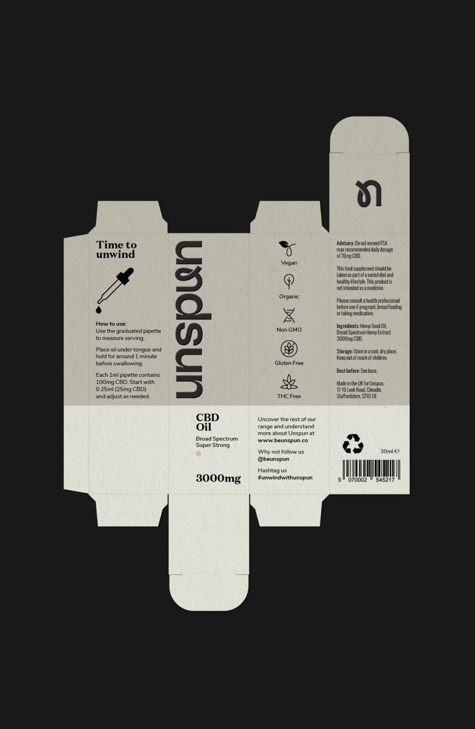
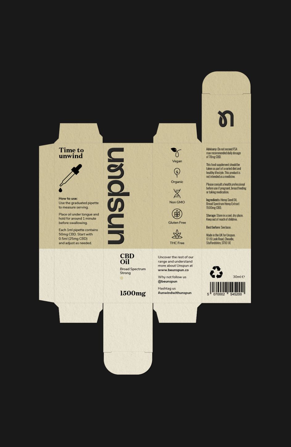
"The two-tone colours on the packs allowed us to pull the strengths and variants away from one another," he adds, "so people could see the offerings were different in strength from not only the text but colours too."
The Unspun team also wanted to ensure their products had a minimum effect on the environment. "Once the packaging had been finalised and confirmed, we brought Nick Stacey on board from ctrl-p studio, who was able to work closely with ourselves, and Gemma and Joe, on the packs and finishes. Advising us on the best approach and materials to use from a sustainability standpoint. The product packaging was designed to be compact, lightweight and easily recyclable, whilst the labels are all biodegradable and printed using non-toxic inks and adhesives."
With Gemma having a background in user experience and Joe coming from a background in business strategy, they already had a good understanding of how they wanted to test the designs, Mike adds. "Our initial creative was taken and presented to their trusted partners in the UK and US. Feedback and comments were consolidated and presented back to us, giving us a really clear direction of the preferred elements and approaches we had created and presented to them."
Summing up
"With Unspun being a startup brand and something very personal to the founders, we wanted to ensure the visual identity and packaging design was on point and met the needs of their target audience," concludes Mike. "Working directly with founders and knowing the challenges and risks they are taking with launching their own brand means there's always that sense of personal responsibility in giving them exactly what they need and want to succeed."
"Working closely with Gemma and Joe throughout the process, we created a brand that felt distinctive and balanced on both an honest and playful position," he adds. "The Unspun brand 'u' was created as a play on the brand name and also meant we had an ownable asset that worked well on its own and within the brand logotype.
"The result is a range of CBD products that can easily adapt and grow using the brand system we created for the launch so that new product lines and other materials can easily be added in the future as the company grows and looks to expand its offering."
"Our experience with NotOnSunday was excellent," says Gemma. "They listened to our needs and worked with us to help refine them. They laid out a clear structure for the project that was easy to follow, and they gave us time to make those critical decisions around brand direction.
"The result is excellent, and customer feedback has been very positive. The design is elegant, elevated and trustworthy: exactly what our customers wanted. From an operational standpoint, it's easy to implement, and they gave us all the tools we need to keep the brand consistent across all our channels. We loved working with NotOnSunday and look forward to doing so again."


](https://www.creativeboom.com/upload/articles/86/862919952c0ad18439004228895a431dc6e45ffc_732.jpg)


. Image courtesy of the designer.](https://www.creativeboom.com/upload/articles/24/24f4101f925e08ac7e10b45bb22a16936b50f6ee_732.jpg)