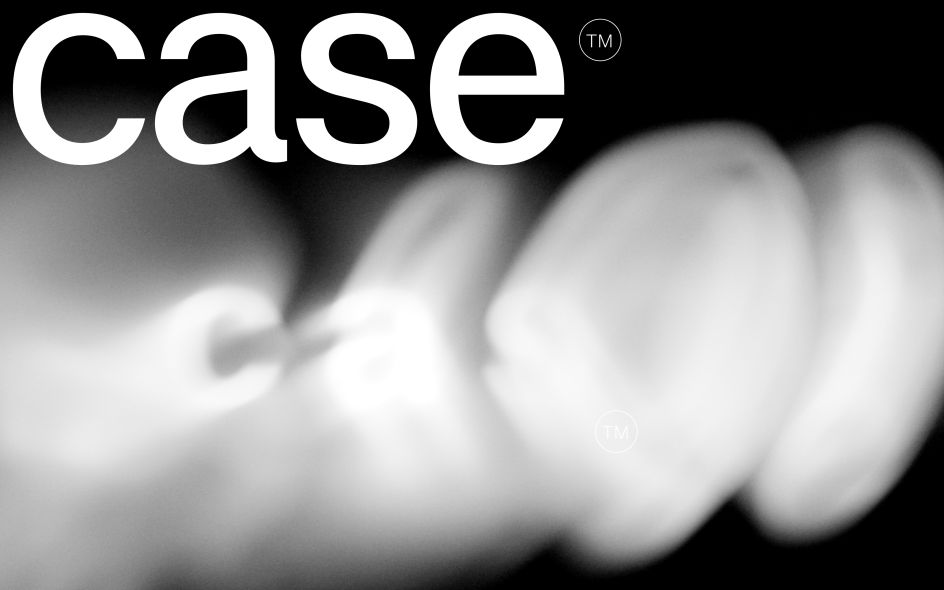
Berlin type foundry Fontwerk have been busy beavers lately. A few weeks back, we shared their fun new typeface hamster Hamster. Today they're releasing the newest iteration of their popular neo-grotesque font, Case 2.0.
To explain why that's significant, let's first take a step back.
One of the most common dilemmas in typography is: do you go for a classic or something entirely new? Classic fonts offer authority, precision, a sense of class and underlying reliability: they are, after all, seen as 'classics' for good reason. But at the same time, you don't want your designs to seem samey, hence the pull towards custom fonts for a more original look and feel.
Fontwerk's Case Collection was born out of decades of experience working on many corporate fonts where the clients wanted their own version of a sans-serif in the style of the popular classics. And so often, their famed type designers, including Erik Spiekermann, Anja Meiners and Ralph du Carrois, often found themselves working on a variation of the omnipresent Neo-Grotesque.
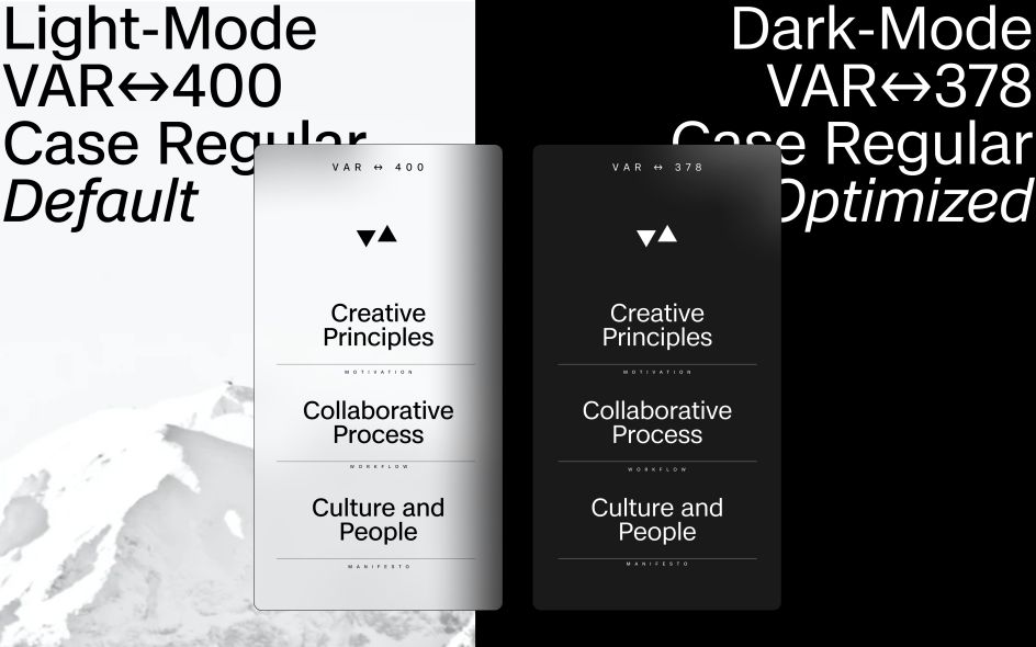
In 2020, they brought together the best bits of this genre with a new, modern vitality in the form of a Case, which they described as "a modern Neo-Grotesque for the new Twenties". Now, with Case 2.0, they've completely reworked this matter-of-fact and confident typeface for the world of 2023.
What's new in Case 2.0?
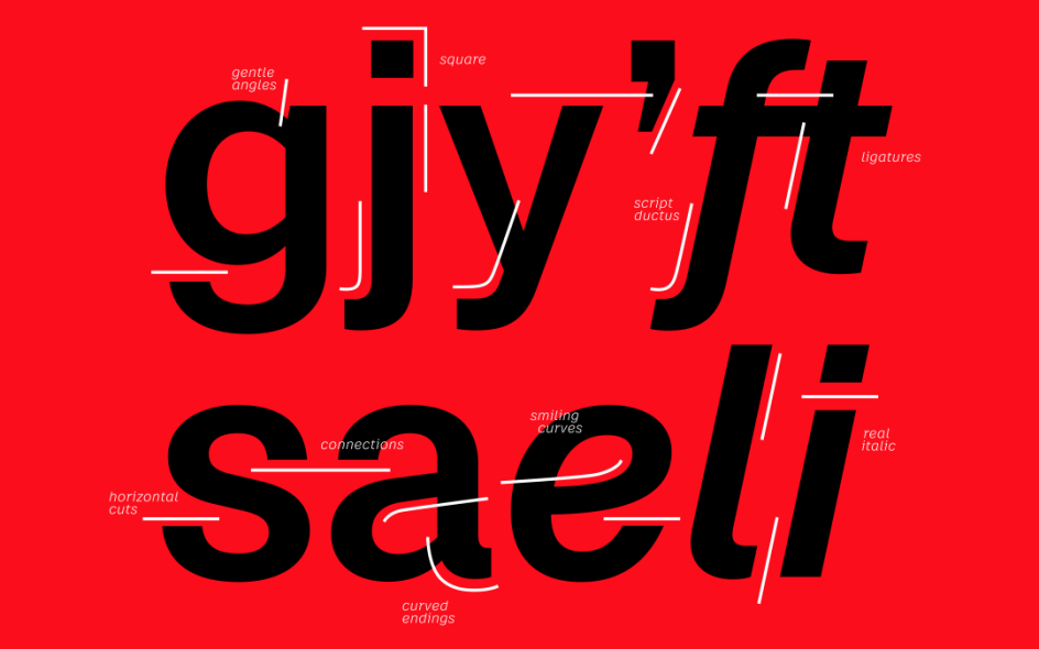
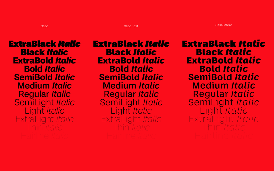
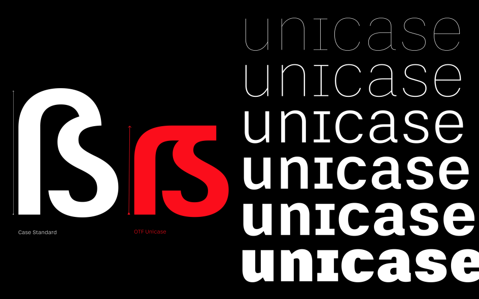
In this brand new version, the team has revised it from the ground up, doubled the number of fonts and characters, added a unicase feature and expanded the language support dramatically. Case now includes support for Cyrillic, Greek and Vietnamese as well as Latin African languages.
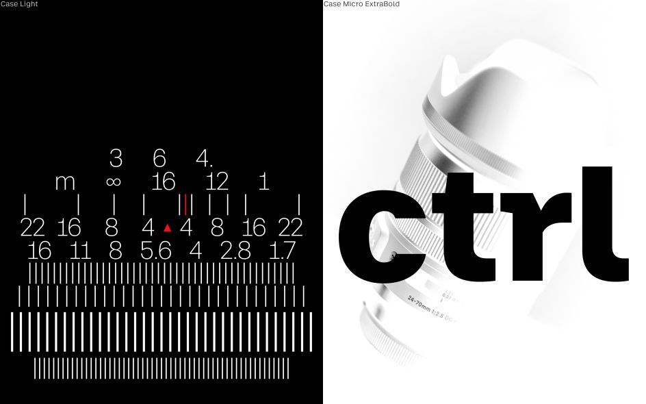
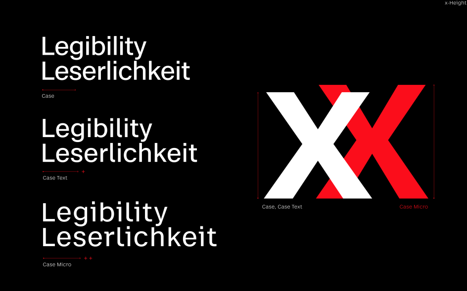
Case 2.0 includes three optical sizes, which allow a high degree of application-specific optimisations. And as previously, the new version of Case proves a familiar and reassuring neutrality with just that little bit extra to help it stand out from its competitors.
"With a striking emphasis on horizontals, remarkable legibility, real italics, and the support of 490 languages, Case 2.0 is a modern alternative to the classics and confidently keeps up with the ever-growing demands of complex branding projects," explains Fontwerk founder Ivo Gabrowitsch. "We're delighted to have worked closely with Ralph, Anja and Erik to produce a no-nonsense yet nuanced typeface that brings character and freshness to the world's most popular font genre.
"Case is full of know-how and little surprises with a no-nonsense personality," he adds. "It's a breath of fresh air in an otherwise bloated font genre, and we believe it has the potential to become a classic of the future."
Editor's Picks


Trending


Editor's Picks
Further Reading