Deliveroo serves up a sizzling new identity to drive a wider global appetite
It's become a brand we see on our city streets and suburbs, with employees whizzing by on electric bikes to deliver restaurant food to our homes. Today, Deliveroo's in-house creative agency has unveiled a refreshed identity, but it's more of an evolution than an overhaul.
The move is part of a drive to ensure competitive edge, distinction, and creative consistency across Deliveroo's ten local markets. It follows a decade of growth for the business – seeing particular success during the global pandemic when we all stayed at home.
Launched this week, the new identity, the first to be developed by Deliveroo since 2016, has been created exclusively in-house by its own creative agency, Deliveroo Creative, who drew on eight months of customer research as well as expertise from all of the brand's product, HR, comms, marketing and engineering teams. "It may seem like a long time, but it meant we could build something that works for everyone and something all of Deliveroo can be proud of," says Emily Somers, global director of brand and creative.
It was quite the project, too, as the agency developed over 400 assets during the process to demonstrate to its stakeholders just how much the identity can stretch and flex across the brand.
But what were the challenges the creative team faced in evolving the identity? (Aside from Deliveroo's struggling performance this year as consumers cut back on spending and "return to normal"?) Firstly, it looked at the brand's visual elements that customers recognised the most. Secondly, it wanted to figure out how to create a more cohesive customer experience from advertising to the food delivery service app. The team also looked at the brand's new positioning and how that might inspire the refreshed identity. Lastly, as Deliveroo continues its global growth, it asked: how to build a consistent look and feel that drives distinctiveness across such unique markets?
The starting point was by identifying Deliveroo's brand codes – those distinctive elements that customers most recognise about the brand, which, according to customer research, were established as the colour teal, the Roo Head shape and the Deliveroo wordmark.
Building on DesignStudio's 2016 rebrand, Deliveroo Creative looked at the shape of the roo head "through a completely different lens" to give it a fresh look, one which brings Deliveroo's personality to life and reflects the new brand positioning to "connect people, businesses, and communities through a shared love of food".
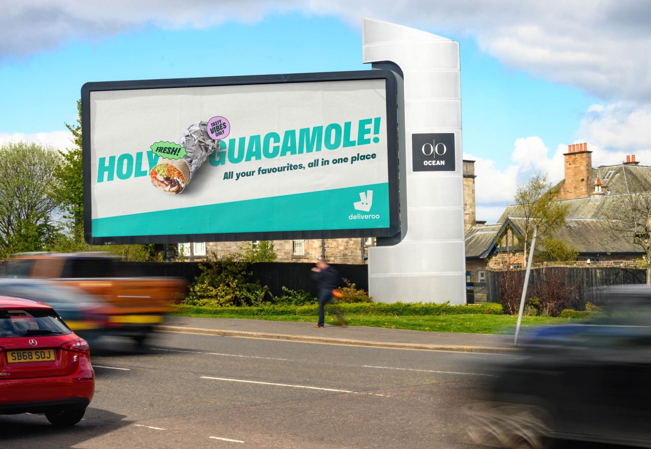
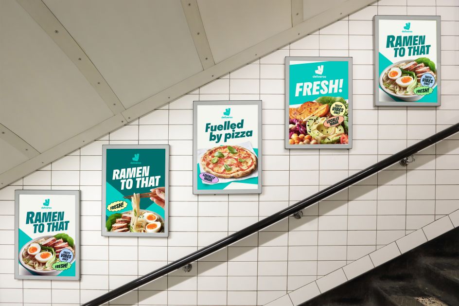
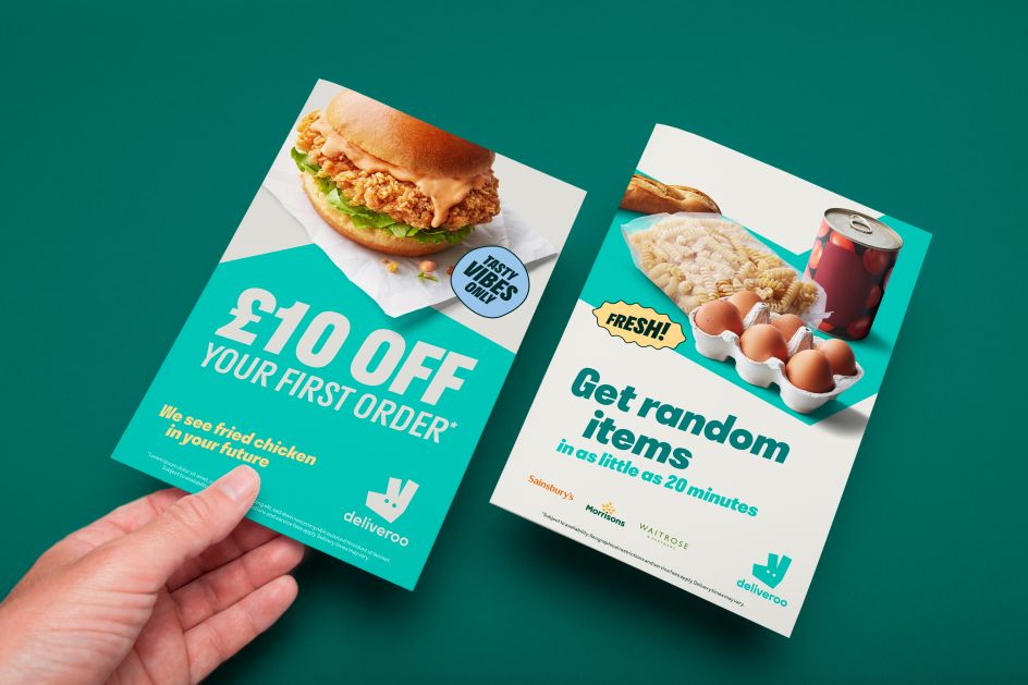
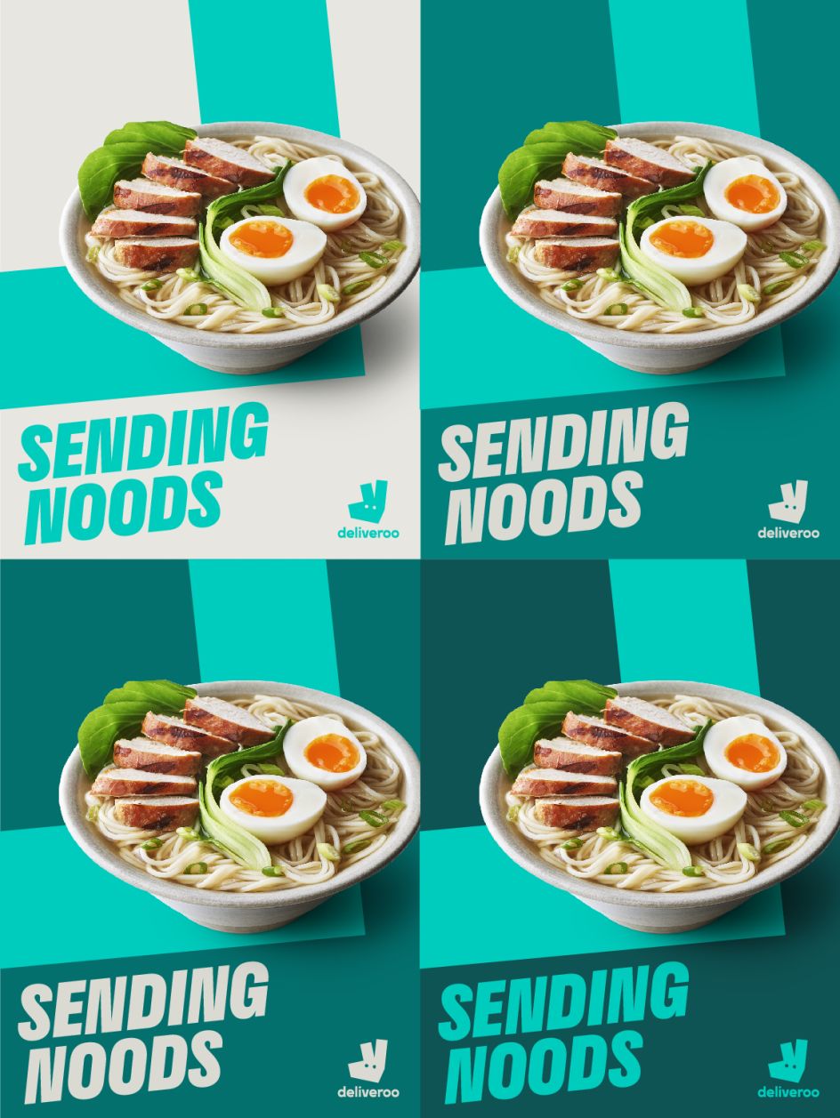
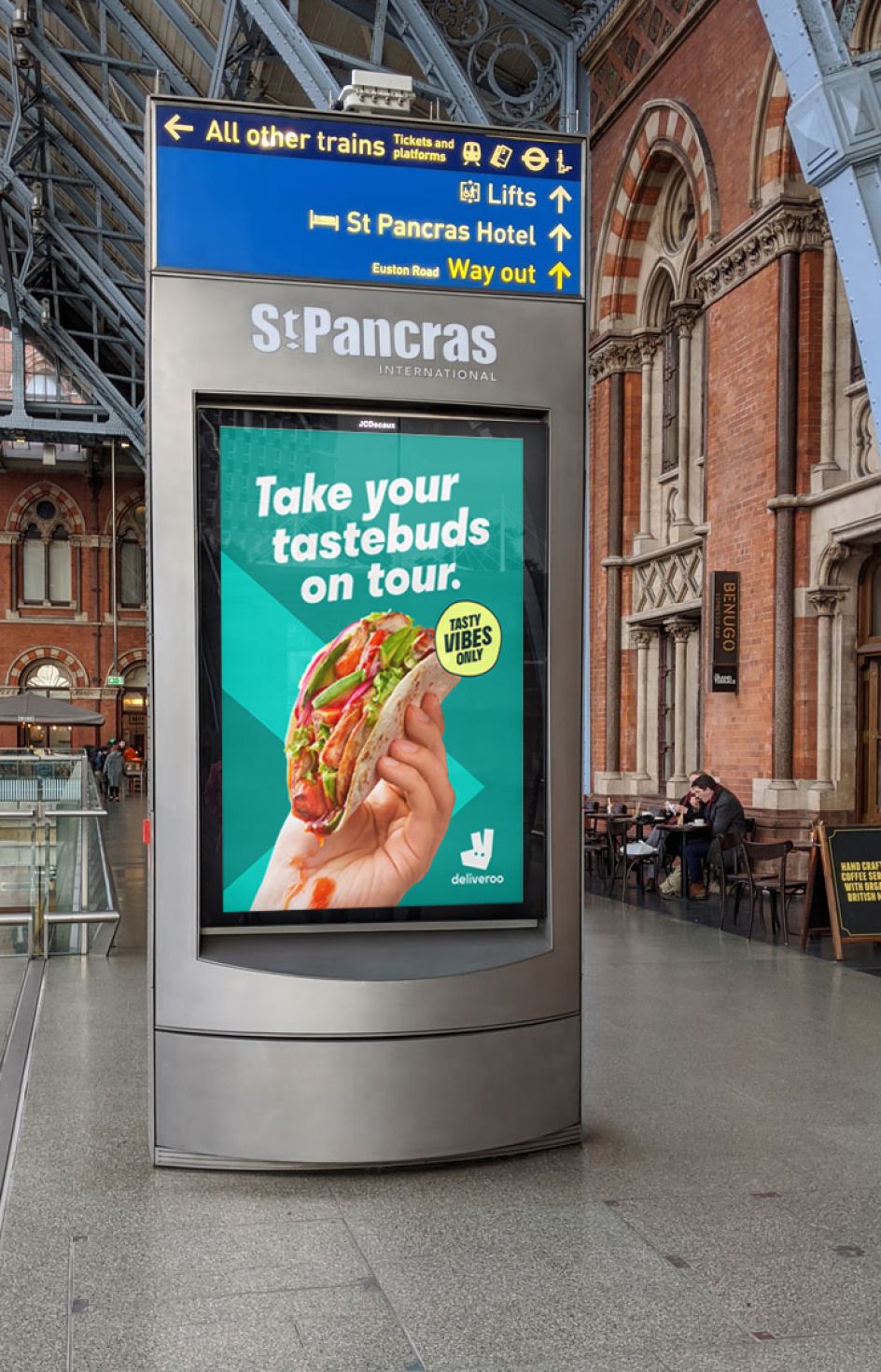
At the centre of the design system is a new graphic device titled 'the Rooute', inspired by Deliveroo's app. The creative team considered the rider's teal journey line, which appears when a customer makes an order and tracks the rider from restaurant to door – "this is Deliveroo's visual expression of connection," it explains. The Rooute, therefore, acts as a visual reminder of Deliveroo's brand codes: the colour teal and the angles of the Roo Head. As a rule, the graphic motif travels through all creative and has a range of behaviours, including usage as a frame, a house for typography and motion. Meanwhile, the angles of the Roo Head inspired other elements of the identity, such as the typography, which is angled at six degrees – the same angle as the nose of Roo Head – and italicised to portray the kinetic nature of Deliveroo's service.
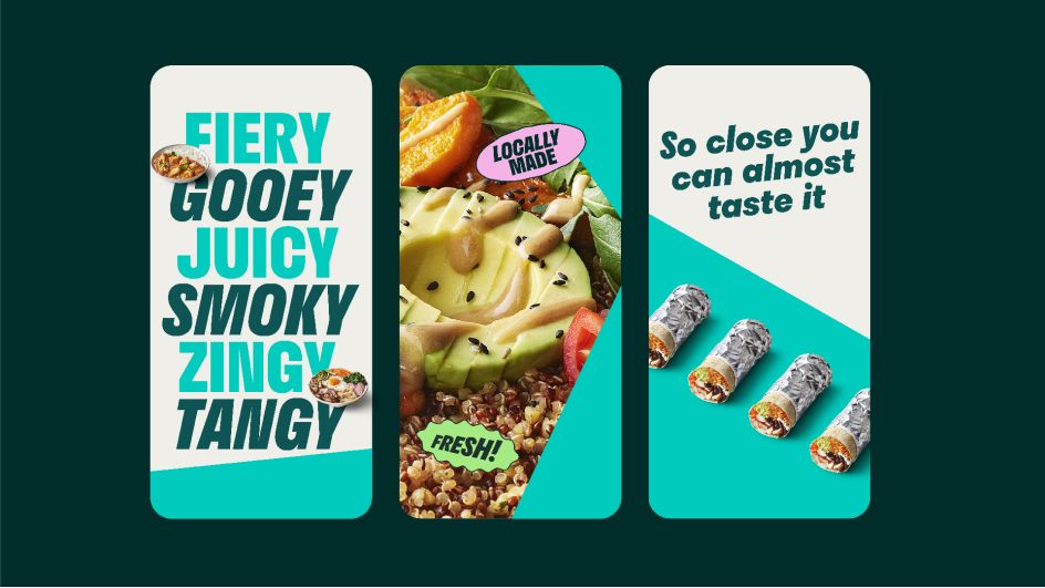
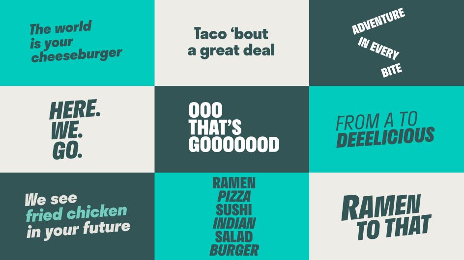
Looking at Deliveroo's tone and voice, the team felt it had always been a differentiating part of the brand. But it has been pushed to be even more playful, showing off Deliveroo's passion for the "tastiest food in the neighbourhood".
A new set of typographic stickers has been created to add more personality, featuring shapes inspired by the imperfect circles that form the eyes in the Roo Head. "The team noticed this little handmade touch in Deliveroo's angular visual world," says the team. "It offers a perfect contrast to the angular elements of the identity, as well as a nod to the handmade nature of our customer journey. From the chefs who hand-make the food, the rider who hand-delivers it, and the customer who eats it."
As for the minimal colour palette, the different shades of teal allow the new bright, mouthwatering 100-image food photography to pop because, ultimately, that's what customers want – food, glorious food.
"For the first time since 2016, we have a consistent visual foundation for our creative campaigns," says Paul Hewitt, global head of creative. "Our new work shows how much life is left in our most distinctive brand asset. Looking afresh and discovering new elements inspired by the Roo Head has been a total joy to direct. Proof that sometimes the answer is staring you right in the face (literally).
"As a creative team, we are now brand guardians, which gives us a new role in the business. But we're hungry for more, and I'm excited to bring this work to life to keep Deliveroo looking smoking hot and tasty – around the world."
The new brand identity will launch this October and will be rolled out in the coming months across all media and channels.
Editor's Picks


Trending


](https://www.creativeboom.com/upload/articles/86/862919952c0ad18439004228895a431dc6e45ffc_732.jpg)


Editor's Picks
Further Reading