Overcoming historical elitism: PAC NYC's barrier-breaking identity
Designed by NYC-based studio Porto Rocha, the new performing arts centre's identity looks to close the curtain on exclusivity while honouring the former World Trade Centre site.
A new creative space has made its home at the historic World Trade Centre site in Lower Manhattan, NYC, with an identity designed by Porto Rocha to welcome previously excluded audiences. Rex Architects recently completed the PAC NYC (Performing Arts Centre NYC) building – the last piece in then-Mayor Michael Bloomberg's plan to revitalise the World Trade Centre as a cultural destination after 9/11.
Bloomberg Philanthropies reached out to Porto Rocha in 2022 with a brief to develop the identity, name and positioning of a new performing arts centre that challenges tradition and champions inclusivity. "From the start, it felt like the perfect match," says the studio's design lead Joseph Lebus. "As an agency founded and owned by Latino Queer immigrants, the project felt personal: we see how performing arts had historically excluded many and saw this as a chance to push the boundaries to connect a brand with an entirely new people in meaningful ways."


Porto Rocha attributes its success in landing the project to its experience working in the art and entertainment sector with clients such as the Sundance Film Festival and Museu Nacional, as well as Netflix, Spotify, and Universal Music.
The cultural significance of this project was clear, as PAC NYC was built to reimagine the role performing arts could play in bringing people together, from New Yorkers in all five boroughs to visitors from around the world. Porto Rocha had to balance accessibility and prestige when designing the identity to ensure it resonated with seasoned performing arts enthusiasts and newcomers.
Lebus reveals that the most challenging aspect was "overcoming the historical elitism associated with performing arts institutions while simultaneously honouring the significance of the World Trade Center site". This meant communicating a firm focus on the future through the identity, "shifting the narrative from a sombre memory of what came to pass to a celebration of what's to come", he adds.


Having a name that was simple, short, and accessible was important for the centre, as it is easy to say and remember even if English isn't your first language. The studio also saw the potential in the symmetry of the name, as the two acronyms composed of three letters make for a "balanced and impactful word mark," according to Lebus.
With so many established brands in the rich NYC performing arts scene, Porto Rocha leaned on the fact that PAC NYC is bolder and more inviting than people might expect from this kind of institution. The studio based the logo and custom typeface on the architecturally unique building - a perfect square when viewed from above - to set the identity apart.
"Like the journey from outside to inside, the logo starts as a square but opens up to showcase the life inside the institution. It becomes a flexible element of the overall system that stands alone as a symbol representing their space in its most elemental form", Lebus explains.


PAC NYC's bespoke typeface is inspired by bold title versions of 19th-century American Gothic fonts, which Porto Rocha merged with the cubic shape of the building to create the boxy, squarish letterforms of PAC Display. The angular shapes are balanced by rounded details in the C, G, O, and Q letterforms, which seek to give the typeface "an open, welcoming feel," making the font both "approachable and declarative at the same time," says Lebus.
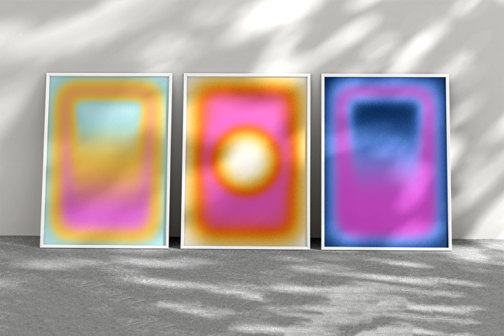
As with the logo and typeface, the colour palette was designed to work with various content to span the entire spectrum. PORTO ROCHA opted to contrast vibrant tones with the monochromatic foundational palette, which Lebus says allows the system to flex between "moments of seriousness and moments of expression depending on the need and context".
Since much of the brand's photography depended on the artists' imagery, the studio wanted to provide a framework that worked for various qualities and styles. "Imagery often interacts with typography in show posters, with cutouts of central subjects in photos overlapping headlines, for example," says Lebus. The PAC NYC logo and typography can also frame this content and unite it under one system.


Returning to the notion that performing arts institutions have an elitist reputation, Porto Rocha created a brand language that feels both contemporary and inviting to help break down the barrier to entry. "We want you to come as you are to PAC NYC without feeling a need to dress up or be someone you're not and feel comfortable swinging by to meet a friend in the lobby, have a drink at the bar, or grab dinner before a show", says strategy and copy director, Natalee Ranii-Dropcho.
PAC NYC's brand language centres around a persona called 'The People's Host' that guides how PAC NYC speaks and sounds. A host plays a fluid role across small gatherings and grand entertainment and can "welcome and challenge, energise and educate", Natalee adds.
"With a straightforward structure and no added flourishes, it stays accessible to people of all ages and languages. This tonal approach worked well with our bold headline typography, presenting messages in a way that felt both energetic and easy to understand at a glance."
Editor's Picks


Trending


Podcasts


Editor's Picks
Further Reading