California studio Cubic Orange help the fight against menstrual poverty in Kenya
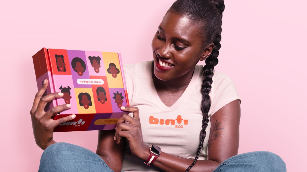
Binti Box is a social entrepreneurship project providing sustainable, locally-made menstrual health products to underprivileged women. Cubic Orange worked to position the brand as fearless yet caring.
Based in San Diego, California, branding studio Cubic Orange is used to working with hip companies such as Death by Tequila, Lift Coffee and CBD skincare brand Flowerkist. But recently, they've been working on something quite different... assisting an African social entrepreneur in her mission to end menstrual poverty in Kenya in collaboration with the University of San Diego.
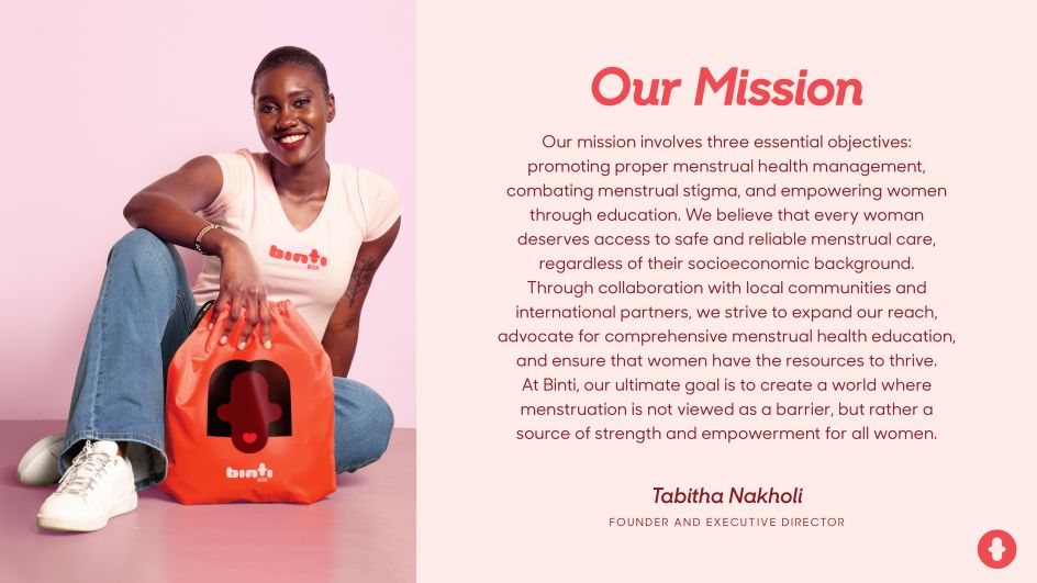
"Binti Box provides sustainable locally made menstrual health products to support and empower underprivileged females of Kenya," explains co-founder Fernanda Guskic. "The project was developed by the Wezesha Binti Foundation with the goal of promoting proper menstrual health management and hygiene and fighting menstrual stigma.
"The process created a strong connection between women who make and girls and women who use the pads. Also, the program connected Kenya with American companies to collaborate and fund this valuable and beneficial project."
Research and brand concept
The team began by thoroughly researching Kenya's economic and cultural landscape to understand the pivotal role education plays in shaping confidence and fulfilment among Kenyan women. And they identified a primary barrier: many are often deprived of education due to a lack of menstrual care products.

The solution that Cubic Orange developed emphasises four key points:
Rational: Positioning the Binti box as an essential tool in the lives of underprivileged females, allowing them to pursue their ambitions without interruptions.
Emotional: Adopting a hopeful and uplifting tone of voice that stems from deep empathy and understanding, with "empowerment" as the focal message.
Visual: Crafting a cohesive and recognisable design system that is relevant, relatable, and appealing both locally and internationally.
Messaging: Conveying information in a straightforward yet inspirational manner, empowering menstruators to challenge taboos and stigmas related to periods in their community. This messaging also assures them that they have allies who are proud of and support them.
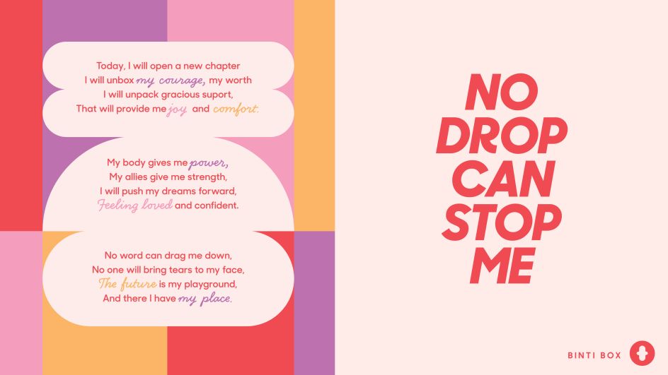
"'No drop can stop me' becomes a powerful statement that anchors the communication platform on carefully selected pillars: Empowerment, Education, Femininity, Sustainability, and Global Reach," explains Fernanda. "Its purpose is to inspire, influence, and encourage menstruators to live proudly, determinedly, and sustainably."
The studio's main goal was to assign Binti Box two equally important roles to support positioning the brand as fearless yet caring.
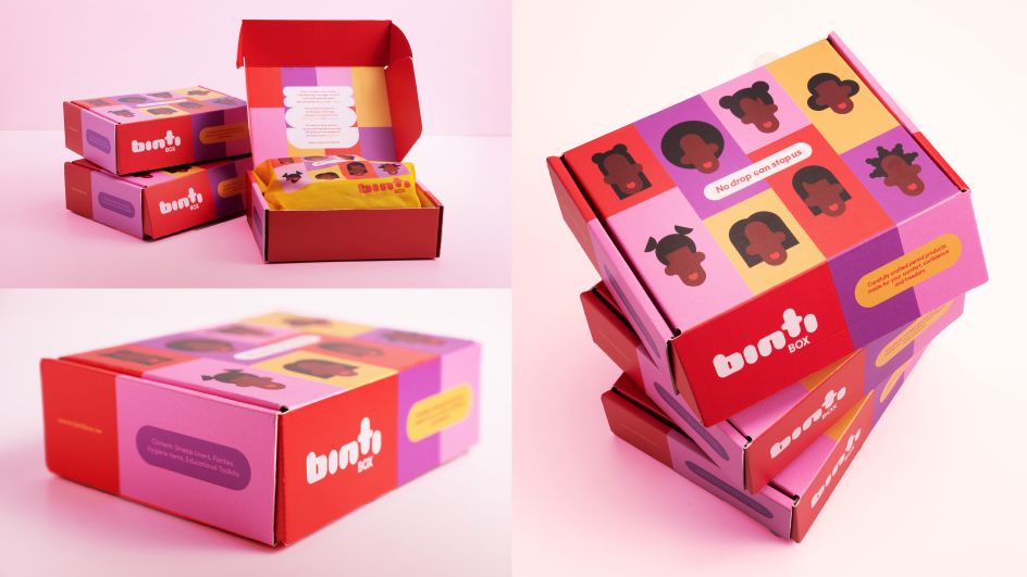
"From the outside, it was an eye-catching, colourful invitation to become a part of a global female tribe, fostering a strong sense of connection and acceptance. From the inside, it aimed to create a more intimate, safe and gentle space every menstruator can call her own, wishing to keep the box for many years to come."
Design system
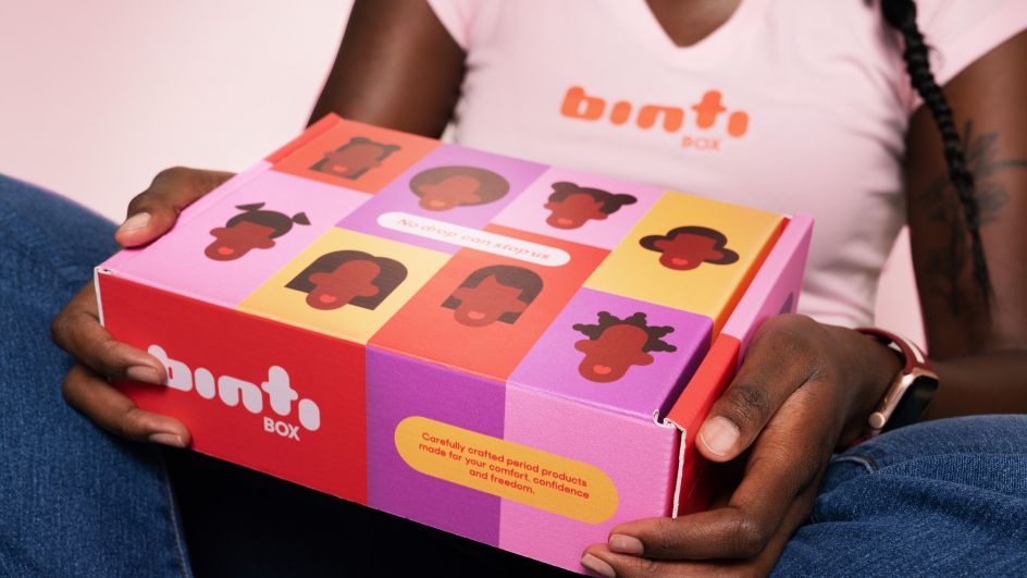
In keeping with the goals of the brand, the design is warm, optimistic and inclusive, with custom-made letters that are bold yet with a rounded and feminine touch.
As for the colour palette, Cubic Orange took the pink and purple hues of the original project and refreshed them during the rebranding process. They also introduced additional colours to honour the African heritage of vibrant shades and patterns.
For the visual identity, the team set out to seamlessly merge the product's aspiration and mission in a playful yet impactful manner. The design centres around the T-shaped pad, where the 'T' is elevated above the grid, creating a sense of uplifting momentum.
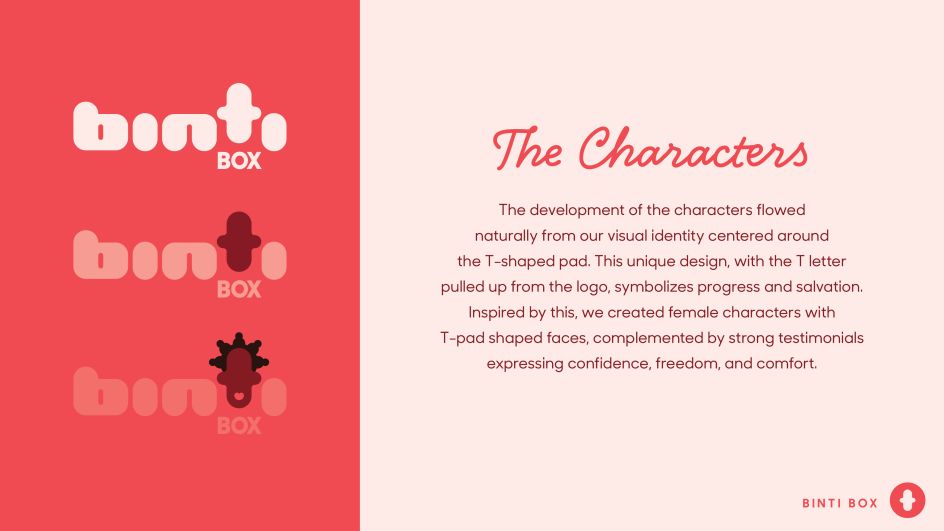
"This inspired us to take it a step further by introducing a set of female characters that would complement both the visual and verbal identity," says Fernanda. "These T-pad-shaped faces were paired with powerful testimonials that convey confidence, freedom, and comfort.
"With the logo serving as the foundation for these characters, it charted the right course for communication, enabling the brand to truly come alive and resonate with its audience."
Tone of voice
As the brand needed to cater to women who primarily reside in rural parts of the country, the tone of voice needed to be down-to-earth, simplified, yet direct and uplifting.
Communication goals were threefold: to encourage the use of personal care products, to "empower the woman within, ready to rise", and to strengthen the sense of community connection.
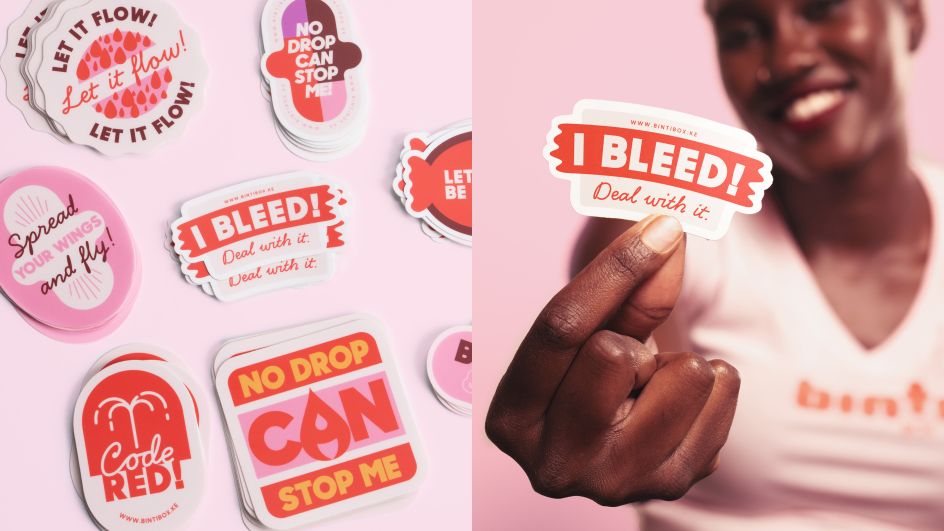
"It was crucial to instil in them a robust sense of self and a feeling of belonging to a broader community," says Fernanda. "We aimed to dispel the shame associated with menstruation and assure them that the future is theirs to embrace. In addition to the inner pack copy, we also designed special stickers to underscore the dignity menstruators should feel."
Cubic Orange also designed a sticker set to emphasise that menstruation is a natural process. "Through a playful approach, we aimed to encourage underprivileged Kenyan women to embrace their bodies and, just as crucially, to communicate this acceptance to those around them. We intentionally deviated slightly from the style established by the logo and box design. This was to give it a more down-to-earth feel, ensuring that the women of Kenya could relate to and be inspired by it in their daily lives."
The project was led by executive creative director Vladimir Guskic. The art direction was by Marko Blagojevic, identity design by Marko Blagojevic, copywriting by Nevena Stanic, packaging design by Marko Blagojevic and Fernanda Costa Guskic, motion graphics by Nikola Guskic and Alan Nguyen, and photography by Tony Regalmuto.
Editor's Picks


Trending


](https://www.creativeboom.com/upload/articles/86/862919952c0ad18439004228895a431dc6e45ffc_732.jpg)


Editor's Picks
Further Reading