Design Bridge and Partners shoots for the stars in new identity for The Archer School for Girls
Taking literal inspiration from its name, Design Bridge and Partners has crafted a fresh identity for The Archer School for Girls in Los Angeles. At its core is The Archer, built on the legendary Artemis – designed to represent each student, aiming for her goals.
The work by Design Bridge and Partners marks a significant milestone for the Californian school that prides itself on helping its students discover and pursue their excellence.
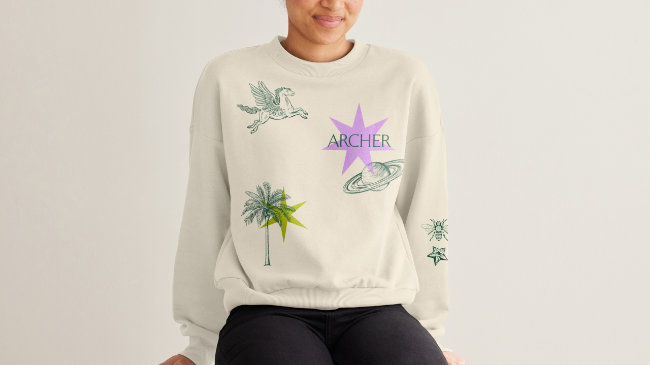
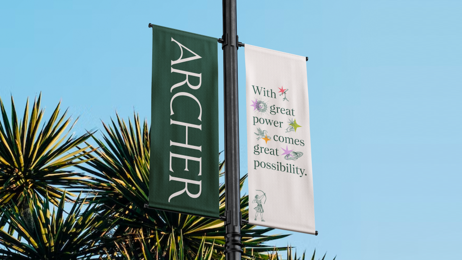
Embracing the symbolism of Artemis from Greek mythology and the Aegis, a protective shield, the identity begins with the character of an archer who is always aiming his bow up to the sky, pointing to a set of constellation elements that represent student goals. These stars sit alongside gravitational features that include The Fountain, The Palm, The Maypole, and Alfie The Dog – the school's unofficial mascot.
The palette's primary colours are stone and evergreen, designed to symbolise foundational support and growth potential. In contrast, secondary colours like palm, pink, sunset, and sunrise represent new growth, the divine feminine, and even Los Angeles' famous sunsets.
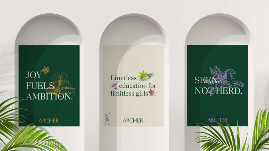
The brief for accompanying photography was to capture the joy and passion of being a student at the school, depicting education in a vibrant and positive learning environment. Marketing collateral for everything from billboards and social media campaigns features empowering messages such as, 'May the best self win' and 'Joy fuels ambition'.
"Our brand transformation underscores the intentional ways we balance many things at Archer, including ambition and joy, structure and freedom, tradition and evolution, as we develop the best possible social, emotional, and intellectual tools girls need to pursue their brilliance," explains Elizabeth English, head of The Archer School for Girls. "We nurture their spirits while equipping them to become architects of their own excellence within our carefully cultivated aegis."
It's an ethos mirrored across its fresh identity that, at first glance, you'd think only represents a traditional, prestigious school, given the evergreen and stone palette, carefully crafted wordmark and classically illustrated icon. But it's more than that, as Marlee Bruning, creative director from Design Bridge and Partners, explains: "You look a bit closer, and you see that this isn't your average school – you see the vibrant colours cutting through, the dynamism of a moving logo, the modern content of the icons. The design reflects the school and its unique iterative approach to education – always researching, reflecting, adapting – it takes what's great about classical education and marries it with cutting-edge modernity."
"Archer possesses a unique 'glow' that awes its families and gifts its girls a signature striking brilliance," says Veta Bates, Senior Strategy Director at Design Bridge and Partners. "To serve the school, the girls, and the world, we set out to extend that 'glow' well beyond its gates. We brought to the forefront some of Archer's most impactful and resonant truths and then found a way to express them with such clarity and distinction that when you encounter Archer in the broader world, you will feel its glow too, as well as the boundless potential it offers its girls and the way Archer can inspire possibilities for education at large."
English concludes: "We believe that genuine life-lasting learning thrives here. Archer girls are limitless creators of their own futures, and our fresh visual identity beautifully expresses our true colours at a cultural inflexion point for culture and the world. Thanks to the strategic partnership of the Design Bridge and Partners team, the sanctuary and strength we've provided for the last 25 years has a solid new foundation for an even more impactful next era."
Editor's Picks


Trending


](https://www.creativeboom.com/upload/articles/86/862919952c0ad18439004228895a431dc6e45ffc_732.jpg)
Podcasts


Editor's Picks
Further Reading

](https://www.creativeboom.com/upload/articles/c6/c6c61bd8fc04434adcee7d90d766a1b1154c597b_732.jpg)